08.21.2012
August 21, 2012
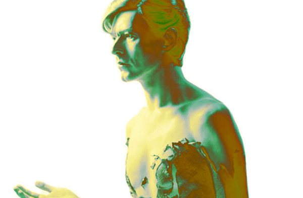
I pitched in on the writing and editing of the definitive monograph of Japanese photographer Masayoshi Sukita, along with Kiyonori Muroga of Idea. Sukita’s work chronicles much of rock and roll history from the late 1960s through today, with a heavy focus on the work of David Bowie, Yellow Magic Orchestra, Joe Strummer and the circle of friends surrounding Jim Jarmusch.
Lovingly designed by HeQuiti Harata, it’s a must-get.
08.07.2012
August 7, 2012

I would like to extend a giant round of thanks to all of the attendees of our lecture on the work of Oswald Bruce “Oz” Cooper at TypeCon in Milwaukee. It was such a tremendous response and so appreciated.
If you’d like a copy of the text that the lecture was based on, you can order a copy of Idea #339 here from Wordshape.
Our studio has created revivals of many of the typefaces covered in the lecture. You can check them out here from Wordshape, here from MyFonts and here from YouWorkFromThem.
Thanks to the Society of Typographic Aficionados and the TypeCon board for having us come present. TypeCon2012 was amazing!
Parallel Strokes
July 10, 2012
Web design for a book I wrote and self-published in 2008, then forgot to put in the portfolio. Four years later, it still looks really good for a micro-site for a book on obscure topics.

06.29.2012
June 29, 2012

My recent poster series with Chad Rea for Electricity Showroom is now available via Ecopop.
Orsay Fine Arts
June 25, 2012
Trilingual (English, Simplified Chinese, Traditional Chinese) corporate identity, stationery and website for France and Taiwan-based art dealership Orsay Fine Arts.

06.19.2012
June 19, 2012

I’ll be doing a piped-in lecture at Otis College of Design on Wednesday at 3pm PST. (Bum rush the show!)
06.16.2012
June 16, 2012

While watching Season Three of Futurama, we discovered that the folks who made the show used a handful of Wordshape fonts, most noticeably Cooper Black Swash Italic here and there throughout. Exciting to find your work out in the televised world!
Idea #353
June 13, 2012

I edited Toshiaki Koga’s new feature essay about designer Zak Kyes for the latest issue of Idea.