06.19.2012
June 19, 2012

I’ll be doing a piped-in lecture at Otis College of Design on Wednesday at 3pm PST. (Bum rush the show!)
06.16.2012
June 16, 2012

While watching Season Three of Futurama, we discovered that the folks who made the show used a handful of Wordshape fonts, most noticeably Cooper Black Swash Italic here and there throughout. Exciting to find your work out in the televised world!
Idea #353
June 13, 2012

I edited Toshiaki Koga’s new feature essay about designer Zak Kyes for the latest issue of Idea.
Slanted #18
June 13, 2012

I have a new feature in issue #18 of Slanted Magazine- an essay about wayfinding and mortality.
06.13.2012
June 13, 2012

I have a new feature in the latest issue of Slanted Magazine– an essay about wayfinding and mortality.

I also edited Toshiaki Koga’s new feature about the work of Zak Kyes in the latest issue of Idea.

Kind of Like Spitting – Professional Results
June 8, 2012
Tour CD for Kind of Like Spitting – listen to it here.
05.30.2012
May 30, 2012
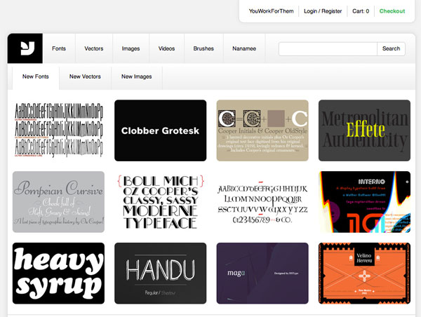
Our Wordshape fonts are now being distributed by YouWorkForThem- the first typeface offerings are available here.
05.29.2012
May 29, 2012

We’d like to extend a giant round of thanks to all of the individuals we have had the opportunity to work with throughout 2012 so far. It’s been a really, really exciting first two quarters and we’re working on some of the most engaging projects of our careers, both large and small. Thanks, one and all!
05.27.2012
May 27, 2012
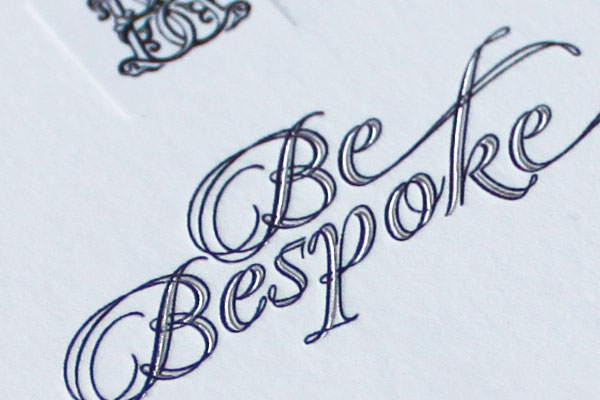
We just created a new website and identity for BeBespoke, a new experience atelier business in Tokyo.