“Because Ian has the craft of design really down pat, he has moved on to other things like giving the client what they really want even if they don’t know what it is they want. This can not be understated, because as a designer myself I am looking to expand my projects with other peoples great ideas, and that takes having a farsighted partner like Ian. Besides actual graphics, Ian has helped steer Joshu+Vela branding, public image and even the naming of the company – for this I am grateful to have someone looking out for my best interests as well as his. I am continuing to count on Ian to steer my projects in a successful direction with all the twists and turns that come up.”
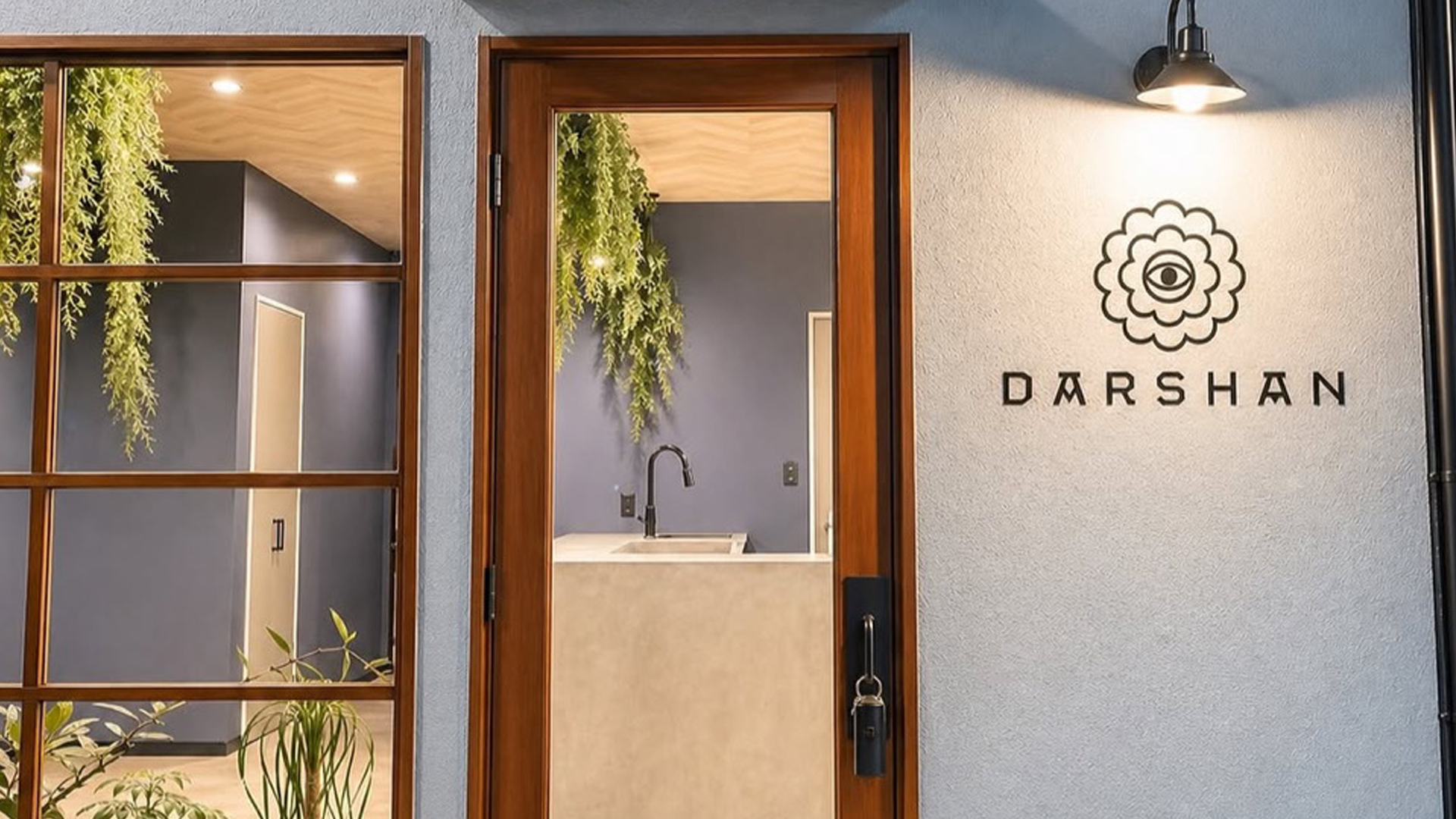
Darshan
An identity for a new Ayurvedic Indian restaurant and yoga studio.
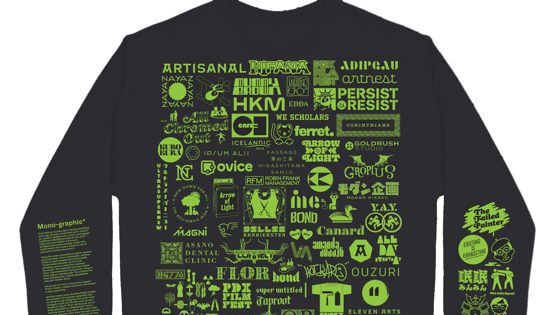
Mono-graphic
We made a tee shirt with 80% of the logos we've designed over the past 25 years.
“Ian Lynam is a visionary designer, forcing us to challenge our assumptions about what design is, and what it can do. He constantly invites us to imagine new modes of inquiry, and makes a case for design as a fundamental way of knowing, and communicating, the world around us.”

Temple University Japan 2026 Conference
Naming, branding, identity and collateral design for TUJ's 2026 Conference.
“Ever find yourself drawn to an image or sucked into an design article based purely on the form or content, then finding out later- after you go back to read the credit line- that a friend actually busted it out? That’s Ian.”
“As an artist, publisher, writer and designer, Ian seems to have had more than nine lives, and frankly it’s hard to keep up! He doesn’t just bring technical skills, but a depth of cultural understanding from the ground up — low, high, pop, fringe — that is invaluable to his varied clients. While other designers skim the shiny surface of current trends, Ian drills down with a solid understanding of history and meaning of the motifs, letter forms, and images he utilizes.”

Fracture: Japanese Graphic Design 1875–1975 exhibition
A traveling educational exhibition about the history of Japanese graphic design history!

Women Graphic Designers
An essay in an inclusive new book about graphic design history.

“Working with Ian is a dream! He is able to take a few half-formed thoughts from our end and turn them into brilliant design that eloquently communicates the identity we aim to project. He has an amazing ability of knowing exactly what you need with only the slightest amount of information. He treats each project with the utmost attention and care and is always quick to respond to changes with an open and generous mind. We couldn’t imagine working with anyone else!”

Roebling Pizza
New identity for one of NY's oldest pizzerias!


“Ian is always the first person I go to when need design help. Besides being an aesthetic genius, he is unrelenting in his commitment to portraying the right image for my brands. Top all of that off with a heavy dose of flexibility and professionalism and you end up with not only first-class designs, but an overall experience that ends up feeling more like fun than work.”


Fracture: Japanese Graphic Design 1875–1975
The definitive book about Japanese graphic design history.
“Ian instantly captivated the room when he came to speak with my design students at Portland State University. He was all of the elements that one would want in a presenter: thoughtful, funny, relevant, organized, passionate, articulate and relatable. Most of all, the entire room walked away with new knowledge. Score! PSU loves Ian!”

Shōwa Guide Tokyo
Art direction for W. David Marx and Roni Xu's book about the remnants of the Shōwa era.

Documenting The Complete Commercial Artist
A design history feature for Idea!

War with Myself: Essays on Design, Culture & Violence
A collection of essays about design.
“Ian is always the first person I go to when need design help. Besides being an aesthetic genius, he is unrelenting in his commitment to portraying the right image for my brands. Top all of that off with a heavy dose of flexibility and professionalism and you end up with not only first-class designs, but an overall experience that ends up feeling more like fun than work.”

Vaud Pro
Ten years after its initial release, we’ve debuted Vaud Pro, our completely redrawn and reengineered version of our type family Vaud.


“Eschewing the shortsighted practical nature of much graphic design-oriented writing, Lynam focuses on demythologizing contemporary graphic design – opening up a new horizon of discourse both East and West.”

Nestlé Toll House custom type
Ruth's Recipe, a custom display typeface for the originators of the chocolate chip cookie

Rick Froberg: The Beating You Deserve
An overview of the career of the late musician, designer, illustrator and artist Rick Froberg of the bands Drive Like Jehu, Hot Snakes, Pitchfork, and Obits.

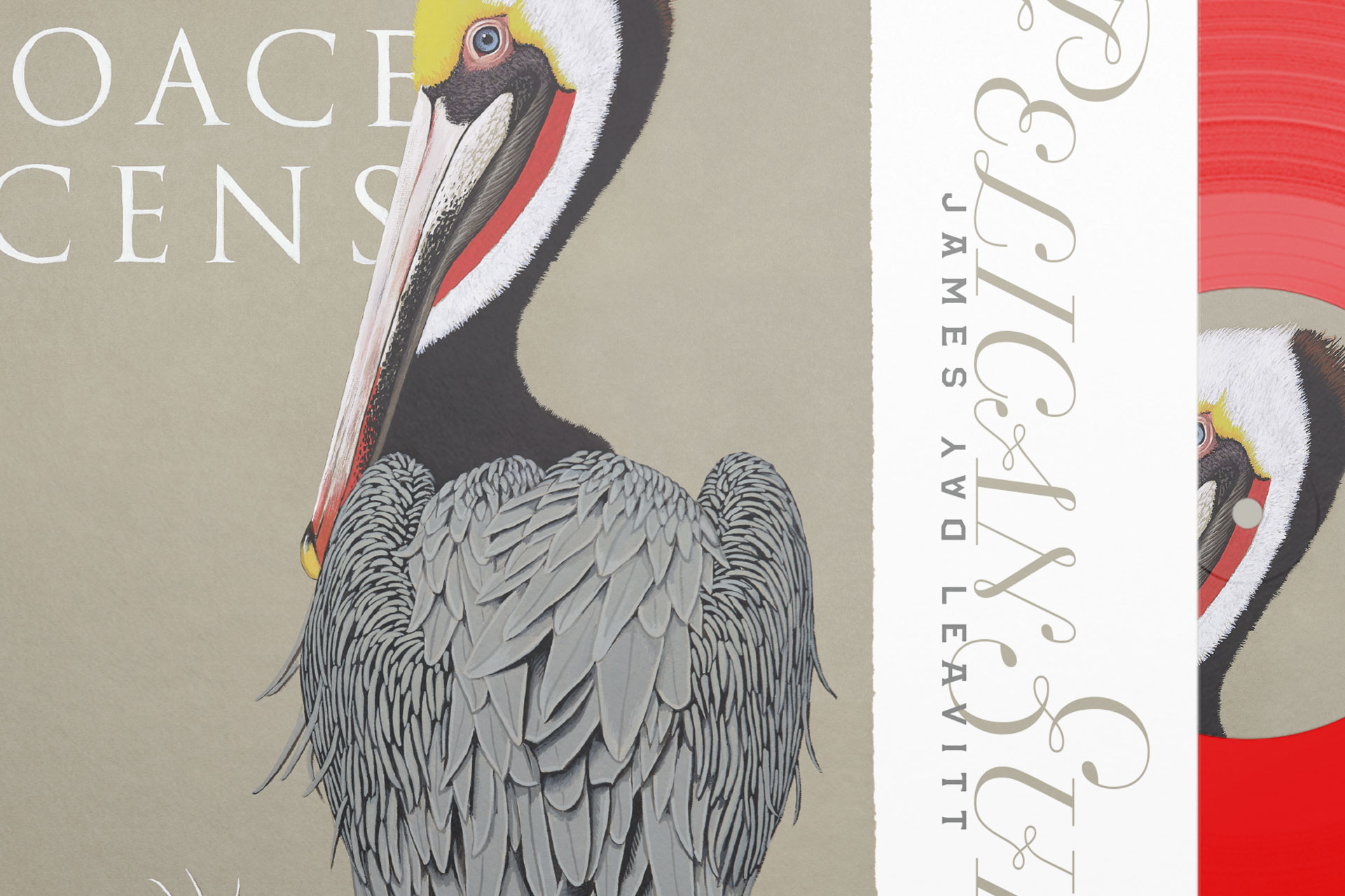
James Day Leavitt “Skylark”
LP. CD, and cassette tape design for musician James Day Leavitt
“Ian is everything I could ask for: a highly talented video creator, web designer, creative collaborator and consultant, all rolled into one guy with a great attitude! I’ve really enjoyed working together with Ian and applaud his stellar creativity, attention to detail, and flexible accommodation to tight timelines and collaborative revisions — thanks for the amazing work, and here’s to more!”

Goldrush
Identities for twin businesses Goldrush Computing and Goldrush Studios


Cooper Chrome Italic Pro
A new retro typeface set that combines the BMX-inspired aesthetics of the 1980s with the roaring 20s!
“Ian has the design skills I wish I had. His consistently creative designs come from an informed mind and relentless work ethic. I love working with him.”

Elpy
Elpy is a friendly rounded sans serif 22-member workhorse family inspired by all things music!

QDOBA custom font family
A family of new typefaces for the Mexican restaurant chain
Ovice
Corporate identity for collaborative software corporation.
“When it came time to announce Firefox’s adoption of the @font-face rule, we needed someone to create an integration demo that straddled both innovative code and a nuanced working knowledge of typography. Ian was the obvious choice- his knowledge of typography applied to print and screen helped create a piece of design that functioned as a working how-to demo, a critique of webfont deployment in its nascent stages and a compelling piece of writing.”


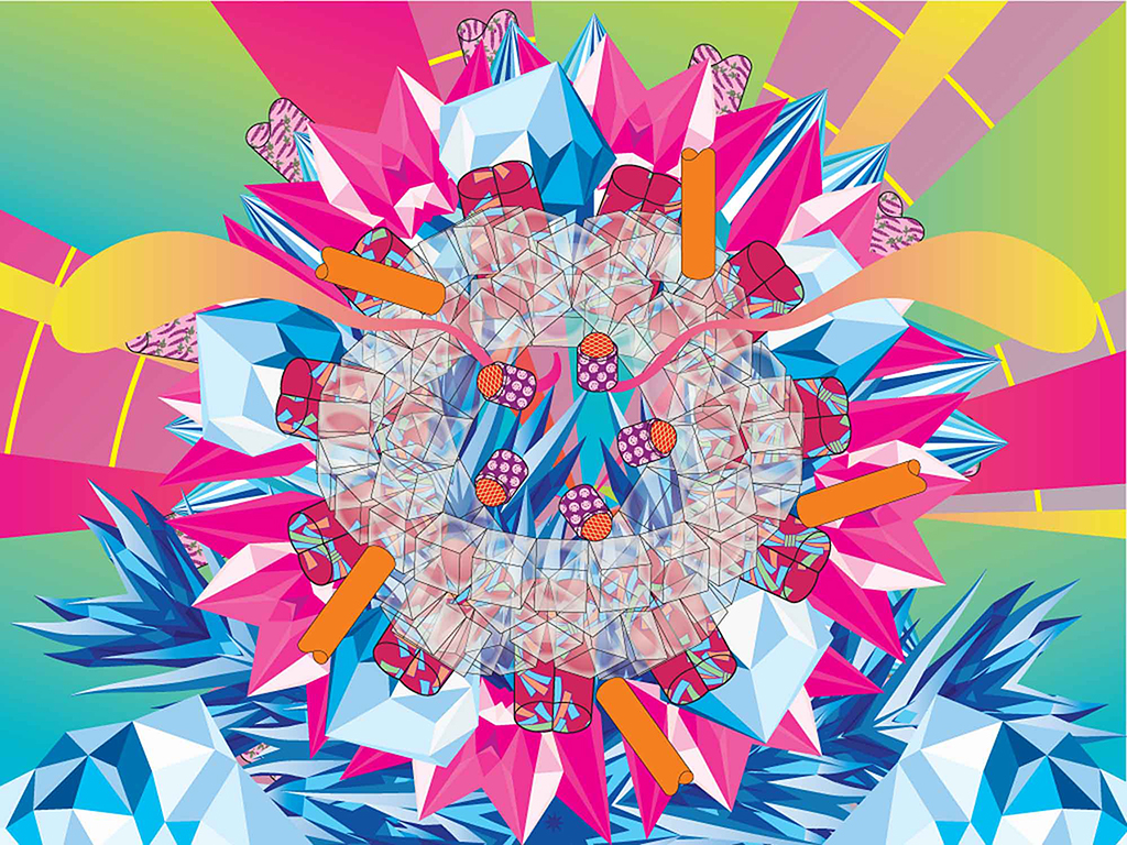
Min Min
Naming, Positioning, Corporate Identity, Copywriting, Website UI/UX/Dev/Build, Packaging & POP for CBD gelato brand

Inside Out & Upside Down: Posters from CalArts 1980–2019
The definitive book on the history of posters at CalArts
“Ian Lynam is a pleasure to work with. Always understanding of what you are trying to achieve and able to offer the sage advice of a creative designer. Reliable, timely, and effective in what he does. I would definitely recommend his services.”


“In all our collaborations, Ian has always brought a fresh perspective and boundless energy to the project. His encyclopedic knowledge of visual culture, ability to quickly work through multiple concepts, and deep Rolodex of talented friends, also give us the confidence to move beyond our first idea, towards a final product that will surprise and delight our clients.”

Art Platform Japan
An online library of English translations of key selected writings on contemporary art in Japan

Corinthians Press 002: Zombie Somnambulence
The second installment of publications from Corinthians Press!

“Because Ian has the craft of design really down pat, he has moved on to other things like giving the client what they really want even if they don’t know what it is they want. This can not be understated, because as a designer myself I am looking to expand my projects with other peoples great ideas, and that takes having a farsighted partner like Ian. Besides actual graphics, Ian has helped steer Joshu+Vela branding, public image and even the naming of the company – for this I am grateful to have someone looking out for my best interests as well as his. I am continuing to count on Ian to steer my projects in a successful direction with all the twists and turns that come up.”


Kamawanu
A new international e-commerce website for the Japanese tenugui maker.

Doko Demo Design Deluxe
Our new Japanese/English dictionary for designers and artists!
“As an artist, publisher, writer and designer, Ian seems to have had more than nine lives, and frankly it’s hard to keep up! He doesn’t just bring technical skills, but a depth of cultural understanding from the ground up — low, high, pop, fringe — that is invaluable to his varied clients. While other designers skim the shiny surface of current trends, Ian drills down with a solid understanding of history and meaning of the motifs, letter forms, and images he utilizes.”

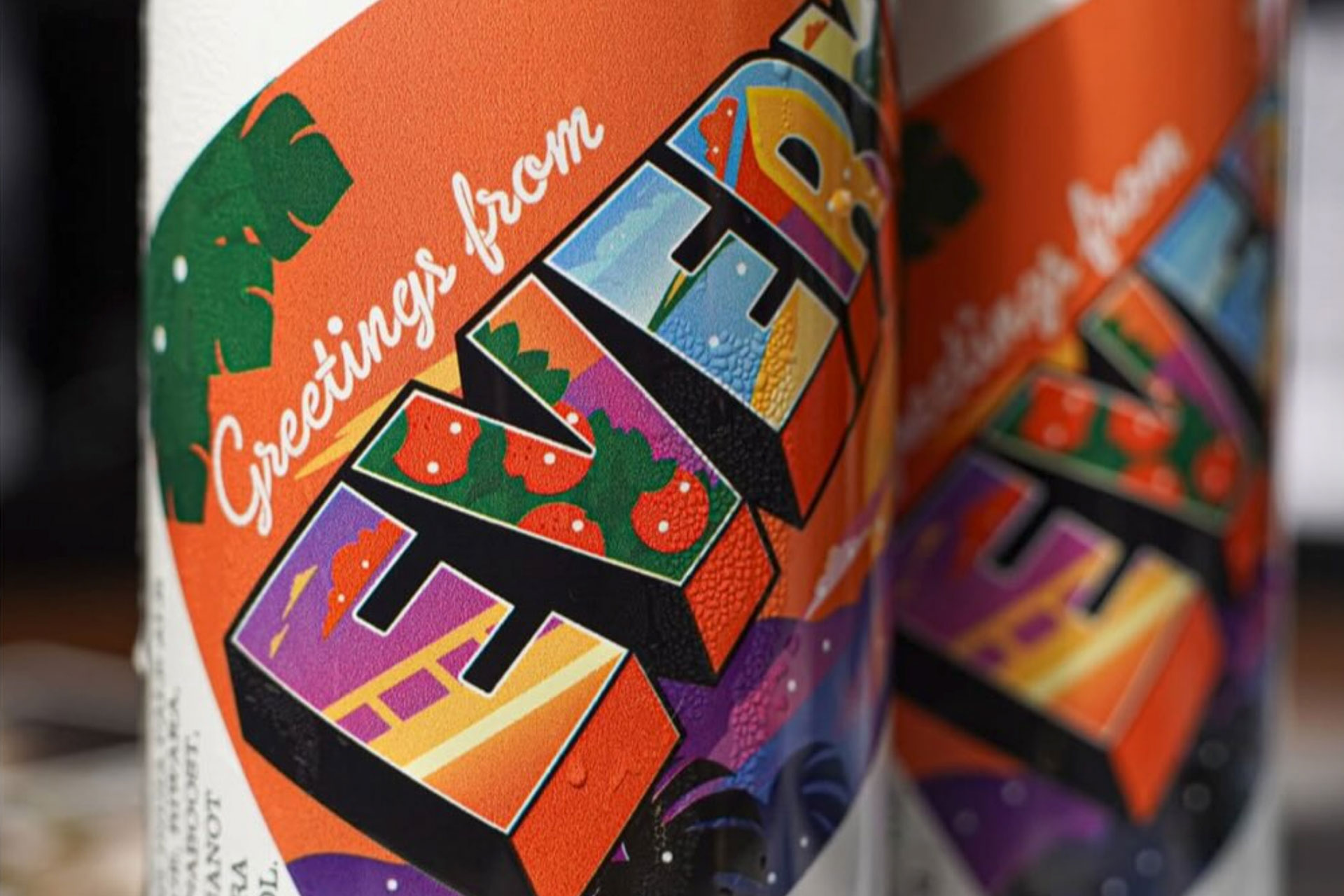
Flor Wines
Naming, branding, identity, and e-commerce for Portland's wine phenom!
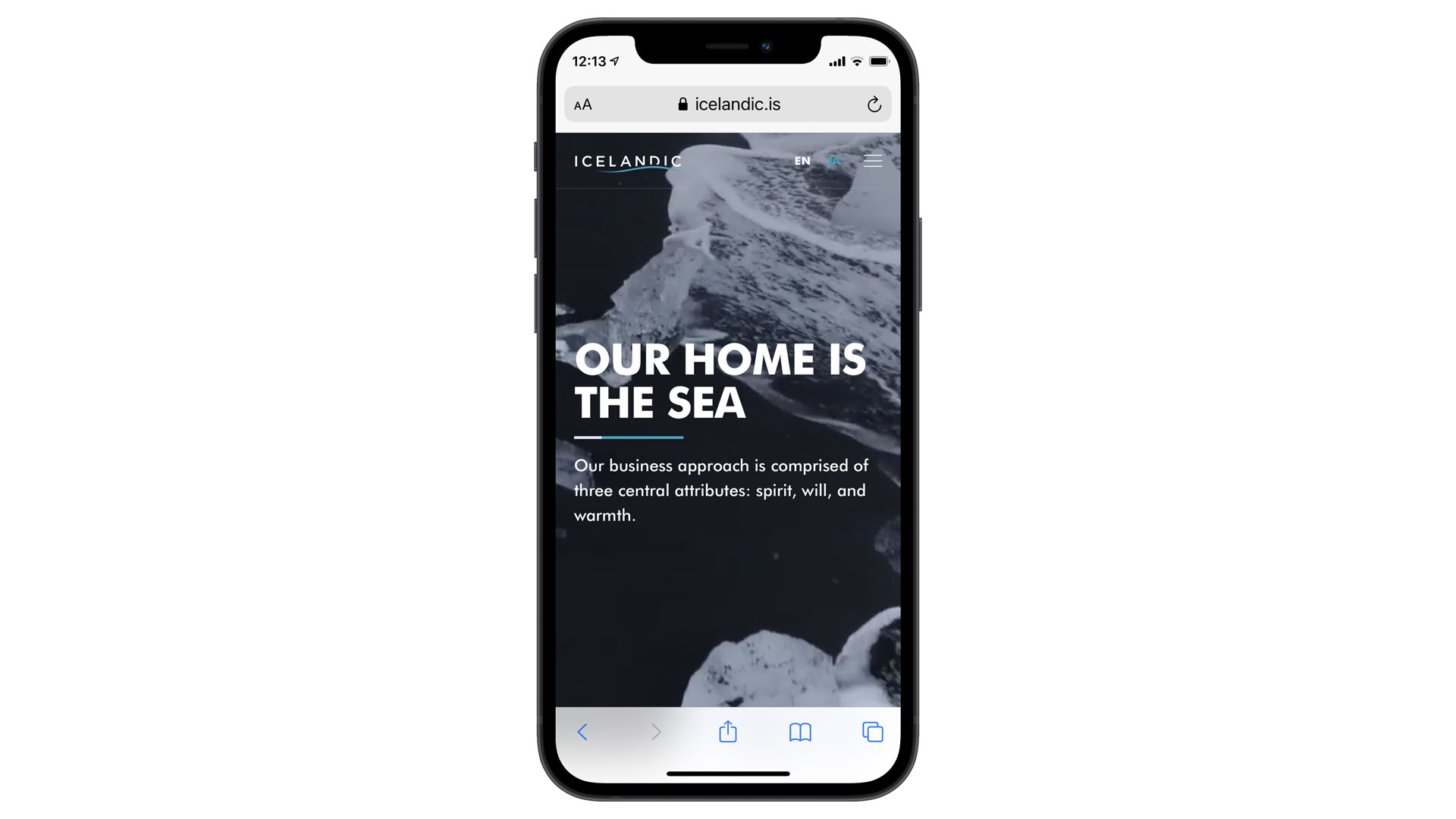
Icelandic Japan
Brand positioning, identity, messaging, website, and interior graphic design.

30 or so Minor Objects: Japanese Graphic Design History
A 130-page bilingual English/Japanese book on pre-WW2 design history.
“In all our collaborations, Ian has always brought a fresh perspective and boundless energy to the project. His encyclopedic knowledge of visual culture, ability to quickly work through multiple concepts, and deep Rolodex of talented friends, also give us the confidence to move beyond our first idea, towards a final product that will surprise and delight our clients.”


Writing Writing
An exhibition of graphic designers who write, research, teach, and practice criticism.
“Ian is always the first person I go to when need design help. Besides being an aesthetic genius, he is unrelenting in his commitment to portraying the right image for my brands. Top all of that off with a heavy dose of flexibility and professionalism and you end up with not only first-class designs, but an overall experience that ends up feeling more like fun than work.”

Luxe & Design
A website design for an exterior design firm and product manufacturer.


Syuhei Hasado
A website for one of Japan's top craftspeople.
“Ian is an honest, simply-brilliant, graphic designer with skills and talent in abundance with the flexibility to adapt to meet and exceed a client’s need and did so each time we worked with him. He is a pleasure to collaborate with I would recommend him to anyone with confidence.”

DOTA2 Radiance
Custom type design for Valve's massively popular multiplayer game DOTA2.

Plaid
We created a custom version of our popular typeface families Cern and Cern Display for financial technology company Plaid.

The Impossibility of Silence
The Impossibility of Silence is a 200+ page paperback for creative folks interested in approaching writing about their vocation and culture.
“When it came time to announce Firefox’s adoption of the @font-face rule, we needed someone to create an integration demo that straddled both innovative code and a nuanced working knowledge of typography. Ian was the obvious choice- his knowledge of typography applied to print and screen helped create a piece of design that functioned as a working how-to demo, a critique of webfont deployment in its nascent stages and a compelling piece of writing.”

Asano Dental Clinic
Identity for Asano Dental Clinic in Kaminoge, Setagaya in Tokyo.

AXES Partners
Branding and identity for AXES Partners, a multidisciplinary firm specializing in project management services throughout all of Japan.

“When it came time to announce Firefox’s adoption of the @font-face rule, we needed someone to create an integration demo that straddled both innovative code and a nuanced working knowledge of typography. Ian was the obvious choice- his knowledge of typography applied to print and screen helped create a piece of design that functioned as a working how-to demo, a critique of webfont deployment in its nascent stages and a compelling piece of writing.”

Ouzuri
The Future of Tradition: brand-building for a Japanese footwear startup
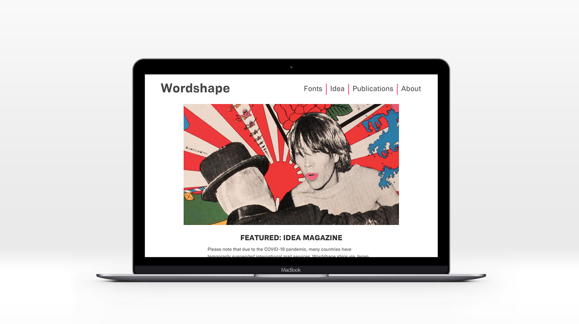
Wordshape
Wordshape is our hybrid type foundry, publishing entity, distributor of the Japanese graphic design magazine IDEA /アイデア and related Japanese graphic design books, and software company.

The Letter I
A 52-page booklet by Ian Lynam that examines notions of authenticity via design, consumption, and history.
“As an artist, publisher, writer and designer, Ian seems to have had more than nine lives, and frankly it’s hard to keep up! He doesn’t just bring technical skills, but a depth of cultural understanding from the ground up — low, high, pop, fringe — that is invaluable to his varied clients. While other designers skim the shiny surface of current trends, Ian drills down with a solid understanding of history and meaning of the motifs, letter forms, and images he utilizes.”


Slanted #35 – Los Angeles
We co-edited and co-curated Slanted #35, an issue wholly devoted to LA.

NJP No. 1
The debut print journal from Néojaponisme — 128 pages of new content about retro Tokyo past and present.
“As an artist, publisher, writer and designer, Ian seems to have had more than nine lives, and frankly it’s hard to keep up! He doesn’t just bring technical skills, but a depth of cultural understanding from the ground up — low, high, pop, fringe — that is invaluable to his varied clients. While other designers skim the shiny surface of current trends, Ian drills down with a solid understanding of history and meaning of the motifs, letter forms, and images he utilizes.”

Temple University Japan in Sangenjaya
Corporate identity, signage, and interior design for TUJ in Sangenjaya.

Critique: The War of Design
A zine about how to approach design critique from cultural and critical perspectives.

VCFA MFA in Graphic Design collateral
Collateral design for VCFA's MFA in Graphic Design Program
“Ian Lynam is a visionary and a thought leader in the field of design. It’s an honor to have him lead our graduate graphic design program.”


VCFA branding & marketing
Branding, positioning, marketing & identity initiatives for Vermont College of Fine Arts

“Working with Ian is a dream! He is able to take a few half-formed thoughts from our end and turn them into brilliant design that eloquently communicates the identity we aim to project. He has an amazing ability of knowing exactly what you need with only the slightest amount of information. He treats each project with the utmost attention and care and is always quick to respond to changes with an open and generous mind. We couldn’t imagine working with anyone else!”

Total Armageddon
A 400-page book of design theory edited by Ian Lynam.

The Thing
An 88-page booklet that examines thorny aspects of design, designers, and design history.

Creativity and technology in the age of AI
A qualitative design research project commissioned by Adobe.
“When it came time to announce Firefox’s adoption of the @font-face rule, we needed someone to create an integration demo that straddled both innovative code and a nuanced working knowledge of typography. Ian was the obvious choice- his knowledge of typography applied to print and screen helped create a piece of design that functioned as a working how-to demo, a critique of webfont deployment in its nascent stages and a compelling piece of writing.”

Visual Strategies for the Apocalypse
A 112-page booklet about overcoming “Creative Constipation™.”

Teaching at Temple University Japan
Ian Lynam is faculty at Temple University’s NASAD-accredited Japan Campus.

Custom typefaces
We have designed a wide range of custom typefaces for assorted companies—from display faces to text families.
“Ian is the best to work with. He went above and beyond what I needed with my project. Ian Lynam has really good eyes – the kind of eyeballs that can tell you just what you need for the right sparks to fly everywhere, including my and your clients eyeballs.”


Slanted #31 – Tokyo
We both edited and are featured in Slanted Magazine's latest issue devoted to graphic design in Tokyo.

Canard
We designed the identity for Canard, Portland's latest culinary phenomenon.
“Ian is an honest, simply-brilliant, graphic designer with skills and talent in abundance with the flexibility to adapt to meet and exceed a client’s need and did so each time we worked with him. He is a pleasure to collaborate with I would recommend him to anyone with confidence.”
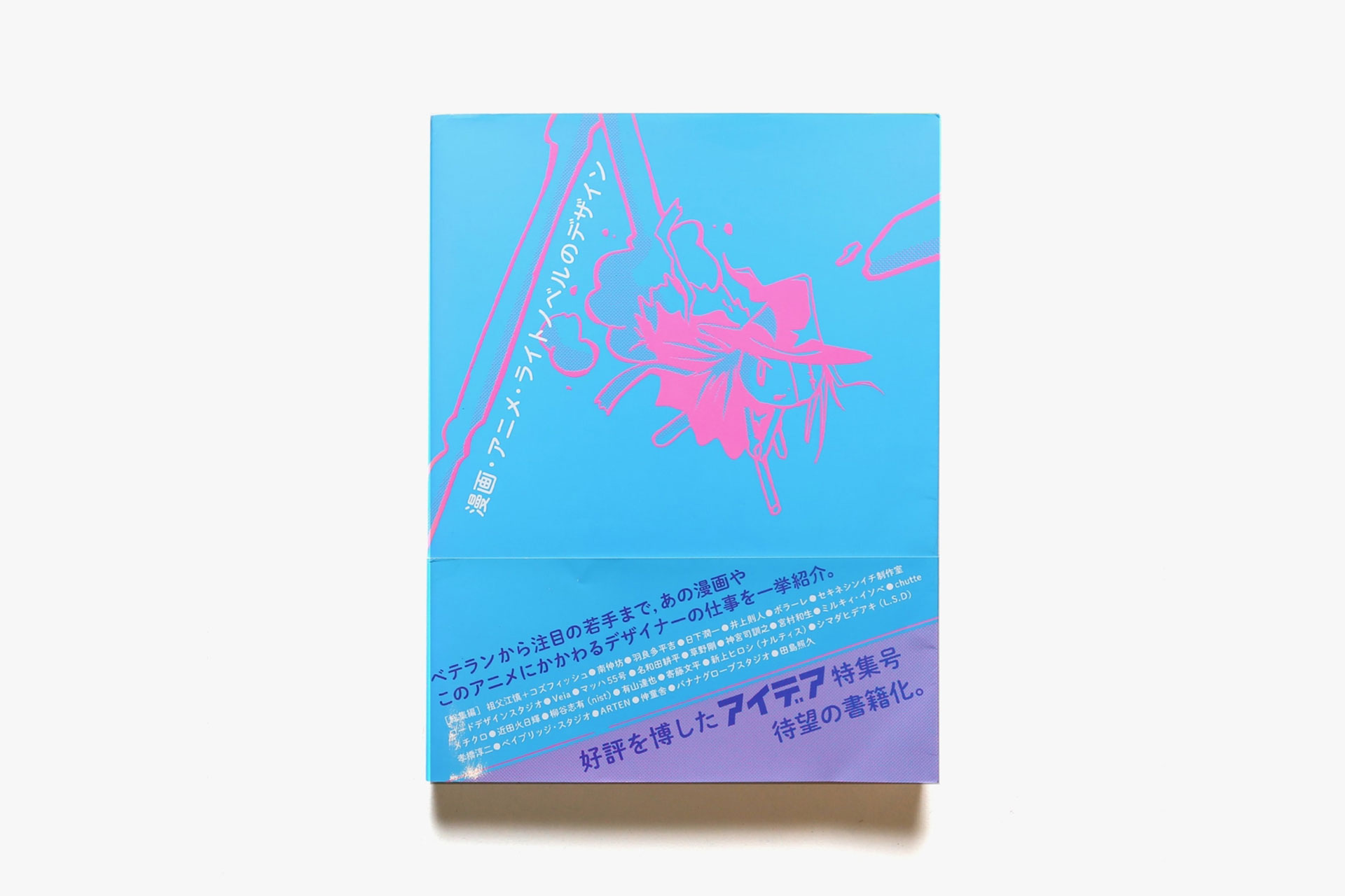
The Design of Manga, Anime & Light Novels
A book about the design of Japanese character culture.
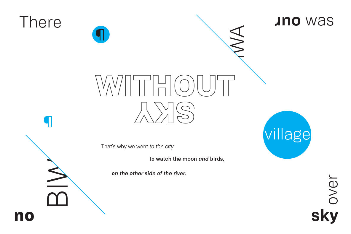
Biwa & Biwa Display
Biwa is a straight-sided family of formally nuanced grotesk typefaces for text typesetting and display work for both print and screen.

“Ian is the best to work with. He went above and beyond what I needed with my project. Ian Lynam has really good eyes – the kind of eyeballs that can tell you just what you need for the right sparks to fly everywhere, including my and your clients eyeballs.”

Cannibals.
A handbook of dubious exercises, tips, and rants about becoming a designer who teaches... (But just as much a handbook for designers who happen to be being taught.)

Slouching Towards Delphi
A series of installations spanning sound, found objects, narrative, and type design.

99+1: Traveling Through Art, Design & Architecture
99+1 is a book and responsive website for the Japanese National Tourism Organization.
“Ian is an empire, a fanfare, a circus.
While most designers are accomplished at walking and chewing gum—the equivalent in graphic design terms of InDesign mastery while thinking conceptually—Ian does backflips of writing and publishing, walks the tightrope of research, and performs the acrobatics of teaching, all while stilt-walking an expansive terrain of graphic design practice… and all this while adeptly juggling platters of diverse knowledge that include history, theory, philosophy, humanities, and the gamut of pop culture.
But most of all Ian is accomplished at generously sharing himself and his many gifts with his whole heart. And this is why, simply, we love him.”

Kurokura
We worked to define the identity of craft sake brand Kurokura.

Start Somewhere
Start Somewhere: A Handbook of Dubious Exercises, Tips and Rants About Becoming a Designer Who Writes is a zine to help designers grapple with generating their own content.

Temple University Japan
We designed the branding, signage and interior design for Temple University Japan's main building Azabu Hall.
“Eschewing the shortsighted practical nature of much graphic design-oriented writing, Lynam focuses on demythologizing contemporary graphic design – opening up a new horizon of discourse both East and West.”


27th Brno Biennial Study Room
Curation, lecture, writing and editing for the legendary Czech series of exhibitions.
“Ian instantly captivated the room when he came to speak with my design students at Portland State University. He was all of the elements that one would want in a presenter: thoughtful, funny, relevant, organized, passionate, articulate and relatable. Most of all, the entire room walked away with new knowledge. Score! PSU loves Ian!”

Pivotal Tokyo Offices
Interior graphics for software innovator Pivotal's Tokyo offices.

Species Regret
An exhibition of writing, installation and sound in Tokyo.

Welcome to Forest Island
Editorial direction and book design for Portland artist Bwana Spoons' first monograph.
“Ian Lynam is a visionary and a thought leader in the field of design. It’s an honor to have him lead our graduate graphic design program.”

That’s Entertainment!
A hybrid exhibition and essay-as-website exploring the role of graphic designers and design criticism in the world market economy.

Space Academy
Identity for Space Academy, an event space in Christchurch, New Zealand.

IDEA | アイデア
Ian Lynam regularly writes, designs, and edits features for IDEA / アイデア, Japan's oldest and most innovative graphic design magazine.
“Lynam is a bitingly humorous writer – gifted with the intuition to give stories depth. This is no accident as he writes from experience – a reading pleasure!”

Slanted
Writing for Slanted, the inimitable German magazine on typography and visual culture.

Whole Foods “Values Matter”
Type design for the North American supermarket chain.

Arts Excursions Unlimited
Holistic identity design for a public arts initiative.
“Lynam is a bitingly humorous writer – gifted with the intuition to give stories depth. This is no accident as he writes from experience – a reading pleasure!”

Parting It Out
Ian went and wrote a book about graphic design. 78,209 words about it, but who's counting? It has a die-cut paper slipcover, a fabric paper-backed inner slipcover, and split fountain printing.

Google Tokyo Offices
We designed the interior graphic design scheme for Google's Tokyo offices, as well as all wayfinding and signage.

Adobe Typekit CJK Specimen
A custom bilingual Japanese/English website highlighting Typekit's Asian webfont support.
“Ian is pragmatic and effective in creating beautiful cultural products, and a pleasure to work with. He found amazing nuggets of graphic design and typography in our corporate archives, and turned them into amazing contemporary assets. He’s comfortable doing things himself, as well as at finding relevant partners, and has consistently shown a great level of initiative.”

Le Comptoir Occitan
Identity and environmental design for a Basque restaurant in the Daikanyama district of Tokyo.

VCFA MFA in Graphic Design
Ian Lynam is former faculty and Chair/Co-Chair of the MFA in Graphic Design Program at Vermont College of Fine Arts.
“Ian Lynam is a visionary and a thought leader in the field of design. It’s an honor to have him lead our graduate graphic design program.”

Northwest Passage
Design and typography for Northwest Passage, a book and CD about independent music from Portland, Oregon.

TypeSketcher
Type Sketcher is a trio of type design sketchbooks with modular grids for designing letterforms.

“Ian Lynam is a visionary designer, forcing us to challenge our assumptions about what design is, and what it can do. He constantly invites us to imagine new modes of inquiry, and makes a case for design as a fundamental way of knowing, and communicating, the world around us.”

Saga Swimwear
Identity and art direction for San Francisco swimwear company.

Nike “Train to Win”
Product line book and DVD for Nike’s Asia Pacific region.

“Ian is an empire, a fanfare, a circus.
While most designers are accomplished at walking and chewing gum—the equivalent in graphic design terms of InDesign mastery while thinking conceptually—Ian does backflips of writing and publishing, walks the tightrope of research, and performs the acrobatics of teaching, all while stilt-walking an expansive terrain of graphic design practice… and all this while adeptly juggling platters of diverse knowledge that include history, theory, philosophy, humanities, and the gamut of pop culture.
But most of all Ian is accomplished at generously sharing himself and his many gifts with his whole heart. And this is why, simply, we love him.”

Konexi
Modular 3D type design for the board game Konexi.

Huis Ten Bosch
We created the branding and design consulting for the latest wing of the Nagasaki amusement park.

YouTube Space Tokyo
We created the interior graphic design scheme for YouTube's Tokyo offices and creative studio.
“Because Ian has the craft of design really down pat, he has moved on to other things like giving the client what they really want even if they don’t know what it is they want. This can not be understated, because as a designer myself I am looking to expand my projects with other peoples great ideas, and that takes having a farsighted partner like Ian. Besides actual graphics, Ian has helped steer Joshu+Vela branding, public image and even the naming of the company – for this I am grateful to have someone looking out for my best interests as well as his. I am continuing to count on Ian to steer my projects in a successful direction with all the twists and turns that come up.”

Topsy
We created the identity for Topsy, the Apple-acquired search engine for Twitter.

The Clone Returns Home
Identity for the Wim Wenders and Kanji Nakajima film.

Poster Initiative
A set of 4 collaborative posters created with fellow designer Ed Fella.
“Ian is the best to work with. He went above and beyond what I needed with my project. Ian Lynam has really good eyes – the kind of eyeballs that can tell you just what you need for the right sparks to fly everywhere, including my and your clients eyeballs.”

PechaKucha Night
We designed the identity for the iconic global design event series.

NASA Hubble Telescope
We created the identity and advertising campaign for NASA and The Washington County Museum‘s 2012/2013 exhibition Hubble Space Telescope: New Views of the Universe.

Le Pigeon & Little Bird
Identities for two of Portland, Oregon's iconic restaurants.
“When it came time to announce Firefox’s adoption of the @font-face rule, we needed someone to create an integration demo that straddled both innovative code and a nuanced working knowledge of typography. Ian was the obvious choice- his knowledge of typography applied to print and screen helped create a piece of design that functioned as a working how-to demo, a critique of webfont deployment in its nascent stages and a compelling piece of writing.”

Letterfirm
An exhibition of international expressive typography curated by Ian Lynam.

LACMA Study Day
Assisting the Los Angeles Country Museum of Art define their vision for curating a collection of Japanese Graphic Design.
Kimbo
Our plug-in for Adobe Illustrator which adds 13 new tools to Illustrator's tool palette.
“Ian is always the first person I go to when need design help. Besides being an aesthetic genius, he is unrelenting in his commitment to portraying the right image for my brands. Top all of that off with a heavy dose of flexibility and professionalism and you end up with not only first-class designs, but an overall experience that ends up feeling more like fun than work.”

Kanto Tour Guide
A set of ten tour guides of the Kanto region, each by a prominent foreign member of the Tokyo community for Shibaura House.

Joshu + Vela
Identity design for the San Francisco bag and accessory company Joshu + Vela.

IDEA #360
A 96-page feature about CalArts' Graphic Design Department for IDEA.
“Ian has the design skills I wish I had. His consistently creative designs come from an informed mind and relentless work ethic. I love working with him.”

Assorted identity projects
Identity is our ethos―the fundamental character of a culture, individual, business or community.

Bitna Chung Photography
We created a decorative, highly tactile print identity for the amazing Portland, Oregon photographer Bitna Chung.

Field Office Films
Identity for the director behind the opening sequence for the TV show True Blood.
“Ian is pragmatic and effective in creating beautiful cultural products, and a pleasure to work with. He found amazing nuggets of graphic design and typography in our corporate archives, and turned them into amazing contemporary assets. He’s comfortable doing things himself, as well as at finding relevant partners, and has consistently shown a great level of initiative.”


PDX Film Fest
Design and typography for the Portland Documentary and eXperimental Film Festival (PDX Film Fest). Portland, Oregon.
“Ian is an empire, a fanfare, a circus.
While most designers are accomplished at walking and chewing gum—the equivalent in graphic design terms of InDesign mastery while thinking conceptually—Ian does backflips of writing and publishing, walks the tightrope of research, and performs the acrobatics of teaching, all while stilt-walking an expansive terrain of graphic design practice… and all this while adeptly juggling platters of diverse knowledge that include history, theory, philosophy, humanities, and the gamut of pop culture.
But most of all Ian is accomplished at generously sharing himself and his many gifts with his whole heart. And this is why, simply, we love him.”


Blunt Mechanic “World Record”
LP, CD and promotional materials for Barsuk Records.

The Potential of Web Typography
The very first specimen of fonts for the web!
“Ian Lynam likes thinking about design as much as making it. Luckily for us, he also likes writing about it that much too. The payoff: he is amazing at all three.”


Marxy “Forty Years From Now”
Music packaging design for Tokyo's Marxy
“Ian instantly captivated the room when he came to speak with my design students at Portland State University. He was all of the elements that one would want in a presenter: thoughtful, funny, relevant, organized, passionate, articulate and relatable. Most of all, the entire room walked away with new knowledge. Score! PSU loves Ian!”

Parallel Strokes
2008 book on the cross-section of type design, graffiti, lettering, and sign painting.