Whole Foods “Values Matter”
Type design for the North American supermarket chain.
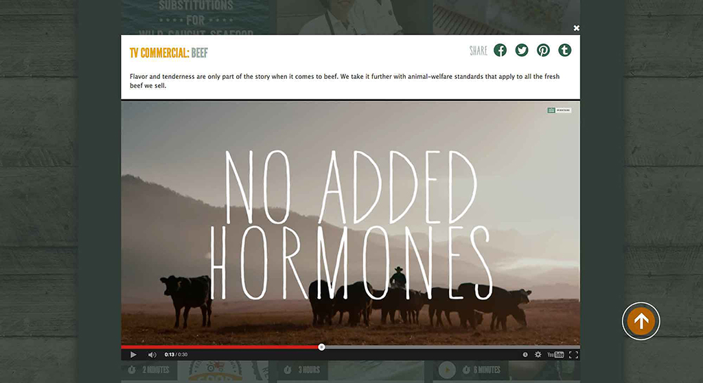
When Whole Foods needed to brand their 2014 holiday “Values Matter” ad campaign with a personality-rich, hand drawn font, they chose the often-imitated-but-never-duplicated YWFT Hannah, YouWorkForThem’s own in-house champ.
In this case, their choice was specific to YWFT Hannah Narrow, which begged their question: could we design two additional weights for this individual font, which existed only in a regular weight? Their answer was “yes”.
Then, YWFT called us. We’ve had an amazing working relationship with YWFT for the past chunk of years—we speak the same languages: OpenType, Python, CSS, and just being stoked on type.

Working closely with the team at their advertising agency Partners & Spade, we designed and refined Semi-Bold and Bold weights of YWFT Hannah Narrow, and offered specialized technical support to the Whole Foods art and marketing departments at their request.
Plus, we added alternate characters galore and iterated the new Whole Foods typeface family into the ground.
It felt good. Really, really good.
Whole Foods Values Matter TV Commercial: Produce
Learn More – http://www.wholefoodsmarket.com/valuesmatter
Whole Foods Values Matter TV Commercial: Beef
Learn More – http://www.wholefoodsmarket.com/valuesmatter


