Northwest Passage
January 31, 2011

Northwest Passage: 50 Years and Independent Music from the Rose City is an 88-page book and audio CD highlighting the history of Portland’s burgeoning independent music scene, and includes contributions from: The Dill Pickle Club, Mississippi Records, Oregon Historical Music Society, PDX Pop Now!, Joe Kregal, Ural Thomas, Valerie Brown, Fred and Toody Cole, Vanessa Renwick and Erin Yanke, Calvin Johnson and Cool Nutz.
Northwest Passage charts the history of Dead Moon/Pierced Arrows, Portland soul singer Ural Thomas (the man responsible for opening many an Otis Redding concert and for providing James Brown with many of the hooks he’s so famous for), along with Beat Happening/Dub Narcotic/K Records’ Calvin Johnson, and a ton of others.
Available here from the Dill Pickle Club.
TypeSketcher
January 31, 2011

A collaboration between myself and Austin Whipple at Scout Books/Pinball Publishing, it’s a trio of type design sketchbooks with modular grids for designing letterforms.
The inside covers feature illustrated essays showing users how to properly draw letters (overshoot, ascender ratios, type anatomy), as well as showing samples of type design that I find particularly intriguing).
At $12 a pop, they’re cheap, as well. The perfect gift for the type nerd closest to you. Pick one up here.
Lurker II
January 31, 2011

Experimental form-making zine. Limited edition of 10.
01.30.2011
January 30, 2011

New font release! Cooper Black Swash is a luscious swash version of the American type design classic, Cooper Black.
The history of this typeface:
Cooper Black, the most famous and successful of Oswald Cooper’s type designs was released in 1920, following a year of development fleshing out the weight of the typeface and filling out the full character set. Cooper redrew the lowercase characters multiple times, toying with the rounded forms of the “m” and “n” and engaged in a lively debate with Barnhart Bros. & Spindler foundry Manager Richard McArthur over the final form as McArthur requested that the typeface be drawn bolder and bolder. Cooper famously said the face was “for far-sighted printers with near-sighted customers”, and the public agreed. Sales of Cooper Black were voluminous, and Barnhart Brothers and Spindler had a difficult time keeping up with the demand for the typeface. Conservative typographers were critical of Cooper Black, though it was overwhelmingly popular, helping to shape the American advertising landscape through the 1920s and 1930s.
Cooper released swash characters for his popular Cooper Black Italic, but never an upright set of swash capitals. A number of prototype versions appeared in the 1960s and 1970s, though none have been ushered into the digital age. Cooper Black Swash has been created in the spirit of Oz Cooper’s work and is a design that we believe he’d be quite pleased with!
Available as a webfont, as well!
01.17.2011
January 17, 2011

Micke Thorsby/PMKFA will be lecturing tomorrow in my Computer Imaging class at Temple University Japan at 2:45 PM in Room 507 at Azabu Hall. Guests are welcome! Directions are here.
Cooper Screamers
January 14, 2011

I wrote a quick article about “screamers”- oversized italic exclamation points that were once a part of the American typographic vernacular, but now appear to live only in formal use in Japan over at Néojaponisme recently. Coinciding with the article is the release of a set of screamers designed by Oz Cooper via Wordshape.

You can download the full Cooper Screamer set via MyFonts/Wordshape.
Slanted 12
January 14, 2011

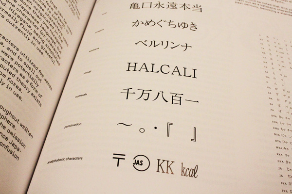
Out now: Slanted Magazine #12– a whole issue of the Berlin-based design magazine dedicated to Women, Typography and Graphic Design.

For this issue, I contributed my second essay installment toward understanding Japanese typography, as well as interviews with Susanna Baer of so+ba and Akiko Kanna, two of the most talented graphic designers working in Japan today.


Slanted 11
January 14, 2011

I have a new essay and interviews with my favorite young Japanese designers, Kunihiko Okano and Daijiro Ohara, in the latest issue of Slanted Magazine.


01.14.2011
January 13, 2011

New project in the Identity section of the site, a full identity for Saga, a swimwear company based in San Francisco.

