Slanted #17
April 8, 2012

I wrote three essays for Slanted #17– all in all, 15,000 words.

I wrote an essay about the twin evolution of Manga and Graphic Design, folding in a bit of personal history and a whole lot of analysis of Manga’s influence on PostModern design (even PostModern design masquerading as Modern design).

I wrote an essay about one of my favorite designers and people, Micke Thorsby. The bulk of it was written in Cuba, on a beach, rum in hand.

I wrote another essay about one of my other favorite designers, Akiyama Shin and his marriage of fine art and design practices, as well as his importance in the contemporary context in Japan.

The three essays wove in and out of a lot of different territory: cats, roommates, sex, The Swedish Chef, pagan rituals, teenage drug use, tentative friendships, politics and sallow people from Minnesota.


Mini Graphics 2
April 8, 2012

I wrote the preface for the latest book of collected graphic design from Sandu Media/Gingko Press- it’s called Mini Graphics II.

The preface is an essay called “Keeping It Mini”.

Studio cards
April 8, 2012
New business cards for our practice. Silver foil embossing on one side and blind deboss and metallic purple foil stamping on the other. The three cards line up to create a miniature graphic montage.
Printed by the kind folks at Yushin+.
04.08.2012
April 8, 2012

New poster design for my band Redskins.
04.08.2012
April 8, 2012

Also, I was recently interviewed by the nice folks over at ID Institute in Germany. Read it here.
04.08.2012
April 8, 2012

I co-edited and contributed a few essays to Idea Magazine‘s new feature about New Wave/PostPunk independent publications, on newsstands any day now…

One is called “Dot Gain” and is an introduction to independent publications in the late 70s and the early 80s.

The second is a hybrid essay/interview with WET magazine founder Leonard Koren about WET and his life and times.
Special thanks to Mark Dytham and Astrid Klein for their assistance in researching the essay!
04.04.2012
April 4, 2012
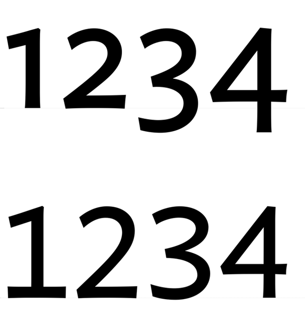
Just did a quickie project for the notorious Tokyo Art Beat: some quick OpenType scripting to swap out lining numerals for non-lining numerals in their house font.
03.27.2012
March 27, 2012

An oldie but a goodie: my typeface Rubber Vloeren in use in a commercial by Brand New School for the American National Pork Board circa years ago. See it here.
03.24.2012
March 24, 2012
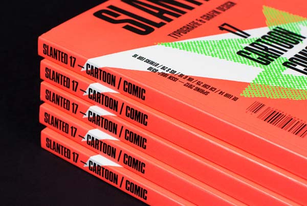
I have a whole heap of writing in the new issue of Slanted Magazine. My dear friend and roomie Patrick Tsai is featured, as well.
Lesque Junichi Arahata
March 24, 2012
My latest deck graphic for Lesque– Junichi Arahata’s latest pro model. In use: my font Pompeian Cursive.