04.27.2012
April 27, 2012
We just finished up an identity for the P.INC Patio, a new summer restaurant in Penticton, British Columbia in Canada that will open in a few scant months…
04.26.2012
April 26, 2012

Smythe Sans and a whole bunch of other new Wordshape fonts are now available via Fontspring, the indie webfont provider alternative.
04.24.2012
April 24, 2012

Last year we released the font Kirimomi Swash Italic, which was a runaway smash hit- it’s a free font whose creation was sponsored by Onitsuka Tiger. We just reached 35,000 downloads from our assorted distributors, which, in my book, is total brutality. So, to celebrate, I put together an accompanying Jannon-inspired Roman serif that is available now from MyFonts.com.
More here!
04.21.2012
April 21, 2012

I’ll be giving a presentation on the secret life of American type designer Oswald Bruce Cooper at TypeCon 2012 in Milwaukee this year. The conference is from July 31st through August 5th. Yuki and I will both be in attendance. Come hang out with us!
More at the Typecon website.
04.12.2012
April 12, 2012
We recently designed new business cards for the three of us, and were paid the ultimate print design compliment in return- our business cards are some of the featured items over at FPO this week. Huzzah!
04.09.2012
April 8, 2012

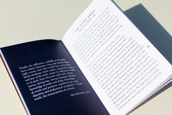
We got a great huge package of zines in the mail from the intrepid Elly Blue of Taking The Lane zine fame this week. It’s so great to see our fonts put to such great use!


Slanted #17
April 8, 2012

I wrote three essays for Slanted #17– all in all, 15,000 words.

I wrote an essay about the twin evolution of Manga and Graphic Design, folding in a bit of personal history and a whole lot of analysis of Manga’s influence on PostModern design (even PostModern design masquerading as Modern design).

I wrote an essay about one of my favorite designers and people, Micke Thorsby. The bulk of it was written in Cuba, on a beach, rum in hand.

I wrote another essay about one of my other favorite designers, Akiyama Shin and his marriage of fine art and design practices, as well as his importance in the contemporary context in Japan.

The three essays wove in and out of a lot of different territory: cats, roommates, sex, The Swedish Chef, pagan rituals, teenage drug use, tentative friendships, politics and sallow people from Minnesota.


Mini Graphics 2
April 8, 2012

I wrote the preface for the latest book of collected graphic design from Sandu Media/Gingko Press- it’s called Mini Graphics II.

The preface is an essay called “Keeping It Mini”.

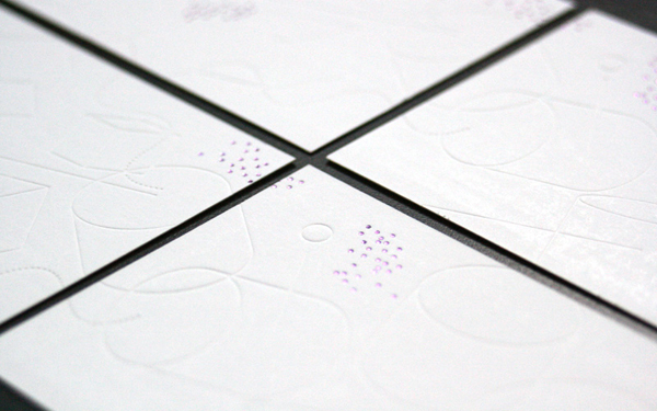
Studio cards
April 8, 2012
New business cards for our practice. Silver foil embossing on one side and blind deboss and metallic purple foil stamping on the other. The three cards line up to create a miniature graphic montage.
Printed by the kind folks at Yushin+.