CalArts 2013
March 10, 2013
Tee shirt design for CalArts Graphic Design Department‘s tee shirt exhibition and sale. This one’s a shoutout to the assorted folks who have taught at the school throughout the years (as well as design educators everywhere) who constantly catch shit from students while simultaneously whipping them into some of the best designers out there. I’ve said it once and I’ll say it again: I am delighted to pay my student loan bill every month. My time earning my MFA at CalArts was some of the best of my life. The folks I studied under taught me so much.
03.10.2013
March 10, 2013

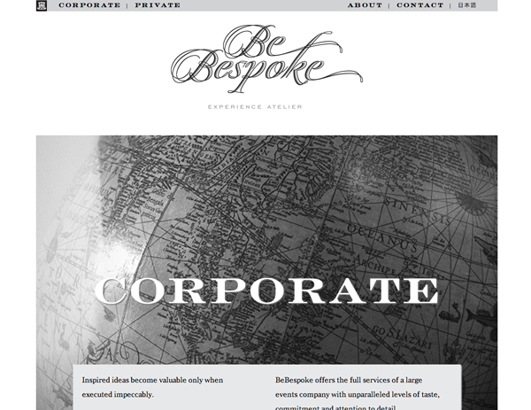
We recently finished up a redesign of BeBespoke’s website – webfonts, some snazzy javascript and a bunch of wonderful imagery.
03.04.2013
March 4, 2013

Idea Magazine’s Editor-in-Chief Kiyonori Muroga and I will be giving a lecture and week-long workshop at CalArts. The lecture will be on Thursday April 11th at 7pm in the C-Art classroom.
Washington County Museum
March 1, 2013
Identity update for the Washington County Museum. We drew a custom wordmark for the museum with an increased x-height for higher readability and legibility on-screen and in print. Each character was drawn from scratch, improving on the old logo – a default setting of Robert Slimbach’s Arno Caption. Each capital letter has differentiated shapes, while lowercase characters have been made more readable and friendly. Overall, the logo is slightly heavier, allowing for increased presence across all media.
Le Comptoir Occitan
February 28, 2013

Identity and environmental design for Le Comptoir Occitan, a new Basque restaurant in the Daikanyama district of Tokyo. The project included signage, business cards, posters, flyers, lettering for glassware and stationery.
Photos by Michael Holmes Photography.
Google Tokyo Office Interiors
February 27, 2013

A collaboration with Klein Dytham architecture. Ian Lynam Design created the interior graphic design scheme for Google’s new floor of offices in Roppongi. Hundreds of meters of custom wallpapers with bespoke graphics were designed that crossed six complementary graphic themes:
• a stylized koi pond for the office entrance with dual projections
• an abstracted, hyper-pop alternate Tokyo for meeting rooms
• garden brickwork with emphasized decorative elements revealing the hidden gardens of Tokyo for hallways and common areas
• sedate gardens for the relaxation and wellness area
• a modular Tokyo for the technical services area
• windows into the Tokyo of the future created in a psychedelic take on 60s and 70s science fiction book covers
We also designed a trilingual room signage system using an alternate, but complementary graphic language.
Photos by Koichi Torimura & Toshiki Senoue
02.23.2013
February 23, 2013

I contributed to Karen To’s Dead Words project recently. I was asked to typographically illustrate the term “ebaptization” – a retired word declaring that someone has not been properly baptized from 1659.
Within, I used Queen Mary’s secret cipher to spell out the word – the language of a woman who changed a church, and in a sense, both de- and un-baptize it.
A dead word rendered in a dead language.

We released a new typeface this week – SketchCaslon Italic – a hand-rendered display typeface with its formal base in the structure of the types of William Caslon.
One can obtain SketchCaslon Italic from MyFonts and YouWorkForThem.
Understanding Cancer Genomics
February 17, 2013
Understanding Cancer Genomics through Information Visualization is an international symposium at the University of Tokyo focusing on how information visualization approaches, methods and tools can be used in the understanding of cancer genomic data. We designed a three-color poster, three-color postcard and provided art direction for the symposium website.
Upswell 3.0
February 16, 2013

Brand spanking new website for Upswell, one of our absolute favorite clients period. The site is a database-driven overview of the work and folks that make up this amazing up-and-coming Portland design management firm.
We were involved in every stage of the site’s development and design, pitching in on editing text, clarifying design direction, tweaking imagery and hand-coding it all from scratch. The site utilizes webfonts, some snazzy custom CSS action, some rather detailed Javascript interactivity, Google Map theme customization, embedded video, image galleries and a whole lot more.
This is the third iteration of their website that we have done over the past few years and it just keeps getting better and better!
See it here.