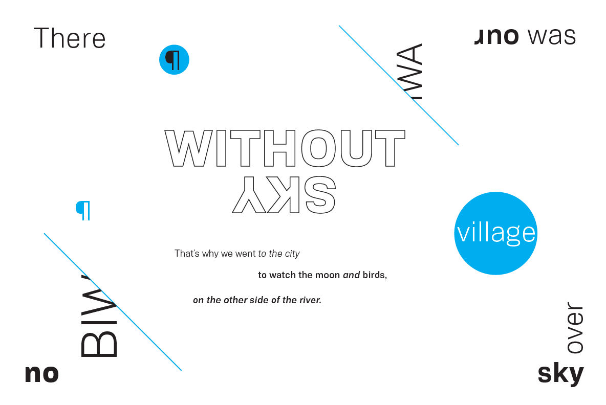
Biwa & Biwa Display
Biwa is a straight-sided family of formally nuanced grotesk typefaces for text typesetting and display work for both print and screen.

Wordshape has released the typeface family named Biwa and Biwa Display, the logical development of our bestselling typeface family Vaud, which is no longer commercially available. Biwa is here to fill that gap.

Biwa is a new straight-sided family of formally nuanced grotesk typefaces.

Biwa’s lighter weights feel subdued, cool in tone, and neutral, while the heavier weights are more robust and full of personality.

Developed over the past few years by Ian Lynam and James Todd, the 14-member Biwa family and the accompanying 14-member Biwa Display family are paeans to the immediate moment when phototype arrived on the global scene — partially smooth and partially machined.

Biwa and Biwa Display are neutral in tone, have enlarged x-heights, and look amazing on-screen and in print.

Each weight is designed to be highly readable in print and on-screen.

The italic variations are true italics, having a single-storied italic a and have been designed for smooth, fluid reading and text-setting.
Lovingly spaced and kerned, the Biwa family works equally well for text typesetting and for display design work.

Languages supported include Western European, Central, and South European as well as Vietnamese.

The entire family is comprised of a range of weights and a matching display family that features rounded terminals for large-scale display work.

Biwa is available from Wordshape, MyFonts, YouWorkForThem, and Creative Market.
You can also see Biwa in use in our project Italic Strategies.

