New typeface set out now via MyFonts: Cooper Text.
Cooper Text is a comprised of two fonts- Cooper OldStyle and Cooper Initials. Cooper OldStyle is a round-serifed text typeface, while Cooper Initials are ornamental capitals designed for use as complementary drop caps.
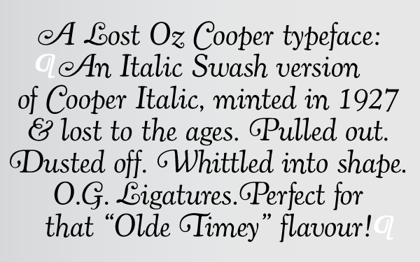
Cooper OldStyle has been lovingly redrawn from Oswald Bruce Cooper’s original drawings and mechanical proofs while Cooper Initials have been drawn from a sample in the seminal monograph of Cooper’s work, The Book of Oz.
Cooper OldStyle was originally released as a non-kerning typeface, which offered limited use for text setting. Oz Cooper was never quite happy with the copious amount of “air” around the typeface’s characters, so this definitive version has been painstakingly spaced and kerned for even text-setting.
Cooper Initials is a set of three typefaces:
– Cooper Initials, the base form derived from Cooper’s original design
– Cooper Ground, blocks of solid color that match the proportions of the Initials and which can be used to add a background color to the typefaces through layering
– Cooper Capitals, the lone letterforms within the initials, which can be layered to add highlight color to the letterform component of the set
These typefaces can be paired with Cooper Italic Complete for setting long lengths of text.
The history of these typefaces:
Cooper OldStyle is the result of Barnhart Brothers & Spindler type foundry representatives Richard N. McArthur and Charles R. Murray having met with Oswald Cooper and his business partner Fred Bertsch in 1917. Due to other commercial design firms adopting Cooper’s style of lettering throughout the Midwest, both companies came to an agreement to create a family of types based on Cooper’s advertising lettering. McArthur and Murray saw the biggest potential in the super-bold advertising lettering that would become Cooper Black, but agreed that a roman weight old style should be executed first, the logical progenitor to a family or related types.
The foundry requested that the roman have rounded serifs so as to more specifically correlate to the planned bold. This was the first of many tactical strategies in type design between type designer and foundry, most specifically McArthur and Cooper, whose back-and-forth relationship in designing, critiquing, and modifying letterforms was integral in shaping the oeuvre of type designs credited to Cooper. While it was Cooper’s sheer talent in shaping appealing and useful alphabets that made his work so popular, McArthur’s role as critic and editor has gone largely un-noted in the slim amount of writing of length about Cooper’s work.
Cooper and McArthur went back and forth over the design of the roman face for nearly two years with Cooper, constantly redrawing and revising the typeface to get it to a castable state. The capitals were successively redrawn by Cooper, with particular care paid to the “B” and “R” to make them relate formally. The lowercase was redrawn numerous times, as were experiments in shaping the punctuation. McArthur requested a pair of dingbats to accompany the typeface, along with a decorative four leaf clover ornament “for luck”.
Cooper included a slightly iconoclastic, cartoonish paragraph mark, as well as decorative end elements, a centered period, and brackets with a hand-drawn feel.
The final typeface is a lively, bouncy conglomeration whose rounded forms dazzle and move the eye. Originally called merely “Cooper” in early showings, the name was later revised to “Cooper Oldstyle”. The typeface met with a warm reception upon release in 1919, the public favoring its advertising-friendly, tightly-spaced appearance. Sales were moderate, and the face was considered a success.
Cooper originally drew the figures the same width as the “M” of the font, but revised them to the width of the “N” at the request of McArthur. Early versions of drawings of the slimmer figures are noted as “cruel stuff” in accompanying notes by Cooper, though they were versioned out into far more elegant numerals than the earlier stout figures. Both versions of the numerals are included in the digital release, as are the ornamental elements.
In 1925, McArthur and Murray requested a set of ornamental initials. Cooper designed the initials open-faced on a square ground surrounded by organic ornament. The initials were “intended to be nearly even in ‘color value’ with that of normal text type”. The letterforms themselves are a medium-bold variation on the Cooper OldStyle theme, lacking the balance of Cooper’s text faces, but charming nonetheless.
Cooper Initials are offered in their original capital alphabet form in this digital version, with no supplementary characters.
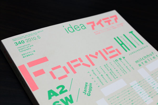
The release of these two typefaces coincides with the publication of the definitive Oswald Bruce Cooper biography, published in Japan’s Idea Magazine issue #339. Cooper’s biography is delivered in English and Japanese with numerous full-color illustrations of never-before-published work.
Available now via MyFonts.


