Point Line Plane
December 30, 2008
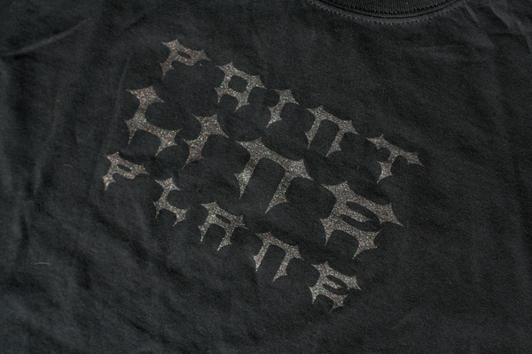
Shirt graphics for Skin Graft Records‘ stalwarts, Point Line Plane.
Rap-Up boombox
December 30, 2008

Limited edition ghetto blaster design for Lasonic and Rap-Up magazine. I designed the unit graphics, as well as all packaging and advertising.
12.26.08
December 26, 2008
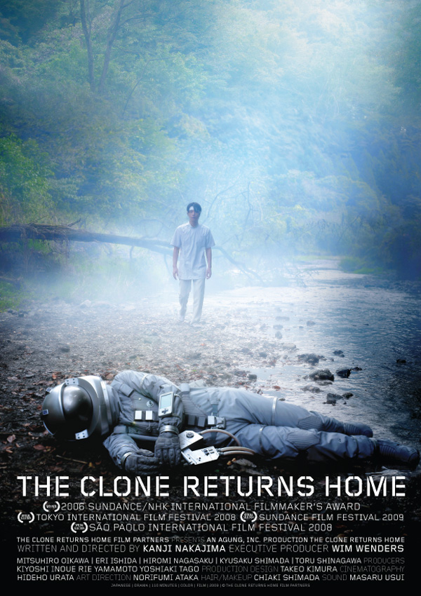 If you happen to be in Sundance country in less than a month, go peep The Clone Returns Home, directed by Kanji Nakajima, executive produced by Wim Wenders, produced by the wondrous Hikari, and graphic design by myself. Hikari and I just returned from a wondrous international sojourn across borders and deadlines to bring the film an updated name and identity informed by JAXA’s early identity explorations as much as Dutch Modernism. If you are in town, GO SEE THE MOVIE! You’ll be pleasantly surprised – it’s in a similar vein to Paris, Texas‘ rheumy/rummy displacement combined with Cha No Aji‘s timing. I’m super-duper-amped to be associated with this film in one fashion or another. I love work from the dawn of sci-fi and this film carries that torch unabashedly while being wide-eyed and beautiful and wholly original. The cinematography is insane and I was happy to give it the graphic workup it so needed.
12.22.2008
December 23, 2008
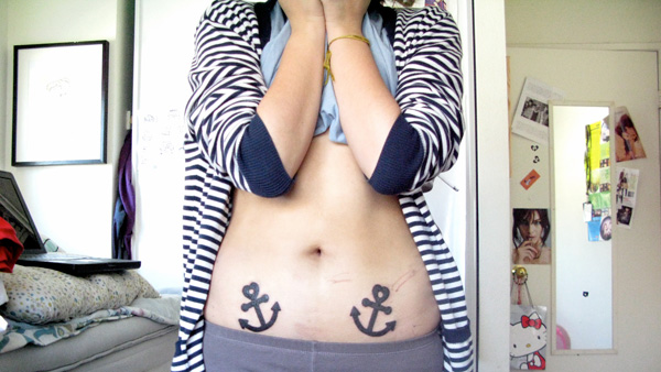
Someone went and got twin tattoos of the logo I designed for Yacht! Other folks have gotten tattoos of other band logos and artwork I’ve done, but this is the first photographic evidence in the past few years. Good stuff.
12.18.2008
December 18, 2008
I’ll be hanging/working at Grasshut for the next two days from noon thru 7PM. Come on down and chat me up if you are in town. They still have a handful of my sold-out books for sale and I’m happy to sign one for you if you pop in and pick one up.
Also, new boombox/ghetto blaster for Rap-Up available now! Photos once I get them!
12.11.2008
December 11, 2008
The date of the PNCA lecture and workshop has been changed to the 11th of December. That’s tomorrow. If you want in, show up at PNCA Commons at 3PM.
Some new work has been added: the print identity for Néojaponisme and the postcard set for Meeting Modernity.
I will be in Portland for the better part of the month, as well as half of January.
Just finished: website for Seattle-based film production company, Cross Films. They are the proud parents of Cooper.
Néojaponisme
December 11, 2008
Two color business cards for online cultural journal Néojaponisme. Instead of printing four separate cards for each editor, we chose to create a “choose your own adventure” approach”. The cards were printed by a rather questionable printer in Bali and the two color plates floated rather significantly, creating a number of pleasing accidents.
Meeting Modernity card set
December 11, 2008
A series of 4/1 postcards reproducing eight select images from Meeting Modernity, a traveling exhibition of found photography documenting Japan as it engaged with modernization and commercial photography in the Meiji and Taisho Periods of history. The Meeting Modernity series is comprised of portrait photography in particular. Meeting Modernity is the focus of my online cultural journal Néojaponisme’s first traveling exhibition. The postcard set was produced in an edition of 300 for the Los Angeles debut of the exhibition at Young Art. The rice paper envelope was designed and produced by Kate Hillseth and Paul Forney of Young Art.
Five By Fifty capabilities
November 30, 2008
Capabilities pamphlet art direction and design for trend analysis and market research agency, Five By Fifty.
11.29.2008
November 29, 2008
I’ll be giving a lecture and doing a design workshop with Pete McCracken’s BFA design seminar class at Pacific Northwest College of Art on December 16.