08.08.2009: Visual Language
August 8, 2009
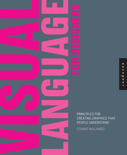
I just had some graphic design work published in Visual Language for Designers: Principles for Creating Graphics that People Understand by Connie Malamed, published by Rockport.
08.06.2009
August 6, 2009
Tons of new work in here: posters, coasters, logos, websites, etc.
Poster Initiative 002
August 6, 2009
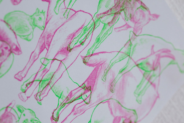
Self-initiated offset-printed poster series produced in editions of 1,000 and distributed around Tokyo.
BudSock
August 6, 2009
BudSock is a nifty new anti-tangle device for mobile devices’ cord systems. I worked with company founder Jeffrey Wescott to develop the product’s identity and packaging, as well as beef up their web presence as of late. It’s a nifty sleeve system backed up by a 110% money-back guarantee.
08.06.2009: Business Cards 3
August 6, 2009


Business card designs in the new book Business Cards 3: Designs on Saying Hello by Michael Dorrian and Liz Farrelly, published by Laurence King.
Sapporo coasters
August 6, 2009
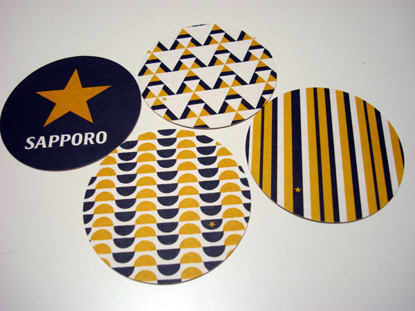
Coaster designs for Sapporo. Commissioned by the kind folks at Dentsu Canda,
Essay for Brand New School monograph
August 4, 2009

I wrote this essay for the Brand New School monograph, edited by Michael Worthington. Apparently the book is on permanent hold, so why not throw the essay up here?
School Days
The Brand New School projects that resonate most strongly with me are their network identities, in particular the identities for Fuel and the International Music Feed (IMF). Both work off of a modular kit-of-parts that incorporates a dynamic range of illustrative and graphic styles that mesh without an easy solution.
The Fuel and IMF projects feature terrific type design/type choices that work well for display on-screen, and are appropriately loud without being stupid—a rarity in graphic design for youth-oriented broadcast identities.
IMF’s mixture of Jens Gehlhaar’s Pretension Project typefaces, IBM-inspired cathode ray faces, pixel fonts, and project-specific typefaces is an eclectic selection that references multiple points in type design history: e.g., Excoffon, Rand, Crouwel, and more.
Fuel’s set of three preexisting and two custom typefaces is a study in poised crudity: The typefaces are always set in caps with default tracking, encouraging the most brute and effective means of making a typeface communicate.
The illustrative aspects of the Fuel identity are novel, in particular the use of buttons/badges as add-on bits of messaging that look slick and pop without going overboard. The range of illustrations on said buttons is diverse and connotative without being too specific—”a little bit country and a little bit rock ‘n’ roll”.
IMF’s amazing mix of illustrations by Clarissa Tossin really stands out. The visual languages of topographic maps, sonograms, musical notation, circuitry, technology, and nationalities are all explored in a myriad of ways. The BNS team has combined these assorted styles in a rich and densely layered approach that looks like nothing else on the air, yet remains quite obviously its work.
Color is considered in each identity in unique ways. Fuel’s post-punk black, white, and magenta is forceful, while the secondary colors applied complement the identity in a sophisticated manner. IMF’s approach to Otl Aicher’s palette is irreverent, with the inclusion of an arbitrary hot pink for added visual impact being the icing on the cake.
On the negative side, the iconography deployed for each identity is the sole weak point of each. The icons look mushy and forced—a bit too detailed for on-screen use, and feeling a bit like they were done in a rush. These aspects make the individual identities rely on the rest of the scheme to do the heavy lifting. However, as a whole, the identities are so strong that they do so effortlessly.
Fuel’s paint and ink textures, marks, and distorted grit add an air of exhilaration to the identity. In particular, when these elements are used as masks and wipes, they add another level of visual subtlety unseen in other network identities of a similar bent, target-wise.
The IMF logo lockup is a great nod to the isometric constructions of Takenobu Igarashi. The Parco-inspired logo’s animated assembly in space with a few camera angle changes is a sight to behold. It strongly connotes the ’70s with its Archigrammatic color scheme; thick, black outline; and accompanying Gehlhaar-designed, Antique Olive-channeling wordmark. Yet, simultaneously, the logo feels very present in the here and now through the mix of references.
Brand New School’s work is indicative of the tide shift that is happening in American television, which is becoming more interesting, engaging, and intelligent. At the same time, television executives are reaching out to incisive and insightful creative companies to help convey their broadcast identities. If I were one of those executives, there is no one else in the United States I would turn to other than Brand New School.
08.02.2009
August 2, 2009

BudSock is a nifty new anti-tangle device for mobile devices’ cord systems. I worked with company founder Jeffrey Wescott to develop the product’s identity and packaging, as well as beef up their web presence as of late. It’s a nifty sleeve system backed up by a 110% money-back guarantee.
07.27.2009
July 27, 2009

Unearthed outside of the city of Sano in Tochigi-ken, this portrait photography series documents Japan as it engaged with modernization and commercial photography in the Meiji and Taishō Periods.
This post marks the Tokyo opening of the Meeting Modernity Exhibition.
Details:
MEETING MODERNITY
OPENING: A Night of Néojaponisme
A night of presentations, discourse, music, and booze.
DATE: 31st of July 2009
OPEN: 1800 START: 1900
FEE: open charge (Nagesen)
PLACE: hybrid so+ba gallery
5-29-20 KYODO SETAGAYA-KU
TOKYO 156-0052
WWW.SO-BA.CC
Come on down to the infamous Hybrid SO+BA Gallery in Kyodo (Odakyu Line) for a night of revelry with the staff of Néojaponisme. A smattering of presentations by the editors of and contributors to the site will be accompanied by Funkmaster DJ Jean Snow on the wheels of steel.