すずの木カフェ
January 12, 2010
Identity and website design for Chie Yoshimura’s Suzu No Ki Cafe in Yokohama.
01.12.2010
January 12, 2010

Updates site-wide! Above, Xmas ornaments for YACHT, included in the big YACHT update in the identity section.

Also in there, fitted cap for YACHT/the Fader. Collaboration with Jona Bechtolt of YACHT.

Poster, audio tour CD and booklet cover design for Portland’s Dill Pickle Club in the publication section.

Redesign of Microcosm Publishing’s zine compilation book 13 Years of Good Luck in the Publication section.
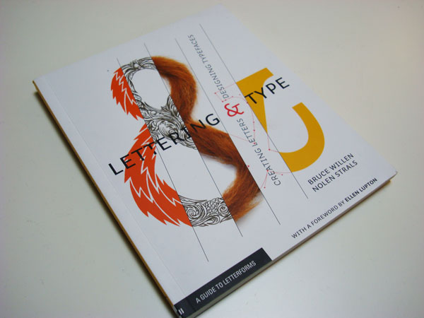
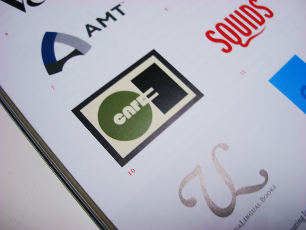
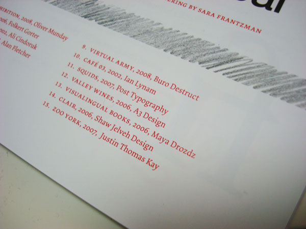
Logo design published in Post Typography’s book Lettering & Type Design, published by Princeton Architectural Press.

Previously mentioned, but not shown, CD and poster design for Blunt Mechanic (ex-Kind of Like Spitting) on Barsuk Records.
Dill Pickle Club WPA Projects
January 12, 2010
Poster, book cover and CD face design for Portland’s Dill Pickle Club‘s guided audio tour CD and publication of Portland Public Works from the Great Depression funded by the WPA (Works Progress Administration) in the 1920s.
13 Years of Good Luck
January 12, 2010

Redesign of Microcosm Publishing’s zine compilation 13 Years of Goof Luck. Cover illustration by Cristy C. Road. The redesign included re-formatting much of the interior image and text content, adding a typographic pattern to the inside covers, title pages, and general snazzing-up. The compilation features some of the most popular writers in the D.I.Y. zine genre today. And only one dollar!
01.10.2010
January 10, 2010

Clobber Grotesk Stencil Bold is a new typeface I designed now available through MyFonts. Clobber marries crude stencil forms with extreme legibility/readability at small sizes.
01.09.2010
January 9, 2010

In the last quarter of 2009, we designed and implemented a massive, very code-intensive intranet for the Unilever corporation’s Japan division used to catalog and track market progress. Needless to say, we can’t show anything but the login screen, but it was a milestone for the studio in showing programming flexibility married with good design.
Unilever Japan Intranet
January 9, 2010

In the last quarter of 2009, we designed and implemented a massive, very code-intensive intranet for the Unilever corporation’s Japan division used to catalog and track market progress. Needless to say, we can’t show anything but the login screen, but it was a milestone for the studio in showing programming flexibility married with good design.
01.09.2010
January 9, 2010

Freshly launched and new in the Web Design section: The Asics Winter Olympics website. The last days of 2009 found me collaborating with the whiz kids at AQ on this content-riddled, photo-driven website for Asics footwear and the Dutch Winter Olympic team. This Dutch language website promotes Asics’ design of the Olympic uniform for the Vancouver Olympics through a lively mix of product imagery, custom animation, facts from history, and bold Native American-inspired graphic design.
Asics X Olympics
January 9, 2010

The last days of 2009 found me collaborating with the whiz kids at AQ on this content-riddled, photo-driven website for Asics footwear and the Dutch Winter Olympic team. This Dutch language website promotes Asics’ design of the Olympic uniform for the Vancouver Olympics through a lively mix of product imagery, custom animation, facts from history, and bold Native American-inspired graphic design.
01.07.2010
January 7, 2010
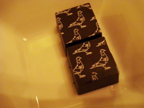
Chomped recently in Portland- Le Pigeon chocolates! Yum!!