02.13.2010
February 13, 2010
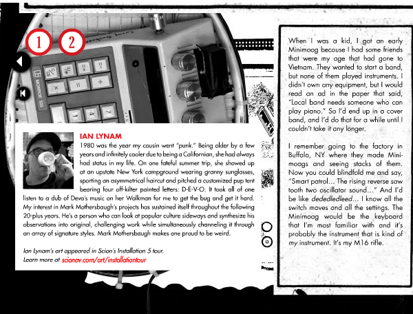
New bit of writing up in Scion’s magazine about my take on the work of Devo’s Mark Mothersbaugh.
Synapse
February 11, 2010
Website for Synapse, a comprehensive online system designed for inter-institutional communication.
02.10.2010
February 10, 2010

I wrote a 10,000 word essay called “Heft, Gravy, and Swing: The Life and Times of Oswald Cooper” for the latest issue of Idea. The essay serves as the definitive biography of the Chicago type and lettering designer, famed for his Cooper Black typeface.

The essay is the result of a long-dreamed of trip to Chicago to sift through Cooper’s original drawings, scarce writings, and working papers. Copiously illustrated with proofs of Cooper’s work, unpublished typefaces, and photographs of rare design work, his legacy is brought into contemporary focus. New biographical information about Cooper, his work, and his associates is discussed within.
Tons of images of the feature and a spicy excerpt in the Writing section.
Idea Magazine #339
February 10, 2010

I wrote a 10,000 word essay called “Heft, Gravy, and Swing: The Life and Times of Oswald Cooper” for the latest issue of Idea. The essay serves as the definitive biography of the Chicago type and lettering designer, famed for his Cooper Black typeface.

The essay is the result of a long-dreamed of trip to Chicago to sift through Cooper’s original drawings, scarce writings, and working papers. Copiously illustrated with proofs of Cooper’s work, unpublished typefaces, and photographs of rare design work, his legacy is brought into contemporary focus. New biographical information about Cooper, his work, and his associates is discussed within.

An excerpt:
Bertsch & Cooper was a visionary commercial art service. They were one of the first shops in Chicago that offered to create layouts, compose artwork, and typeset text all under one roof. They continually added staff, resulting in a scattershot assortment of illustrators, draftsmen, and compositors peppered throughout the same building in a variety of rooms. At their first location, Bertsch was famous for his “inter-office communication system” which consisted of yelling upstairs and down from the inner balcony of the building to professional associates. Cooper was ensconced in the “bull pen”- a room with a half dozen or so other commercial artists scratching away at the jobs of the day. Cooper was renowned for his “filing system”- a towering, dusty, haphazardly curved pile of layouts, proofs, notes, and other assorted papers that loomed over his desk, each day’s ephemera separated by a newspaper from that date.
This pile grew in relation with Bertsch & Cooper’s increasing roster of clients, which included a number of local Chicago businesses including doctors’ offices, legal firms, coffee shops, and banks, New York’s Marchbanks Press, the department store Marshall Fields, Strathmore Papers, Red Book Magazine, American Printer Magazine, and the American Institute of Graphic Arts. Cooper’s distinctive lettering can be found on a series of public service announcements for the United States government’s Food Administration, exhorting the public to eat less and conserve rations during World War One.

The article was jointly designed by myself and the Shirai Design Office, the esteemed designers of Idea.


02.10.2010
February 10, 2010


02.06.2010
February 6, 2010

My latest print project, a double poster set called “Poster Initiative 004A” will debut at Grasshut in Portland, Oregon in the show “Staying Put”. The show opens tomorrow, February 6.
The show is a collection of prints from folks such as Yellena James, Tim Biskup, Scrappers, Chris Johanson, APAK, Mauro Gatti, Shawn Wolfe, The Little Friends of Printmaking, Studio Folk, and others.
Work from the show is available online here.
Location:
Grasshut
811 East Burnside
Portland, OR 97214
503.445.9924
02.01.2010
February 1, 2010

Open decks are now available at Grasshut in Portland!
Also, Trevor and I were interviewed on the blog Skatemodo about Open. Nice apostrophe use, Trev.
01.30.2010
January 30, 2010

I also have work published in the new book Celebration Graphics Sourcebook: Festive Designs from All Cultures by John Stones, published in the United States by Rockport and globally by Rotovision.
01.30.2010
January 30, 2010
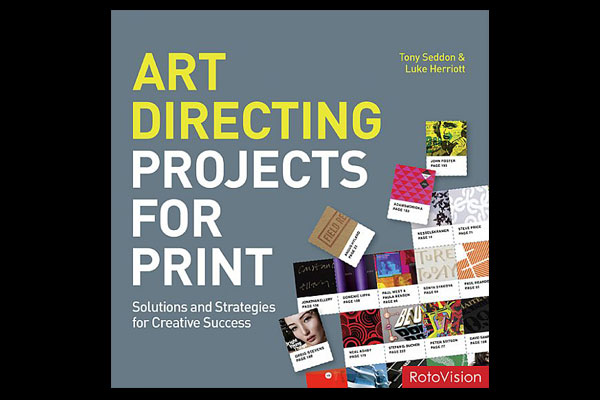
I have work in the new book Art Directing Projects for Print, also published by Rotovision.
01.30.2010
January 30, 2010

A number of pieces of identity work I designed are featured in the new book No Rules Logos by British design author John Stones, published by Rotovision. The works are displayed prominently and given worthwhile analysis by the author.