Blunt Mechanic
June 18, 2010

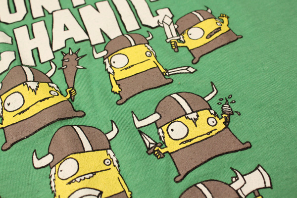
New shirt design for Blunt Mechanic (ex-Kind of Like Spitting). The vikings from the World Record album cover make an appearance in yellow, white, grey, and black on a lime green shirt.
Pick up a shirt here.
How To Pick Locks Vol. 2
June 18, 2010
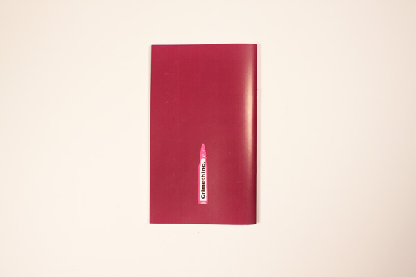
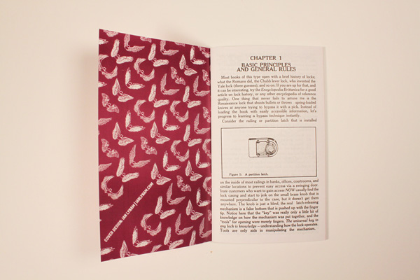
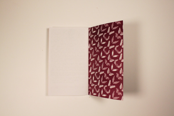
Now out: A Guide To Picking Locks Volume Two, published by Crimethinc. I designed a snazzy two-color cover for this second volume, picking up where I left off with Volume One.
06.18.2010
June 18, 2010

Critical Mass
Compiled by Ian Lynam + Idea magazine
An inquiry into contemporary critical practices in graphic design featuring:
Mark Owens, Zak Kyes, Jon Sueda, Brian Roettinger, Daniel Eatock, Scott Ponik, Michael Worthington, Yasmin Khan, Metahaven
Subterranean Modernism: A Critical Retrospective
By Randy Nakamura + Ian Lynam
On the Uselessness of Design Criticism
by Randy Nakamura

You can pick up a copy here.


Also new:
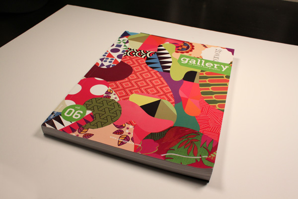
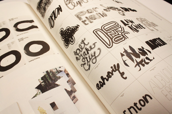
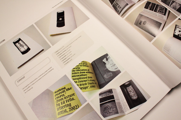
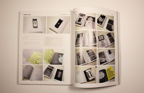
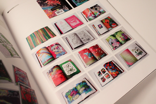
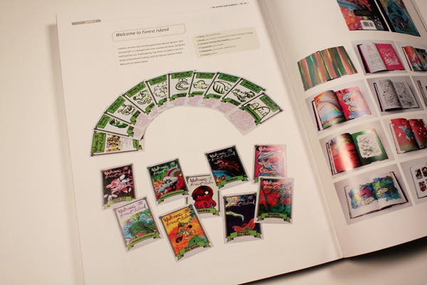
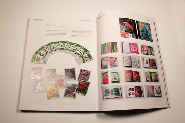
I have a handful of projects featured in the new Choi’s Gallery Magazine.
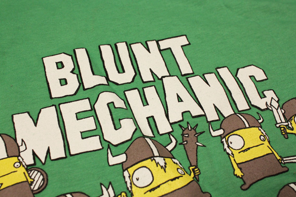
New shirts out for Blunt Mechanic.

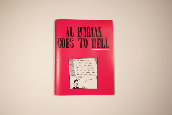
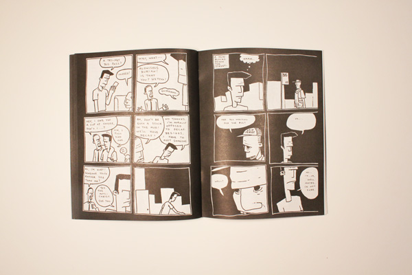
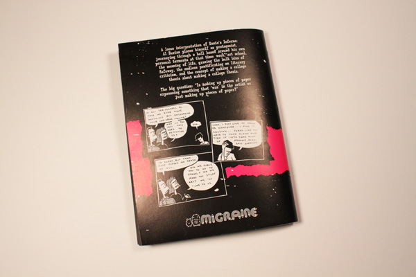
Also new: Migraine, my decade-dead publishing imprint resurfaced from the grave this month to release an illicit edition of Al Burian’s comic Al Burian Goes To Hell. All I can say is that I was responsible for the design, and that I hope Al doesn’t kick my teeth in.
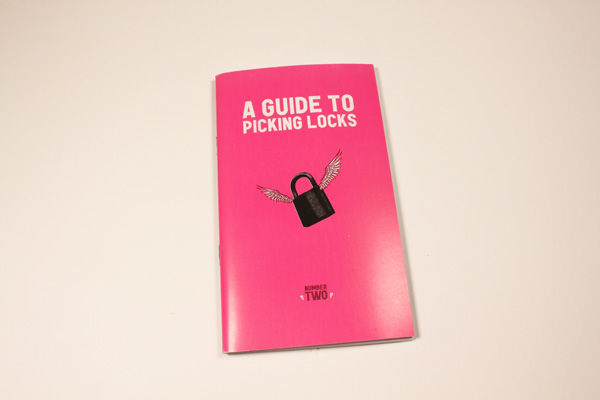
Now out: A Guide To Picking Locks Volume Two, published by Crimethinc. I designed a snazzy two-color cover for this second volume, picking up where I left off with Volume One.
06.14.2010
June 14, 2010

New typeface release from Wordshape/MyFonts:
Cooper Black Condensed is a less wide, but not squished variation on Cooper Black.
The history of this typeface:
Cooper Black, the most famous and successful of Oswald Cooper’s type designs was released in 1920, following a year of development fleshing out the weight of the typeface and filling out the full character set. Cooper redrew the lowercase characters multiple times, toying with the rounded forms of the “m” and “n” and engaged in a lively debate with Barnhart Bros. & Spindler’s General Manager Richard N. McArthur over the final form as McArthur requested that the typeface be drawn bolder and bolder. Cooper famously said the face was “for far-sighted printers with near-sighted customers”, and the public agreed. Sales of Cooper Black were voluminous, and Barnhart Brothers & Spindler had a difficult time keeping up with the demand for the typeface. Conservative typographers were critical of Cooper Black, though it was overwhelmingly popular, helping to shape the American advertising landscape through the 1920s and 1930s.
1925 saw the release of Cooper Black Condensed, a “condensed but not squeezed” variation on the Cooper Black theme. McArthur and Cooper had the usual lively back-and-forth over the shapes of some of the letterforms, in particularly the uppercase “Q”, resulting in a thoroughly accomplished alphabet. The first showing specimen of Cooper Black Condensed compared the new face with Cooper Black, showing that it was 20 less wide and that it promised to “show something of gentility while being able to spit on its hands and make itself useful”.
This typeface is the result of researching and faithfully redrawing characters from Cooper’s original drawings and series of engraved proofs for the typeface. The typeface includes the full range of punctuation and diacritics that fill out a full character set. The typeface has been lovingly kerned for the smoothest result in text setting.
06.06.2010
June 6, 2010

My type foundry, Wordshape, released a new typeface this week: Interno.

Interno is a headline typeface built from a Walter Ballmer Olivetti logo exploration drawn sometime in 1960. Work on Interno commenced in 2006 by Eli Carrico, but was soon abandoned. In 2009, Eli picked it back up and ran with it, completing Interno 1. I picked through Eli’s development stages of the typeface and edited together a slightly different version, Interno 2, utilizing a mix of development characters and original characters.

Interno is Italian for internal (or at least that is what the translation widget told us). A great deal of the classic Olivetti design was down in-house (i.e. internal). Also, the typeface has internal switchbacks reminiscent of a paperclip. Interno sounds a bit like “turning inside” phonetically(In-Turn-O). Additionally, Interno takes the first letter and last letter of Olivetti and flips it.

Available now via Wordshape/MyFonts.
06.06.2010
June 6, 2010

One of the most difficult things to find in Tokyo is a really deep collections of writing on graphic design in English. It’s one of those dark holes in consumer friendliness that is totally understandable, given that English isn’t the native language.
As a stopgap measure, I’ve put together 3 volumes of copies of design history, criticism, and theory titled “Design Research – Additional Reading” and put it on reserve in the Temple University Japan Library. The three volumes cover a lot of ground – from Adolf Loos to Robert Brownjohn, John Ruskin to Rick Poynor. Copious copies of articles from graphic design books, publications, and pamphlets are within. If you have the time and inclination, as well as a penchant for reading blobby xeroxed stuff, it’s at least one more resource.
06.03.2010
June 3, 2010

For the past few months I’ve been working on a 100-page feature of IDEA Magazine called Critical Mass, an inquiry into contemporary critical practices in graphic design. Critical Mass features interviews with Mark Owens, Zak Kyes, Jon Sueda, Brian Roettinger, Daniel Eatock, Scott Ponik, Michael Worthington, Yasmin Khan, and Metahaven; looks at the books Forms of Inquiry, Wonder Years, and Iaspis Forum on Design and Critical Practice: The Reader; and new essays by myself and Los Angeles-based designer/writer Randy Nakamura.
This new issue will be released shortly. Here’s a sneak peek at one of the pieces within, an essay called Subterranean Modernism: A Critical Retrospective that I co-authored with Randy Nakamura:
The idea of “oppositionality” is mostly anathema to graphic designers today. Designers may speak of “criticality” or “inquiry” but the notion of rejection is absent. Designers prefer the idiom of choice and preference. If one had to choose a ground zero for a prototypical critical design practice for the past decade it would have to be the Arnhem-based Werkplaats Typografie (WT). Part school, workshop and meeting place, the Werkplaats sees itself as fostering a kind of critical design practice “by the position which the designer adopts in relation to the world at large – the social, political or technological developments taking place in contemporary society.”
The origins of this kind of design practice might be found in a variety of modernism that is a bit more underground and quieter, a “subterranean modernism”. It emerged from the post-World War II era, but its proponents were not the European emigres in New York City or canonical modernists of the International Style in Europe. They were the more peripheral and less well known British designers Norman Potter (1923−1995) and Anthony Froshaug (1920−1984). Both are less ideological than their predecessors, in many ways they can be understood as an inflection point between modernism and postmodernism. They had a preference for process, the subjective, and the local. There was an assertion of the poetic, not through the unconsciousness or deliberately nihilist assaults on aesthetics and society, but by an attention to reason, craft, and materiality. The spheres of design were not advertising agencies or large corporate studios, but print shops, schools, museums and cultural clients. A distinct bias can be seen towards the typographic, the book, and the reader. They were more communitarian in spirit than reformist, sustaining certain traditions, but far from hidebound. It was the reign of the idiosyncratic, not the revolutionary. If this was modernism, it was a modernism devoid of master narratives, though inflected with a way of working that are humanist and craft-centered…
Upswell
May 30, 2010

New website for Upswell, a digital communications agency based in Portland, Oregon. Erica and Armando are awesome to work with, visionary in allowing us to execute their website and identity as we saw fit while throwing down with some seriously helpful and thoughtful insight, and wonderful folks to chat with over wine and small plates.
05.30.2010
May 30, 2010
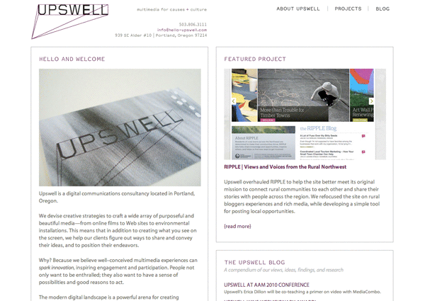
New website for Upswell, a digital communications agency based in Portland, Oregon. Erica and Armando are awesome to work with, visionary in allowing us to execute their website and identity as we saw fit while throwing down with some seriously helpful and thoughtful insight, and wonderful folks to chat with over wine and small plates.
A serious thank you to both of them, as well as to Thien, the latest member of our team (and all-around super-rad friend) for making their site come to life.
Rad folks to work with + rad folks to work for = total amazingness!