08.25.2010
August 25, 2010

Mammal is playing LIVE on Saturday at Lamai in Shibuya for their KIDS’ DISCO event- live music for parents and kids. The event is sold out, but feel free to try to sneak in!
08.14.2010
August 15, 2010

I’ll be in LA for TypeCon, repping the studio, Wordshape, and Pinball Publishing next weekend. Pinball and I will be debuting our new joint project, TypeSketcher at the conference.
And while we’re on the subject of typography…

I just released a new typeface, Neuerland, an attempt to update Rudolf Koch’s traditional hand-cut display typeface, adding ligatures and alternate characters inspired by the forms of Herb Lubalin and Tom Carnase’s Avant Garde.
08.03.2010
August 3, 2010

I’ve been out of the form-making loop for a few years now, confined to other territories (web, identitiy, research, etc), but a handful of new projects have lit a fire under my tuckus to dig into exploring Japanese typography and stabbing away at image-rich visuals. Above, a draft for an image + lettering treatment for Plazm Magazine Issue #30.
08.01.2010
August 1, 2010

On occasion, I like to do projects alongside my students. Full report in Print + Product section!
Kenzaburo Oe poster
August 1, 2010
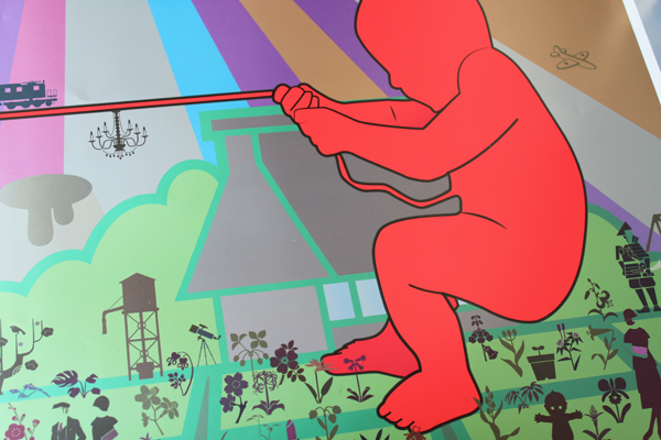
On occasion, I like to do assignments alongside my students at Temple University Japan, as exploring more abstract approaches to work is fairly rare in Japanese design pedagogy.
The assignment:
Literary Metaphor
Design a poster for an author or critic from the list below whose writing interests you and whose ideas you find
thought provoking. The poster should be large scale (at least 20 inches by 30 inches), in color, and should include the usual who, what, when, and where information that would be appropriate for a book signing, reading, or lecture. The poster must include images as well as typography.
The challenge is to create a visual metaphor for literary ideas that is intelligible without being a trite one-liner, as well
as seductive without relying on usual overworked stylistic trickery.
Potential texts:
Interpreter of Maladies by Jhumpa Lahiri
Me Talk Pretty One Day by David Sedaris
Fires/Where I’m Calling From by Raymond Carver
Labyrinths/Dream Tigers/Ficciones/The Book of Sand by Jorge Luis Borges
Who’s Irish by Gish Jen
Stripping by Pagan Kennedy
The Periodic Table by Primo Levi
Collected Stories by Gabriel Garcia Marquez
Kavalier & Clay/The Yiddish Policemen’s Union by Michael Chabon
Natural Disasters by Al Burian
For my own poster, I chose a book not on the list that students might be familiar with- The Silent Cry by Kenzaburo Oe.
I included 30 different visual metaphors within my poster design, as well as allusions to Oe-san’s recent legal troubles due to his reporting on a WWII massacre in Okinawa.
The poster was printed 60 inches wide by 110 inches tall using a variety of metallic inks, usual CMYK process, and white ink.
07.28.2010
July 28, 2010

Here’s a bit of a preview for a massive new project I’m working on with Roland, manufacturer of fine musical instruments, vinyl cutters, and amazing printers. More soon… and yes, that is metallic ink in there.
07.26.2010
July 26, 2010

The past few months have been particularly busy at the studio, and I wanted to take a moment to thank the amazing folks I’ve gotten to work with lately. Praise is due:
Paul Sather, my constant cohort when it comes to creating innovative work for screen-based devices and the web. Thanks for years of friendship and hard work.
Patrick Tsai, my co-director on a few new projects and one of my best friends in the world.
Hisae Higuchi, my new assistant, has been rocking in so many ways- holding down translation duties, business communications, and making sure meetings run smoothly while being super-fun to work with the whole time, always with a smile.
Hannah Smith has been up to her ears in shooting all of the studio’s work despite the heat and still finding the time to bang away at WordPress and Photoshop. Thank you!
Darin Bendall busted ass on a number of Flash projects, showing his tenacity and patience for the quickly dying art that is AS2.
Thien Huynh has been held down the programming on a number of site projects, showing off his acumen at making flexible XHTML/JS/CSS when not listening to me kvetch about the daily grind.
I am truly lucky to be able to work with each and every one of you. Thank you for all of your hard work!!!
07.24.2010
July 24, 2010

Chris Palmieri, Craig Mod and I were interviewed in the latest issue of Japan’s Web Designing magazine about the potential of webfonts.

The feature features a tasty lettering treatment by the tremendous Daijiro Ohara. Within, we discussed sites that work, sites that don’t, @font-face, and the future of the web.

Thanks to Ishida-san, Nakano-san, and all at Web Designing!


07.21.2010
July 21, 2010

New font release: Cooper Black Italic. This typeface is the definitive version of Oswald Bruce Cooper’s classic typeface Cooper Italic.
1926 saw the release of Cooper Black Italic. During the design process, Cooper relentlessly experimented with the forms of the letters, creating multiple options for each letterform. It includes a full uppercase, lowercase, figure, and punctuation character set, Response to Cooper Black Italic was overwhelmingly positive and the typeface sold very well.
This typeface is the result of researching Cooper’s original drawings and series of engraved proofs for both typefaces. The typeface includes the original ligatures, and a range of punctuation and diacritics, et al, that fill out a full character set. The typeface has been lovingly kerned for the smoothest result in text setting.
This font updates and complements the fun, friendly Cooper Black Swash Italic, an old Chicago-style display typeface. It is great for retro designs and forward-thinking contemporary graphic design.
07.5.2010
July 15, 2010

I’ll be teaching two classes in Temple University Japan’s Continuing Education department in the fall semester: Imagemaking 101 and Typography 101. Take a look at the links to see details.