I’m A Design Student—What Happens Next?
April 9, 2020

I was interviewed along with my VCFA co-conspirator Silas Munro, pal Mitch Goldstein, and four other design educators about life for students after the current pandemic on the AIGA Eye on Design blog.
You can read it here: https://eyeondesign.aiga.org/im-a-design-student-what-happens-next/
Some of the interview questions that were not published, but for which I think I provided snappy answers:
Are there specific design jobs or design skills that are more likely to get through this crisis without much disruption, and others that will be hit harder?
Hands down, education. I have found that most realms of design are incredibly fickle during an economic downturn, and teaching is something that has relative stability. Sure, it is not glamorous, but you get to go into interesting, speculative situations every day and talk to really nice people who are smart.
For over a decade, there has been a “brain drain” on graduate education because the technology sector just paid *so much* more, so many folks who would have taught instead turned to tech. I imagine that the current crisis will make technology companies ask their workers to do much more for much less money. (That would be the rational business move.) I think that right now is really the time to get into design education if you are so inclined. If you have a terminal degree, you can teach while still doing your ‘fabulous’ tech work.
When this is all over, how do you think this will change the structure of the design industry or design education?
I feel like this is all a giant dry run for the future. This is a time in which companies and clients are seeing how much labor they can extract from people working from home so they don’t have to pay for real estate, pay annual salaries, pay benefits, or generally do the things that Fordist companies did for their employees once upon a time. I can literally envision in my mind hundreds of HR people on the high administration level in tech companies just rubbing their mitts right now in anticipation of the future and what this very moment means for tomorrow’s shareholder profits.
What can we learn from this experience of working and teaching remotely that will help to make our jobs and classrooms more flexible/adaptable to change and more accessible to designers from marginalized communities?
I would counter that with two rhetorical/not rhetorical questions for you:
1. Do you think that flexibility and adaptability are necessarily good traits?
2. Socioeconomically, we have seen that it drives down the amount of money that people make and increase labor exponentially. Is that what we want from the future?
IDEA #389
March 3, 2020

Issue #389 of IDEA examines “the f-word”… That’s right: Feminism, the notion that all genders are equal. The first third of this issue of IDEA looks at the work and struggles of contemporary Japanese and Korean female graphic designers, exhibitions about their work, and so much more. It also includes histories of important global feminist graphic designers and helps to chart a course of feminist herstory throughout graphic design.
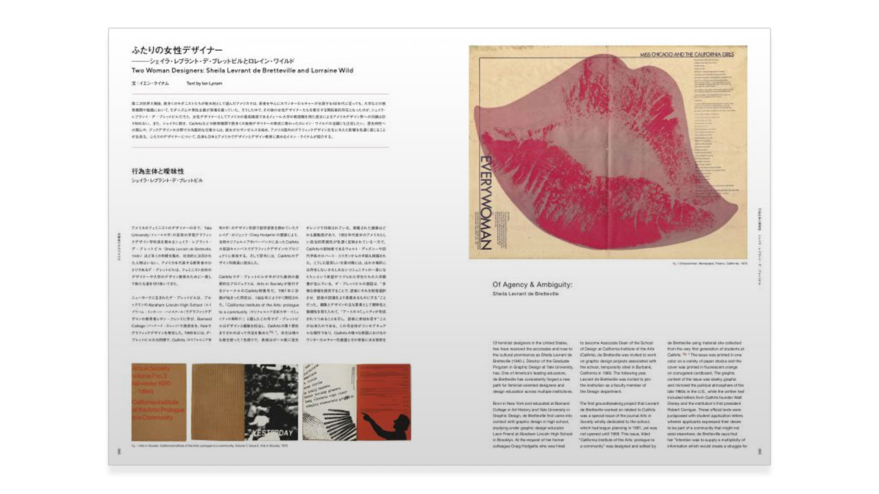
I wrote two biographies for this issue: one of Yale’s Sheila Levrant de Bretteville and one of CalArts’ Lorraine Wild. I’m very excited to have been asked to write these, notably Lorraine’s.
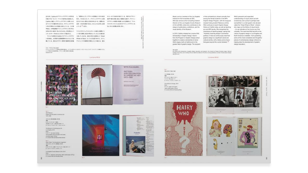
Lorraine has been a mentor and friend for many years and who is someone I find to be incredibly inspirational.

My Corinthians partner Renna Okubo and I also put together a special Japanese and English supplement insert for this issue titled “The Global Style: Modernist Typography After Postmodernism”.
The primary text is by another mentor and friend, Mr. Keedy. It is about the style of graphic design after Postmodernism and is accompanied by two texts written by me that help to contextualize exactly what “The Global Style” is.
Contents:
The Global Style: Modernist Typography After Postmodernism
Text by Mr. Keedy, Ian Lynam
Design by Yuta Murao
Translation by Shu Kuge, Emma Okubo
Introduction: Understanding the Global Style
Text by Ian Lynam
The Global Style: Modernist Typography After Postmodernism
Text by Mr. Keedy
Commentary: Multiple Modernisms
Text by Ian Lynam
You can pick up IDEA #389 here: http://wordshape.com/idea-389-feminist-moments/
TUJ Media Lab
February 29, 2020

Just finished: a new wall supergraphic for Temple University Japan Campus’ Communication Department Media Lab.

The supergraphic will serve as the backdrop for TUJ broadcast projects.

The supergraphic was sponsored by the Kal & Lucille Rudman Family Foundation of Philadelphia.

Reindeer Games
February 14, 2020

I have a new essay called “The Small Olympics” published in The Asia Pacific Journal’s Japan Focus online peer-reviewed journal.
Japan has a pervasive and problematic history based on design by consensus and speculative labor for the design of past Olympic Games as much as for the upcoming Games. The 2020 Games have been defined by design competitions, events where individuals volunteer to create visual graphic works without financial reward for the time and labor spent. This devaluation of creative work helps explain why Tokyo is swathed in mediocre Games-related visuals.
You can read it here: https://apjjf.org/2020/4/Lynam.html
AIGA Grow Conference Keynote!
February 13, 2020

I’m thrilled to announce that I’ll be giving the keynote lecture for AIGA Austin’s GROW Conference: http://growwithaiga.org/

I’ll be speaking about methods and methodologies for constructing both design criticism and critically oriented graphic design.

Friend and VCFA alumnx Shruthi Manjula Balakrishna will be presenting, as well as friend and fellow CalArts alum Tuan Phan will be leading a workshop.

My lecture will be followed by activation workshops where participants will get to explore constructing critical design methods.
Ouzuri
February 1, 2020
Another recent project: the identity design for Ouzuri, a line of contemporary variations on zori, traditional Japanese footwear that are worn with kimono.
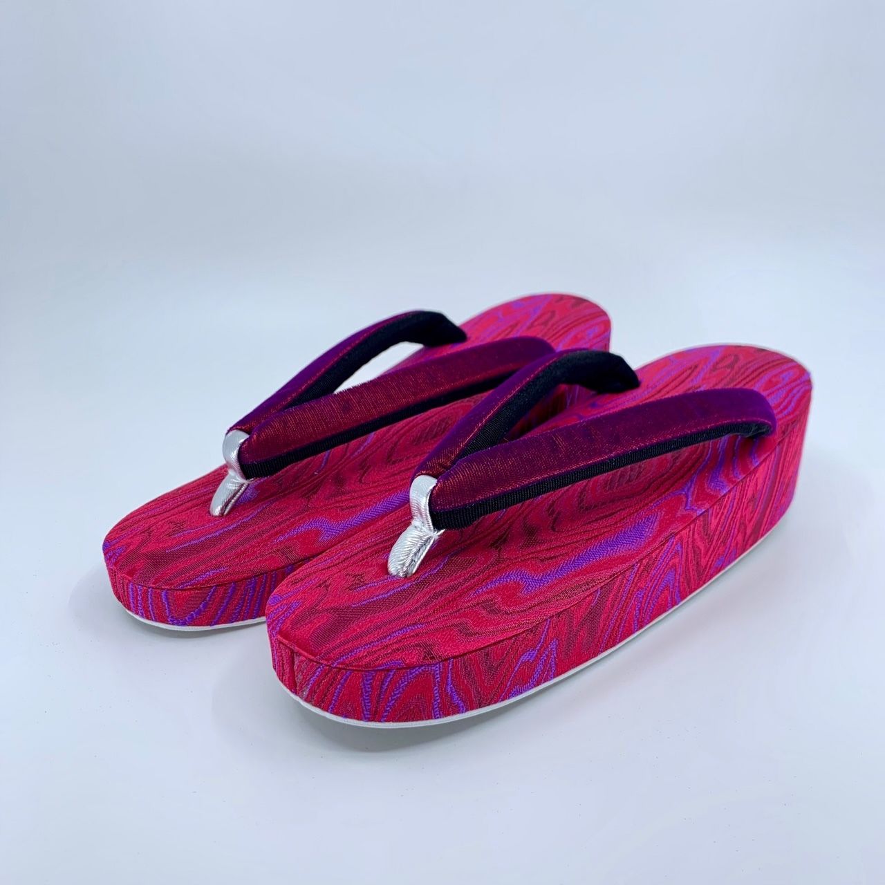
The project includes logo design, color palette and typographic palette development, the design of printed collateral, positioning strategy and copywriting. I am particularly happy with the tagline that we came up with for Ouzuri: “The Future of Tradition”.

Visit the Ouzuri website here: https://ouzuri.stores.jp/
Eleven Arts logo design
January 11, 2020
I recently designed the logo for Los Angeles-based anime distribution and production company Eleven Arts.
Modes of Criticism #5 – Design Systems
December 23, 2019

I have a new essay called “Anything With A Shape Cannot Be Broken” in Modes of Criticism no. 5. The theme for the issue is “Design Systems”. My essay explores the imperialist suprematist ideologies behind pre-WW2 Mingei crafts of Japan and how those ideologies are linked to culturally suprematist ideologies lurking beneath the seemingly anonymously designed surfaces of MUJI products.

I also explore links between fascism in both European and Japanese Modernism, implicitly/explicitly exploring how “less is more” and “problem solving” are the rhetoric of genocide.
Thanks to Francisco Laranjo for inviting me to participate. One can obtain a copy of MOC5 here: https://www.onomatopee.net/exhibition/modes-of-criticism/#publication_10381
This is hardcore.
November 23, 2019

I was interviewed over on the AIGA Eye on Design blog along with Kathleen Sleboda, Christopher Sleboda, and Kristian Henson about the DIY hardcore punk movement of the late 1980s and 1990s and about our collaborative book Hardcore Fanzine which came out this year. You can read the essay here: https://eyeondesign.aiga.org/this-is-hardcore-the-huge-impact-of-a-niche-movement-on-graphic-designers-today/
ServiceNow
November 19, 2019

Just installed: a number of big supergraphics treatments for the interior design of ServiceNow’s new Tokyo offices.

Walking into the ServiceNow (https://www.servicenow.com/) offices, staff and clients alike are greeted by giant graphic treatments that Pascal Santoso and I put together to encourage sales, support, and congeniality!

Thanks to Jordan and Ben at AXES Partners for inviting us to work on this project, as well as thanks to Chris, Tonya, and the team at ServiceNow.
