Reindeer Games
February 14, 2020

I have a new essay called “The Small Olympics” published in The Asia Pacific Journal’s Japan Focus online peer-reviewed journal.
Japan has a pervasive and problematic history based on design by consensus and speculative labor for the design of past Olympic Games as much as for the upcoming Games. The 2020 Games have been defined by design competitions, events where individuals volunteer to create visual graphic works without financial reward for the time and labor spent. This devaluation of creative work helps explain why Tokyo is swathed in mediocre Games-related visuals.
You can read it here: https://apjjf.org/2020/4/Lynam.html
AIGA Grow Conference Keynote!
February 13, 2020

I’m thrilled to announce that I’ll be giving the keynote lecture for AIGA Austin’s GROW Conference: http://growwithaiga.org/

I’ll be speaking about methods and methodologies for constructing both design criticism and critically oriented graphic design.

Friend and VCFA alumnx Shruthi Manjula Balakrishna will be presenting, as well as friend and fellow CalArts alum Tuan Phan will be leading a workshop.

My lecture will be followed by activation workshops where participants will get to explore constructing critical design methods.
Ouzuri
February 1, 2020
Another recent project: the identity design for Ouzuri, a line of contemporary variations on zori, traditional Japanese footwear that are worn with kimono.
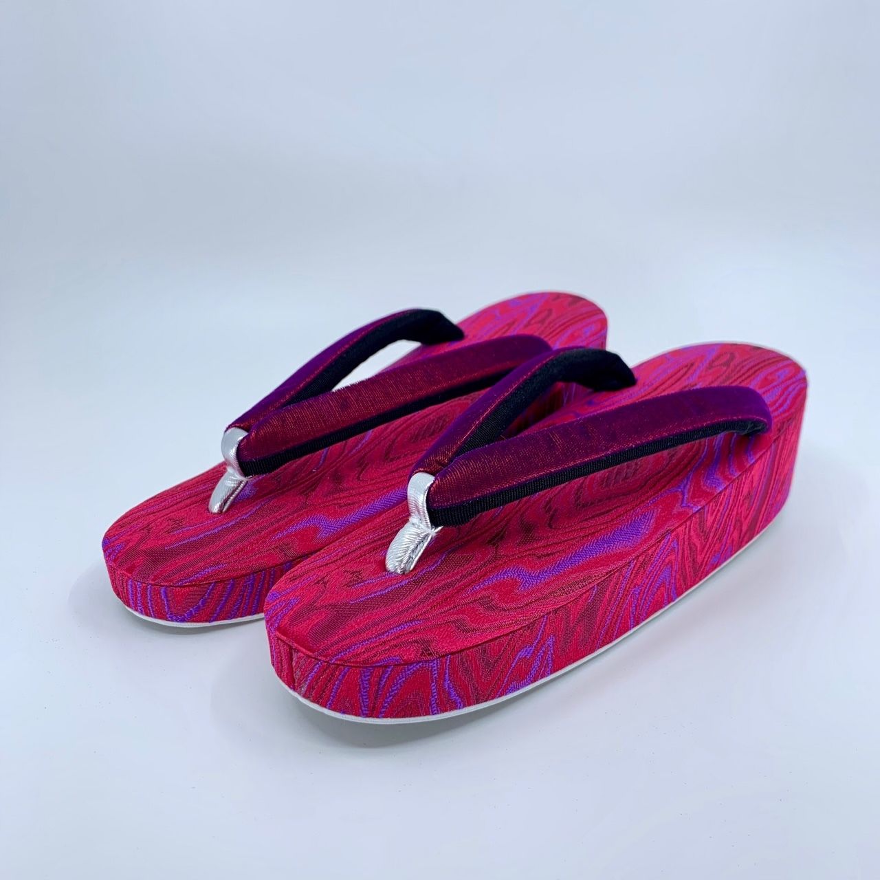
The project includes logo design, color palette and typographic palette development, the design of printed collateral, positioning strategy and copywriting. I am particularly happy with the tagline that we came up with for Ouzuri: “The Future of Tradition”.

Visit the Ouzuri website here: https://ouzuri.stores.jp/
Eleven Arts logo design
January 11, 2020

I recently designed the logo for Los Angeles-based anime distribution and production company Eleven Arts.
Modes of Criticism #5 – Design Systems
December 23, 2019

I have a new essay called “Anything With A Shape Cannot Be Broken” in Modes of Criticism no. 5. The theme for the issue is “Design Systems”. My essay explores the imperialist suprematist ideologies behind pre-WW2 Mingei crafts of Japan and how those ideologies are linked to culturally suprematist ideologies lurking beneath the seemingly anonymously designed surfaces of MUJI products.

I also explore links between fascism in both European and Japanese Modernism, implicitly/explicitly exploring how “less is more” and “problem solving” are the rhetoric of genocide.
Thanks to Francisco Laranjo for inviting me to participate. One can obtain a copy of MOC5 here: https://www.onomatopee.net/exhibition/modes-of-criticism/#publication_10381
This is hardcore.
November 23, 2019

I was interviewed over on the AIGA Eye on Design blog along with Kathleen Sleboda, Christopher Sleboda, and Kristian Henson about the DIY hardcore punk movement of the late 1980s and 1990s and about our collaborative book Hardcore Fanzine which came out this year. You can read the essay here: https://eyeondesign.aiga.org/this-is-hardcore-the-huge-impact-of-a-niche-movement-on-graphic-designers-today/
ServiceNow
November 19, 2019

Just installed: a number of big supergraphics treatments for the interior design of ServiceNow’s new Tokyo offices.

Walking into the ServiceNow (https://www.servicenow.com/) offices, staff and clients alike are greeted by giant graphic treatments that Pascal Santoso and I put together to encourage sales, support, and congeniality!

Thanks to Jordan and Ben at AXES Partners for inviting us to work on this project, as well as thanks to Chris, Tonya, and the team at ServiceNow.

Universal Lunch
November 15, 2019

I was so lucky to be invited to participate in the livestreamed and recorded interview/conversation series Universal Lunch (Un)Common Hours curated by Design Inquiry and hosted by Gabrielle Esperdy and Jimmy Luu.

I and Denise Gonzales Crisp got to chop it up with Gabrielle and Jimmy for an hour or so—you can check out the recorded video here shortly: https://www.youtube.com/user/DesignInquiry/videos
Visual Strategies for the Apocalypse wins STA 100!
November 1, 2019

Very excited to announce that my recent publication Visual Strategies for the Apocalypse won the STA 100 design competition — for 40 years, Chicago’s Society of Typographic Arts has held this competition which awards the top 100 pieces of typography in North America. Read more: https://100.sta-chicago.org/winners
2019/2020 Yearbook of Type
October 24, 2019
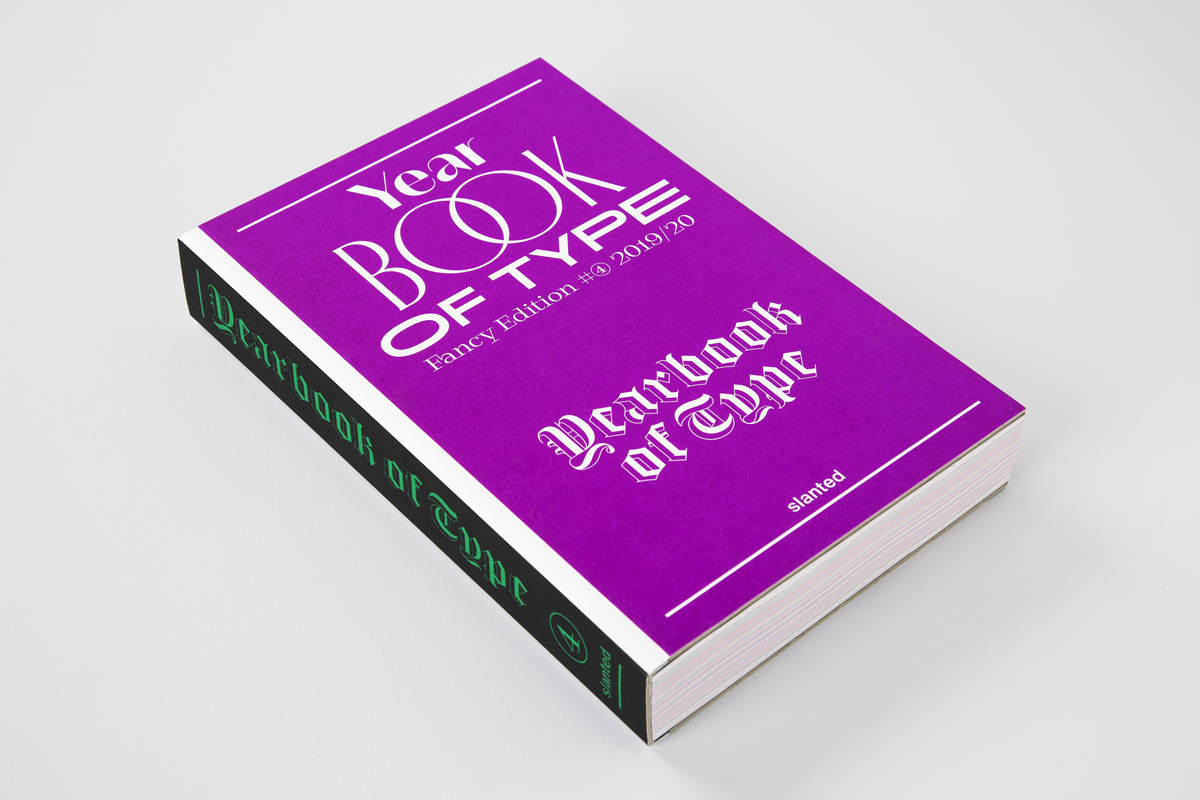
I have a new essay titled “A Futuring: Frugality, Online Dating, and Some Rain” in the 2019/2020 Yearbook of Type just released by Slanted Publishers in Germany. Check it out here: https://www.slanted.de/yearbook-of-type-2019-20-out-now/

The Yearbook of Type is now in its 4th edition: 158 typefaces from 178 designers from around the world are presented in this 400-page, colorful, and gobsmackingly typographic book. The Yearbook of Type is both a practical guide that helps users navigate the diverse, ocean-like, typographical landscape, as well as a critical guide to the best type today.

The highlights in short:
– Detailed presentation of 158 recent typefaces
– Ample background information
– Index of typeface classifications
– Index of all 176 type designers and 98 foundries from 36 countries
– Explanation of all OpenType features
– Essays, interviews, and tutorials by Pedro Amado, Massimiliano Audretsch, Bianca Berning, Ian Lynam, Lilo Schäfer, Rainer Erich Scheichelbauer, Mark van Wageningen, Amber Weaver, Stefan Willerstorfer, Anuthin Wongsunkakon, and Benjamin Wurster
– Microsite online linking the typefaces directly to the foundries’ websites
