Idea #347
August 5, 2011

The new fonts I designed for Onitsuka Tiger, Kirimomi Geometric Sans and Kirimomi Swash, are featured in the new issue of Idea Magazine (the primary part of the new issue is a fantastic overview of the work of designer Bunpei Yorifuji – amazing!). Issue 347 features the first full showing of the typeface’s complete character set and a lengthy essay about the development of each font in Japanese.
As the text is Japanese-only, here is the English version of the essay for international readers:

The Kirimomi Typeface family
by Ian Lynam
For the past year I’ve been working on a new type design project with the Japanese sports fashion brand Onitsuka Tiger in conjunction with my online journal Néojaponisme. I sat down with some folks at Onitsuka Tiger’s office in Tokyo to pore over the company’s vast archives of print advertising from the company’s advent in 1949 through today, and to draw inspiration as I pleased for the design of a pair of digital fonts that help tell the story of Onitsuka Tiger as a brand.
Looking through the hundreds of ads, catalogs, brochures and assorted other materials, it became immediately clear that there was a bigger story to be told — the Onitsuka Tiger materials span the technological and cultural development of Modern printing. The typography and graphic design of Onitsuka Tiger’s assorted printed materials provided a myriad of potential jumping-off points that span both Japanese and Western history, revealing a startling series of commonalities as well as interesting divergent moments in time.
From classical influence to highly futuristic, there is a huge gamut of interesting sources to pull from. Onitsuka Tiger’s printed promotions started in the age of metal typesetting, took advantage of phototype compositing in the 1960s through the 1980s, then entered the digital realm in the the late 1980s. As a Japanese company that marketed domestically and abroad, the marketing department had to be aware of typographic trends internationally, and this was reflected in their printed materials. From the prevalence of American Type Founders typefaces used in early advertising mixed with hand lettering to incised prototype katakana and hiragana to the Helveticization of the globe, Onitsuka Tiger’s printed matter functions as a cultural and aesthetic survey of popular styles and unique approaches to graphic design.
The two fonts created for this project are:
Kirimomi Swash
A display typeface which is rooted in both classical form and the sharp edges of photoype lettering. The typeface looks back to the historic forms of French typefounder Jean Jannon for it’s base, as well as the curved terminals and weighty serifs of the work of William Caslon. The various interpretations of their work throughout history have been applied to give each letterform presence, stability and rigidity. Sharp phototype swashes culled from the logo for Emperor, a line of golf shoes released by Onitsuka Tiger thirty-plus years ago have been applied to give the face a timeliness of the Modern/Postmodern era, offsetting the historical skeletal frame.
Kirimomi Swash is first and foremost a display face, and in order for it to function gracefully, a number of ligatures and alternate characters have been included. It is intentionally not designed for text setting, as that would require a smoothing-out of the most prominent elements, and the result would most likely be a typeface that while potentially being useful, would not stand out in a crowd.
Kirimomi Geometric Sans
A sans serif inspired by early geometric typefaces and the horizontal directionality of phototype text, yet designed to render immaculately on-screen and in print. This geometric sans owes a deep debt to Roger Excoffon’s 1962 typeface Antique Olive, as much as to contemporary interpretations of Paul Renner’s Futura, the near geometric rounded characters pinched and squeezed for readability.
Antique Olive’s S and s were indicative of brush track twists, having an overly large top story giving it the appearance of almost being upside-down. While many continue to question this move, as Antique Olive was meant to be the French contender for the sans serif crown being vied for by Univers and Helvetica and “failed” due to it’s strong personality, these strong nuances help convey a vivacity and liveliness missing from so much of contemporary sans serif type design. Excoffon’s idiosyncratic moves are mirrored in aspects of Kirimomi Geometric Sans – the scooped top of the lowercase i and j mirror their dotted elements; the whole face has a very large x-height; and terminals are sliced off, creating a distinctively sharp visual impression. The sliced serifs and terminals give the face a horizontal thrust that pushes readers’ eyes forward in lines of text.
Aspects of Kirimomi Geometric Sans veer wildly from these inspirational starting points: the lowercase a being double-storied, the optical “dazzle” of it’s predecessors toned down, and the entire typeface carefully kerned for optimum results in text setting. A number of alternate capitals and ligatures are included for the best possible results, including OpenType auto-substitution for all OpenType-enabled applications.
A number of pattern-making glyphs have been drawn and included in lieu of traditional typographic ornament within each of these fonts. Contemporary font technology allows the deployment of pattern elements in a regulated environment, allowing designers to control the amount of space in side bearings. When typeset and leading/line-height is adjusted, one can create smooth, even patterns, choose coloring and adjust scale quickly without having to resort to external files.
A series of posts and essays that document the development of these typefaces and their cultural relevance to the continuum of type design, as well as a lengthy essay about the co-development of Japanese and Western type design will debut on Néojaponisme. Accompanying these essays will be these digital fonts (as well as @font-face CSS web kits), available for free download in the upcoming month.
Slanted #14
August 5, 2011

I have two new essays in the latest issue of Germany’s Slanted Magazine. One essay is a retrospective on the work of the late Japanese designer Kiyoshi Awazu while the second is the fourth installment in my series on Japanese typography. This time around I talk about kanji, linguistic development and the modification of kanji using kana.

Tokyo folks can find Slanted at Logos bookstore in Parco 2, situated in the basement.

Design of Manga, Anime & Light Novels
August 5, 2011

Kiyonori Muroga and I wrote the introduction for Idea Magazine’s latest book, Design of Manga, Anime & Light Novels, available here. The book is a collection of exciting packaging and editorial design for otaku-centric endeavors.

08.03.2011
August 3, 2011

I have chunk of work in the new book Logology 2: The Wonderland of Logo Design, published by Victionary.
The official blurb from the publisher:
Attending to an international audience overwhelmed by data and information, the new logo generation answers the urge for speed communication and recognition in both the physical and digital world. More than just a mark to differentiate between producers in a crowded market, logos today embrace efficiency and flexibility to fit extensive applications and take on a new significance to intrigue, explain and instruct. Can its making be as simple as it looks?

Displaying more than 1600 logos from 500 designers worldwide, Logology® 2 systematically contrasts the principle theme, structure, composition and palette of the world’s latest logo designs under 78 classes. It pictures a wonderland of logotypes, graphic icons, mascots and trademarks that have taken on a new significance to intrigue, explain and instruct as corporate logos, signs, favicons or decorations on the internet or in the real world. Alongside the tremendous showcase are 15 case studies where selected designers walked us through their creative process for the branding and rebranding of businesses, public bodies and non-profits. Branding experts, Frédéric Vanhorenbeke from Coast Design and Holger Jacobs at Mind Design, have shared their views and experiences respectively in the forewords for this book.
08.03.2011
August 3, 2011

Just finished our first big project for Google. No, we can’t talk about it. Yes, we are indebted to the folks who brought us on board!
08.02.2011
August 2, 2011

The past two weeks found me traveling to Kobe to shoot a handful of spots for Onitsuka Tiger, following ASICS/Onitsuka Tiger Europe’s digital content producer (and all around awesome dude!) Mutaurwa Mapondera as he interviewed five influential individuals from the brand’s history.

His first interview was with Mr. Uetsuki, the original head of Marketing and Promotions for Onitsuka Tiger. Super-interesting guy with lots to say and amazing sketches for logos, product concepts and the thickest pile of passports from his years of crossing the globe promoting the brand.
Mutaurwa is documenting our time together exploring Onitsuka Tiger’s history and legacy on his blog. Recommended reading!
07.29.2011
July 29, 2011
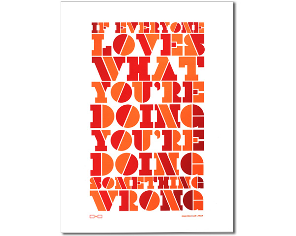
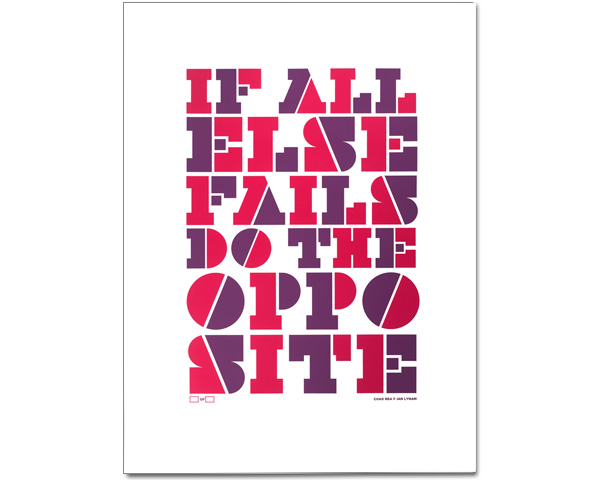
I just teamed up with copywriter extraordinaire Chad Rea to produce a new trio of posters for Electricity Showroom, a brand spanking new poster retailer out of Portland. Each is printed in two colors, limited edition and signed by us.
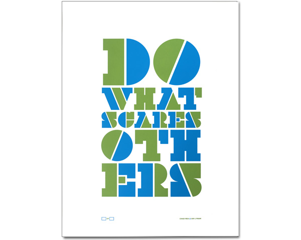
100% pure typography. Uncoated paper. Hand-pulled.
07.22.2011
July 22, 2011

So, due to some wackiness, the name of the free fonts created for Onitsuka Tiger were changed from Kihachiro Geometric Sans and Kihachiro Swash to Kirimomi Geometric Sans and Kihachiro Swash a few days after launch. The dust is settled and the fonts are currently burning up the charts over at MyFonts, where they are available for FREE!
07.13.2011
July 13, 2011

I’m happy to announce that my type foundry Wordshape has also partnered with Fontspring and our fonts will be available from them soon!