01.10.2011
January 10, 2012

SuperDeluxe
January 10, 2012
Lynam/Kameguchi Wedding Invitations
January 8, 2012
Simultaneously the easiest and hardest project ever: designing invitations to your own wedding. Just as daunting- do you put it on your website? I thought not, but we’re really proud of how these turned out.
We picked up the squirrels sharing an acorn from an old book of German trademarks, the initial caps from hand-lettering by Bavarian communists, and were forced to put the damn venue’s logo on the map card by the damn venue. Nonetheless, it turned out beautifully. Fine-tuned bilingual typography, lovely printing and blind debossing, custom paper and even the ol’ ‘Rubine Red gradient in the gutter trick’.
01.08.2012
January 8, 2012

I recently finished up the identity design for Tokyo Fashion Week 2013, alongside global initiatives like Tokyo Fashion Week in Italy and Tokyo Fashion Week in India. The logo is comprised of letterforms from a custom typeface that combines the geometric rationality of Futura with a more humanist sensibility.
Tokyo Fashion Week 2012
January 8, 2012
I recently finished up the identity design for Tokyo Fashion Week 2013, alongside global initiatives like Tokyo Fashion Week in Italy and Tokyo Fashion Week in India. The logo is comprised of letterforms from a custom typeface that combines the geometric rationality of Futura with a more humanist sensibility.
01.07.2011
January 7, 2012
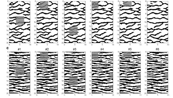
Danish professor Thomas Mejer Hansen used one of my patterns for Néojaponsime for his recent paper “Inverse problems with non-trivial priors: Efficient solution through Sequential Gibbs Sampling”, co-authored with Knud Skou Cordua and Klaus Mosegaard. This essay examines how an analysis of pattern can allow incorporation of prior information of arbitrary complexity, or how to analyze patterns using proposed algorithms.
01.04.2012
January 4, 2012

I wrote the introduction essay “Tie Me Up, Tie Me Down” for the new book Big Brand Theory, published by Sandu Media and Gingko Press. Check it out here and here.

I also recently judged the Asia Pacific Design Awards for the second time. More on that shortly…

… and my film “E-Waste” will be featured in the upcoming Sustainable Living Film Festival in Istanbul.
12.26.2011
December 26, 2011

Client Don Blanquito, finds himself the subject of a New York Times feature and mini-doc. Congrats, Alex!
11.28.2011
November 28, 2011
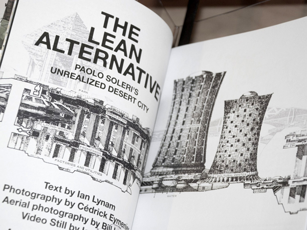
My work for Too Much Magazine is on display in London currently for the much-lauded Archizines exhibition at the Victoria & Albert Museum.
Slanted # 16
November 26, 2011

I have two new essays in Slanted Magazine #16, the latest issue of the German typography magazine.

One, “Hoofin’ It”, is about shoes, style, authenticity and the age of look and feel.

The other is called “Top Down” and is a look at urbanism, population density and Japanese typography.