09.17.2013
September 17, 2013

Essayist, critic, translator, zine editor and educator Taro Nettleton will be giving a lecture in my design class at Temple University today at noon in Room 507 in Azabu Hall. The lecture is open to the public. Nettleton will be lecturing on the theme of “The Visual Playlist” – presenting an image-based mixtape of album covers which have helped shape contemporary visual culture.

Videogram
September 12, 2013
Design and development of the Videogram visual identity, website, and embedded web application. We also helped develop the user interface of the iOS and Android versions of the Videogram application.
Videogram allows users to upload web video content including files from YouTube, Vimeo and other video hosting services, as well as their own video content directly from a pc or mobile device. Videogram then outputs the video content into interactive sequential imagery so that users can analyze the content of videos, tag individual sequences/scenes.
Videogram allows users to get a quick overview of a video’s contents at a glance without watching the video from beginning to end. The visual summaries are suitable as interactive thumbnails on video publishers sites and they can also be used to help consumers browse through videos (like they do for images). Videogram allows the consumer to start the video from a point of visual interest (smaller clips) on mobile devices, thus eliminating the ‘pain points’ of streaming/buffering a large video on oversubscribed/congested mobile networks.
To generate a Videogram, a video is auto segmented based on the color features of each frame. The segments are also clustered according to their similarities. We have introduced an importance score to rank the segments. A segment is considered to be important if it is long and rare. Keyframes are extracted from highly ranked segments and sized according to their scores so that more important keyframes are presented as bigger frames. Videogram’s patented frame-packing algorithm puts the different sized keyframes in a compact “comic book” format.
Videogram is a product of CinemaCraft, a 500 Startups-backed firm based in Tokyo and San Francisco.
Cinemacraft
September 12, 2013
Corporate identity for software developer Cinemacraft and visual identities for their suite of products, including Videogram.
09.06.2013
September 6, 2013

David Matthew Davis and Thea Lorentzen designed these amazing ten-color silkscreened posters for Kiyonori Muroga and my recent trip to CalArts for our Idea Magazine workshop and lecture at the school.

Thank you, guys!!!
08.29.2013
August 29, 2013

The Letterfirm exhibition opening went off amazingly well. Over 250 folks stopped in to check out the work, have a few drinks and bob their heads to the amazing sounds of DJ E*Rock.
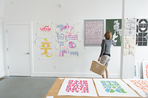
Thanks to the TypeCon team for inviting us to have the exhibition and mega-thanks to Reading Frenzy for making it happen!

All photos by Bitna Chung Photography.
Letterfirm
August 29, 2013
I curated Letterfirm, an exhibition of international expressive typography, featuring some of the most diverse graphic designers and typographic artist in active practice today. The exhibition was held in conjunction with TypeCon 2013. It opened on August 20th at Reading Frenzy.
Participants in Letterfirm include:
Aaron Winters
Gail Swanlund
Chris Ro
Tom Kracauer
Thea Lorentzen
Scott Massey
Jiwon Lee
Masato Nakada
Sarah Faith Gottesdiener
Yasmin Khan
Ed Fella
Silas Munro
Ian Lynam
Michael Worthington
Jae-Hyouk Sung
Benjamin Woodlock
David Matthew Davis
Troy Patterson
Kat Catmur
Alex Pines
Everything–Type–Company
Mylinh Trieu Nguyen
Micah Hahn
Published in conjunction with the exhibition was The Letterfirm Reader, a 96-page booklet of recent essays on graphic design, aesthetics, history, and criticism.
All photography by Bitna Chung Photography.
The Letterfirm Reader
August 29, 2013
I curated Letterfirm, an exhibition of international expressive typography, featuring some of the most diverse graphic designers and typographic artist in active practice today. The exhibition was held in conjunction with TypeCon 2013. It opened on August 20th at Reading Frenzy.
Published in conjunction with the exhibition was The Letterfirm Reader, a 96-page booklet of recent essays on graphic design, aesthetics, history, and criticism. It is available at the exhibition, and was given away for free in the TypeCon goodie bag given to all participants.
An excerpt from the inside cover:
Every year at TypeCon, the goodie bag is stuffed full of objects filled with text, yet that text is most often crafted with the lone intention of highlighting foundries’ latest offerings. This booklet is intentionally the opposite—it is a booklet that was designed to be read in the downtimes between speakers, in bed, or at a bar or café.
The Letterfirm Reader is an attempt to bridge the disconnect between design criticism, typography-oriented writing, and pure ol’ plain fun prose. It is a casual follow-up to The Space Is The Place Supplement, a booklet of a similar nature that was available for free at my exhibition at Land Gallery in Portland in 2011.
I am excited that the Letterfirm exhibition is being held at Reading Frenzy—my introduction to graphic design was through the DIY small press. Reading Frenzy is Portland’s longest-running retailer of small press ephemera. I was a volunteer at the old shop on Oak Street in the mid 90s.
I hope you enjoy The Letterfirm Reader. These essays, as well as a dozen more, will be published in a new book in the upcoming year. I look forward to sharing them with you.
The booklet was printed in an edition of 600 by Eberhardt Press using split fountain printing. It was edited by Scott Michael Craig.
All photography by Bitna Chung Photography.
Idea #360
August 11, 2013
Idea Magazine #360 features a 96-page feature that I edited, designed and wrote big chunks of.
For a week, Idea Editor-in-Chief Kiyonori Muroga and I stayed in Valencia, the home of CalArts, to “work on a design research/writing/making/collecting/documenting project about CalArts itself, it’s history, it’s current state, ephemera, and researching in a very open way”, making CalArts both the laboratory and the subject.
The results is an image-rich look at the past few generations of CalArts alumni, the work of faculty and related projects.
Included is work by Ed Fella, Lorraine Wild, Mr. Keedy, Caryn Aono, Scott Zukowski, Silas Munro, Tasheka Arceneaux-Sutton, Mark Kulakoff, Corey Holms, Jon Sueda, Geoff McFetridge, Megan McGinley, Max Erdenberger, Brian Roettinger, Scott Massey, Andrea Tinnes, Tim Belonax, John Wiese, Jae Hyouk-Sung, Micah Hahn, Michael Worthington, Gail Swanlund, Louise Sandhaus, and many, many others.
The feature is crammed to the gills with bilingual essays and interviews.
You can pick up a copy here.
Idea #360
August 11, 2013

Idea Magazine #360 features a 96-page feature that I edited, designed and wrote big chunks of.

For a week, Idea Editor-in-Chief Kiyonori Muroga and I stayed in Valencia, the home of CalArts, to “work on a design research/writing/making/collecting/documenting project about CalArts itself, it’s history, it’s current state, ephemera, and researching in a very open way”, making CalArts both the laboratory and the subject.

The results is an image-rich look at the past few generations of CalArts alumni, the work of faculty and related projects.
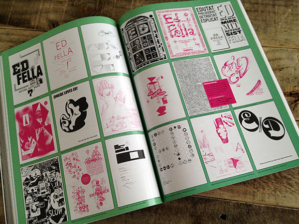
Included is work by Ed Fella, Lorraine Wild, Mr. Keedy, Caryn Aono, Scott Zukowski, Silas Munro, Tasheka Arceneaux-Sutton, Mark Kulakoff, Corey Holms, Jon Sueda, Geoff McFetridge, Megan McGinley, Max Erdenberger, Brian Roettinger, Scott Massey, Andrea Tinnes, Tim Belonax, John Wiese, Jae Hyouk-Sung, Micah Hahn, Michael Worthington, Gail Swanlund, Louise Sandhaus, and many, many others.

The feature is crammed to the gills with bilingual essays and interviews.

You can pick up a copy here.