VCFA MFA in Graphic Design video
November 30, 2017

I put together this profile video recently for the VCFA MFA in Graphic Design program. Michael Hanks did the camera work while my buddy E#Vax of Ratatat composed the music.
Kokusai Soushoku identity
November 29, 2017

One of those projects I never had time to post—the logo from the identity for Kokusai Soushoku (国際装飾株式会社), a Tokyo-based display production company that has been in business since 1931. Check out their amazing interior works on Instagram here!
Biwa & Biwa Display
November 9, 2017

I just released a new typeface family named Biwa and Biwa Display, the logical development of our bestselling typeface family Vaud, which is no longer commercially available. Biwa is here to fill that gap.
Biwa is a new straight-sided family of formally nuanced grotesk typefaces. Biwa’s lighter weights feel subdued, cool in tone, and neutral, while the heavier weights are more robust and full of personality.
Developed over the past few years by Ian Lynam and James Todd, the 14-member Biwa family and the accompanying 14-member Biwa Display family are paeans to the immediate moment when phototype arrived on the global scene — partially smooth and partially machined. Biwa and Biwa Display are neutral in tone, have enlarged x-heights, and look amazing on-screen and in print.
You can license Biwa here.
Slanted #30
November 9, 2017

I have an essay in issue 30 of Slanted, this one devoted to design and art in Athens, Greece.

This essay is titled “Faith/Void Split”, which is also the title of another essay that I wrote for Slanted #18 back in 2012. It has nothing to do with the other essay. I just like being contrarian sometimes.

Here is an excerpt from the essay:
Talking about gods and goddesses brings up some big cultural and societal considerations—notably, ideas of belief and notions of faith. I didn’t think about faith or belief very much for many years. I was and continue to be agnostic (a hard act to pull off when you’ve consorted with the immortal). Additionally, I worked primarily alone for many years, so I didn’t have to worry about these kinds of things. But then I started teaching in two very different design schools where the students were Buddhist. Or Shinto. Or sometimes both. Or sometimes nothing. Or sometimes Muslim. Or Christian. Or Mormon. Or smaller, less-known religions, and I just had to learn to become tolerant of different flavors of religious folks really fast. I’d adhered to the old Amebix “No gods, no masters” credo a bit too well for years, and learning to be someone who is open-minded with people of other belief systems kind of takes a lot of work.
Ultimately, I was able to boil down my ideas about faith and belief, and distill them into how I thought about my students, instead of how I thought about my students’ spiritualities. Some of my students are so exceedingly promising, talented, intelligent, and kind that I have faith in them and their abilities. On the other hand, I have many students that I must actively believe in and devote much of my energy to, because they have potential, even if it is often unrealized. Faith is when people are so talented that you know that they will create amazing work no matter most situations. Belief is… well, the opposite. Belief is having to try.
You can pick up a copy of Slanted #30 here.
Between Two Strangers
September 5, 2017
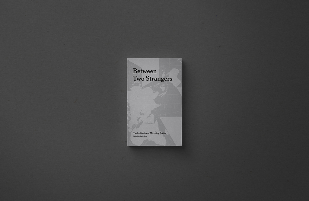
Between Two Strangers is a collection of stories and interviews from artists and writers on the challenges of maintaining an artistic practice in another country. Featuring Dana Olarescu & Bojana Jankovic, Ian Lynam, Xiaolu Guo, Emily Hartley-Skudder, Sarah Stein Lubrano, Saleh Addonia, Nina Mangalanayagam, Jim Russell, Noma Bar, Brenda Wong, Annette Mees, and Peter & Lizzie Mandeno.

Edited, designed and printed by Katie Kerr. Photographs by Lizzie Mayson, Alice Connew, Charlie McKay and Robin Friend. Check it out here.
Cannibals!
July 11, 2017

Cannibals is my new 92-page booklet — a handbook of dubious exercises, tips, and rants about becoming a designer who teaches… (but just as much a handbook for designers who happen to be being taught.) It is comprised of a handful of new essays about design, education, hope, dread, delight, misery, and of course, sex. Lovingly printed in three offset colors, Cannibals is part-innately relatable pop narrative, part-irreverent mythology, and part-searing critical analysis of design culture today.
You can read all about it over at the new Cannibals micro-site!
Design Issues
July 10, 2017

I designed the cover for the latest issue of MIT Press’ long-running journal Design Issues. The first American academic journal to examine design history, theory, and criticism, Design Issues provokes inquiry into the cultural and intellectual issues surrounding design.
Regular features include theoretical and critical articles by professional and scholarly contributors, extensive book and exhibition reviews, and visual sequences. Special guest-edited issues concentrate on particular themes, such as design history, human-computer interface, service design, organization design, design for development, and product design methodology. Scholars, students, and professionals in all the design fields are readers of each issue. Design Issues is a peer reviewed journal.
Check out Volume 33, Issue 3 of Design Issues here.
Corinthians in Harper’s Bazaar Korea
May 12, 2017

Corinthians, my new curatorial partnership with Renna Okubo are featured in an interview in the latest issue of Harper’s Bazaar Korea.
New essay in Slanted #29
May 5, 2017

I have a new essay in Slanted #29 called “Type Design: Discipline, Medium, Practice, Tool, or Other?”
Let’s Color!
April 3, 2017
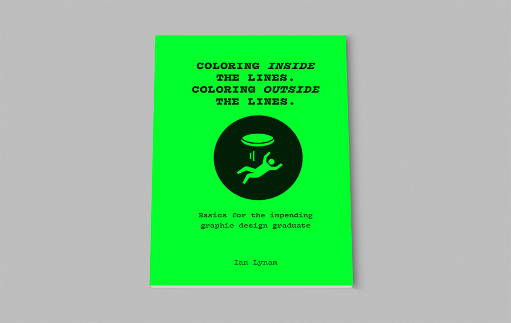
This is a new zine that I wrote for folks who are about to graduate from design school.

It is memoir-based and includes a ton of tips for job-hunting, letter-writing, and all of the stuff they don’t teach in a lot of schools.

As usual, there is sex and crime within.

I’ll have a chunk of copies with me when I visit the U.S. next week. In the meantime, it is available here. Orders will be fulfilled in two weeks.