Grafik
November 7, 2008
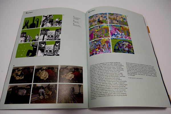
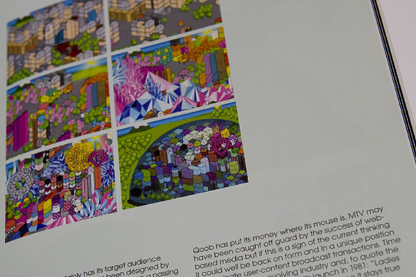
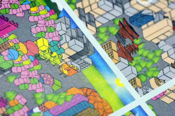
I had my Tokyo.Future video featured in Grafik Magazine’s article on QOOB.
Marxy “Forty Years From Now” CD
November 7, 2008
CD design for Néojaponisme co-founder Marxy’s latest full-length CD on New York’s Music Related label. A mix of declassified files, xeroxing, and sumi ink spills was recombined to create the ominous look of this long player.
Joshu + Vela
November 7, 2008

Identity, pattern, and print design for San Francisco-based bag and accessory company Joshu + Vela. I branded this boutique company from its inception, creating the identity system, typographic standards, and all advertising. Joshu + Vela make beautiful bags crafted from leather and canvas using all-natural indigo and mango dyeing, custom metal parts, and premium zippers. I designed a series of patterns which are printed on all bag interiors of their extensive bag line using a mix of screenprinting and dye resist treatments. Other Joshu + Vela projects include designing assorted linesheets, lookbooks, business cards, letterhead, envelopes, notepaper, and assorted promotional materials.
Graniph
November 7, 2008
An ongoing series of apparel designs for Tokyo-based clothing line and retailer Graniph utilizing an exploration of garment processes including embroidery, custom dyeing and chemical distressing along with cut and sew custom shirt designs.
Idea Magazine #331
November 7, 2008


Lengthy essay titled “Gary Hustwit’s Helvetica” about the independent director’s hit documentary on the history and social impact of the typeface Helvetica.
Excerpt:
“Experimental Jetset and British designer Michael C. Place are held up as the purveyors of the return to rational functionality in graphic design, in particular through their use of Helvetica. Danny van den Dungen, one of Experimental Jetset’s three principals discusses the practice’s work and their return to a reliance upon Helvetica as both a style and a step in the evolution of Modernism. van den Dungen opines that this return to the high modern style (though paired with pop colors and more radical grid constructions) logically follows the free-for-all deconstructive tactics of David Carson and Emigré, while simultaneously embracing the culturally resistant attitudes of early Modernism and functional aspects of late Modernism. He speaks of the use of the Modern design language as being part of the Dutch design continuum, and that what they are doing is merely (yet quite consciously) expanding upon the visual language of their country of origin. In all, it is a logical discussion of contrasting ideas and idealogies that makes his approach very convincing. Michael Place discusses Helvetica from a primarily stylistic viewpoint – his work is highly influenced by the work of Swiss International Style high priest Josef Müller Brockmann – and when he discusses the large-scale identity projects that he desires, it from the launching point of “Wouldn’t that be cool?!”, not an essential, unified approach to corporate identity. Surprisingly absent from this section of the film is an interview with the members of Japanese design firm Groovisions. Groovisions reliance upon Helvetica and influence from Müller Brockmann’s work stands as the third most popular illustration of contemporary graphic designers using these same visual tropes in contemporary practice. The Tokyo-based company operates from a similar perspective to Place’s, of Modernity as style, not ideology, and their more current design work is starting to stray more and more from their old reliance upon what had become a default template of Modern artifice.”
Idea Magazine #330
November 7, 2008


Lengthy essay about the film Beautiful Losers for Idea Magazine that explains the cultural context and ramifications of this group of artists’ work.
Excerpt:
“Beautiful Losers is an American documentary directed by Aaron Rose and Joshua Leonard. The film primarily focuses on the group of artists, designers, and directors whose work was exhibited at Rose’s former gallery, Alleged, which existed from 1992 to 2002 in New York City. They were a loose-knit group of similarly-aged peers whose interests in skateboarding, punk, graffiti, hip-hop and an overriding collective interest in D.I.Y. artistic pursuits, both fine and commercial, brought them together. Alleged Gallery played an important part in hybridizing the two approaches: fine art and graffiti being introduced to global audiences and graphic design being introduced in a gallery context.”
Lost
November 7, 2008


Lost is a special-edition book that celebrates 10 years of documenting graffiti and visual culture in Los Angeles. It features previously unpublished material as well as highlights from the long out-of-print first 12 issues of this highly acclaimed publication.
Among those featured in this book are pioneers such as Tempt, Yem, Besk, and the MAK crew; artists influential in shaping current L.A. graffiti culture including Ayer, Atlas, Cab, and Hael; and visuals by street art innovator The Phantom, photographer Luna One, and artist Patrick Martinez.
Two on-going Lost sections are presented in this volume as well; the Lost Blackbook Project which collects material from writers’ sketchbooks that gives a unique look into the graffiti process; and Contrast Resolution, a visual exploration of the impact of graffiti on the streets of L.A.
Eyeone provides the introduction as well as an overview of issues past, and Ian Lynam rounds out this volume with a foreword that puts Lost in the context of graffiti, typography and design.
Contents:
- Introduction by Eyeone
- Foreword by Ian Lynam
- Tribute to Ayer (R.I.P.) | LTS/KOG
- Photo essay featuring the MAK crew
- Spotlight on Dest | LORDS crew
- Feature on Envy | OTR
- Collection of work by Tempt | STN
- Besk and 7Dee of the UCA crew
- Work by Keyn | 7TH LETTER
- Spotlight on Der | BEOK Crew
- Feature on Hael | OTR/7TH LETTER
- Photography by Luna One
- Work by Pale | STP/UTI
- Interview with Cab | LOD/K2S
- Illustrations by Patrick Martinez
- Feature on Atlas | CBS
- Work by The Phantom
- Retrospective on Yem/Krenz | AM7
- Lost Blackbook Project
- Contrast Resolution
Made With Font Font
November 7, 2008

Edited by FontShop co-founder Erik Spiekermann and Dutch writer/designer Jan Middendorp, this book showcases the history and influence of the award-winning foundry. The book is replete with real-world examples of FontFonts in use, from high-profile ad campaigns for big automakers and fast food giants to iconic poster designs for the Tyson/Tubbs heavyweight battle in Tokyo and New York’s Shakespeare in the Park. They even threw one of my business card designs in there.
“Made with FontFont” includes art and articles by Strange Attractors, John D. Berry, Peter Bilak, Neville Brody, Susanna Dulkinys, Eboy, Rian Hughes, Max Kisman, Akira Kobayashi, LettError, Ellen Lupton, Martin Majoor, Albert-Jan Pool, Paula Scher, Christian Schwartz, Nick Shinn, Fred Smeijers, Studio Dumbar, and xplicit.
An interview that I wrote a number of years ago for Font Magazine (my inaugural piece of graphic design writing!) is included in the book- it’s an interview with Bay Area FontFont type designer and nice guy Alan Greene.
“Made with FontFont” is a companion to “FiFFteen”, an exhibition celebrating FontFont and FUSE. The show has been traveling internationally, with previous stops including Barcelona, Berlin, Helsinki, London, and New York.
Hardcover, 352 pages, color illustrations
Field Office
October 28, 2008

I worked with Trevor Fife, the principal of Field Office to create a unique, off-kilter identity positioning program that truly suits the nature of his film production company. A mix of olive and magenta type was used for the primary wordmark, along with a very symbolically ambiguous, yet formally essential secondary logo to brand the company. These elements, along with no-nonsense sans serif typographic choices set on slightly jumping baselines with detailed type ornaments laid Field Office’s identity foundation. The identity package consists of letterhead, envelopes, business card, fold-out DVD reel packaging, and buck slips.
CalArts 2010
October 28, 2008

Tee shirt graphic for CalArts’ AIGA group’s annual tee shirt show featuring work by students and alumni. This graphic depicts my view of California Institute of the Arts’ educational system: a traditional Bauhaus-derived basic graphic design education that emphasizes form and meaning (hence the circle, triangle, and square), then infuses that with a personal interpretation (thus the destabilized, wobbly structure of the circle). The postscript outline of the graphic emphasizes the instructional nature, as the CalArts faculty also teach students the nuts & bolts of how to build designs correctly.