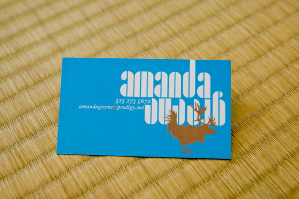
Amanda Greene

November 8, 2008

Identity for Los Angeles photography studio, Amanda Greene Photography.

Alan Jackson

November 8, 2008

2007 tour shirt graphics for American country star Alan Jackson.

AFI

November 8, 2008

Shirt graphics for Bay Area alt rockers AFI.

Nike “Train To Win”

November 8, 2008

Product line book and DVD for Nike’s Asia Pacific region. Using a mix of stocks and printing processes, I worked with long time collaborator Joshua Berger of Plazm to design this book emphasizing today’s training results tomorrow. Mixing stellar product shots, action photography of Nike professional athletes, forceful typography, and subtle lighting effects, this book is a great overview of Nike’s 2008 line of workout wear. The book mixes high-gloss and uncoated stocks, coated and uncoated printing, spot varnishes, foil stamping, custom die cutting, and French-fold binding.

Néojaponisme

November 8, 2008

Art direction for Neojaponisme, an online journal on Japanese culture, art, literature, and design. Since founding the site with W. David Marx in 2007, we have been a leading provider of news about Japan to the world. Aside from general art direction, I write weekly articles for the journal, as well as providing most editorial illustration. I’ve curated a number of series of content, including photography, illustration, and assorted MP3 podcasts. The aesthetics of the website are rooted in Bauhaus-era avant garde literary journals.

The website lives off the web in the form of a traveling exhibition called Meeting Modernity.

My Alphabet

November 8, 2008

Originally published by my old small publishing imprint, Migraine, in 2000, the layout was revisited for a limited reprint in 2004 of 1000 copies each as promotional material for my type foundry, Wordshape. Written by Patrick Mullins, My Alphabet Volumes 4 & 20 chronicle the beginnings of lexicography (reference books) and timekeeping.

To quote the original Migraine catalog text about the My Alphabet series, “This series of publications is specifically designed to assist the historically challenged young people of early twenty-first century western nations to reach a broader understanding of certain things they may encounter in everyday life. A wide variety of commonplace concepts and topics, including but not limited to: the dictionary; timekeeping; the library; and the making of maps are vigorously researched, given deep consideration and then glossed over in a mock-academic tone (adopted by the author especially for this publication) which has caused at least one reader to remark, “It gave me a headache”.

The magazine is sadly out of print, but can can be downloaded in pdf format from Wordshape here.

Lesque Fall 2008

November 8, 2008

Skateboard deck graphics for Lesque Skateboards, an independent skateboard company based in Tokyo and Transworld Skateboarding Japan’s 2008 Team of the Year.

Japan PDX Imports

November 8, 2008

Identity positioning package for Japan PDX Imports, an importer of right hand drive vehicles to the United States from Japan. Identity includes all interior and exterior retail signage, stationery, apparel, and web design.

Parallel Strokes

November 8, 2008

Parallel Strokes is a collection of interviews with nineteen contemporary typeface designers, graffiti writers, and lettering artists around the world. The book is introduced with a comprehensive essay charting the history of graffiti, its relation to type design, and how the two practices relate in the wider context of lettering.

Interviews within include conversations with pan-European type design collective Underware, Japanese type designer Akira Kobayashi, American graffiti writer and fine artist Barry McGee/Twist, German graffiti writers Daim and Seak, American lettering artist, graphic designer and design eductor Ed Fella, among others. Parallel Strokes is an enquiry into the history, context, and development of lettering today, both culturally approved and illicit.

Parallel Strokes spun out of my CalArts Graphic Design MFA thesis. I designed and self-published the book in 2008 after years of intermittently writing it and collecting visuals.

The book was released via my publishing imprint, Wordshape, in an edition of 1000 and sold out within a few months. The 240 page book was printed with a one-color interior on matte paper with a metallic 3-color UV gloss cover.

I also designed and released a number of promotional items for the book’s release. These included canvas tote bags in 2 color options, a blue/blue split-fountain screenprint and a magenta/Rubine Red split-fountain screenprint. I also designed a two-color 18″ by 24″ poster that featured the entire book laid out in thumbnail format. With a magnifying glass, one wasn’t required to buy the book- you could just squint and read the poster.

Though sold out, you can still see the Parallel Strokes website here.

Parallel Strokes

November 8, 2008

Parallel Strokes is a collection of interviews with nineteen contemporary typeface designers, graffiti writers, and lettering artists around the world. The book is introduced with a comprehensive essay charting the history of graffiti, its relation to type design, and how the two practices relate in the wider context of lettering.

Interviews within include conversations with pan-European type design collective Underware, Japanese type designer Akira Kobayashi, American graffiti writer and fine artist Barry McGee/Twist, German graffiti writers Daim and Seak, American lettering artist, graphic designer and design eductor Ed Fella, among others. Parallel Strokes is an enquiry into the history, context, and development of lettering today, both culturally approved and illicit.

Parallel Strokes spun out of my CalArts Graphic Design MFA thesis. I designed and self-published the book in 2008 after years of intermittently writing it and collecting visuals.

The book was released via my publishing imprint, Wordshape, in an edition of 1000 and sold out within a few months. The 240 page book was printed with a one-color interior on matte paper with a metallic 3-color UV gloss cover.

I also designed and released a number of promotional items for the book’s release. These included canvas tote bags in 2 color options, a blue/blue split-fountain screenprint and a magenta/Rubine Red split-fountain screenprint. I also designed a two-color 18″ by 24″ poster that featured the entire book laid out in thumbnail format. With a magnifying glass, one wasn’t required to buy the book- you could just squint and read the poster.

Though sold out, you can still see the Parallel Strokes website here.

|