Slanted Experimental Type 3.0

I have a new essay “The Syntax of Seeming Destruction” in the latest issue of Slanted devoted to experimental type and typography. Check it out here: https://www.slanted.de/experimental-type-3-0/

I Blame the Sun: The Making of a Book About Japanese Design History

Folks keep asking me about the process of putting together my new book Fracture, so I wrote an essay about it which you can read here: https://medium.com/@ianlynam/i-blame-the-sun-the-making-of-a-book-about-japanese-design-history-ee6de726181b

Slanted no. 44: Type Fashion

I have a new essay in Slanted no. 44, all about typography integrated into fashion.

The essay is called “The Blob, or A Tale of Two Cities”.

It is about a streetwear brand that I started in Portland which failed miserably and Sailosaibin, the shop/clothing brand that Yuki and I do today in Tokyo.

Fracture: Japanese Graphic Design 1875–1975

15 years in the making, my book Fracture: Japanese Graphic Design 1875–1975 is available for pre-order now!

War with Myself book trailer

We made a trailer for my new book. You can view the trailer here: https://www.youtube.com/watch?v=fc63GInFDT8. It was shot, directed and edited by Kyle Broyles.

Unrealized Archive

My contributions to Unrealized Archive no. 4 were collected in a print edition from Stripe.

Collision

I wrote the preface for the new book Collision by Lars Harmsen, published by Slanted. Check it out here!

The Nest

I have two new essays in The Nest by Scott Massey.

The Nest is a book about process—the process of designing, and how it changes both what we make and who we are. The Nest is also a book about memory—how memory builds up in layers and influences our experiences, as well as the things we make. The focus of The Nest is a series of posters created in celebration of the exhibition Inside Out & Upside Down: Posters from CalArts 1970–2019. The Nest documents Scott Massey’s use of appropriation, collage, layering and re-working to generate 200 unique and vibrant compositions that each tell a different story about creative discovery. 

Obtain The Nest here.

Slanted 40: Experimental Type

I have a new essay in Slanted no. 40. The issue’s theme is “Experimental Type”. My essay is called “My body isn’t a temple. It’s a laboratory. With salad.” It’s about experimental typing instead of experimental typography or type design. An excerpt:

“Type” has many meanings, but “type“ is also a verb, as in “to type”. The verb form is what I’d like to invoke in this piece of writing.

To summon.
To conjure.
To project.
To call forth.
To harness.
And hopefully, with which to *coalesce*.

Slanted 39

I wrote a new essay called “Very Mercenary” for the newest issue of Slanted, devoted to Stockholm, Sweden. The essay is about Stockholm Syndrome and how graphic designers often develop a variation of this condition when working with clients. The intro:

It had been a real homewrecker of a day.

I was holed up in my garret on Svartesgatan, looking down on Södermalm splayed out below me, calculating my next steps. I had the tools. I had the optics. I had everything I needed… except for that one particular, very, very tricky piece: a target.

Clients had been easy to come by the past few decades, but then things got weird—the clients started outsourcing their hits to cheaper labor elsewhere. It didn’t matter that I had a perfect kill rate, not to mention that my “Hotness” rating online was 4 out of 5 chili peppers. For the clients, it was all about what they were spending… good clean hits were out. Working alongside the elite culled from the best of the best was out. No jungle action. No desert heat… No stormed embassies… No ghost platoons…

Given the context of this essay, it is obvious that I am writing about freelance graphic design, though if we turned the clocks back a few decades, this would’ve been a pitch-perfect introduction to one of your typical super-shitty novels about a mercenary.

Get Slanted 39 here: https://www.slanted.de/product/slanted-magazine-39-stockholm/

Impossibility of Silence talk recording

You can view the recording of the 2022 AIGA talk I gave recently here: https://youtu.be/tpuwCu48k9Y

I Got Something to Say — Poster Inventory, 2013–2021

I have a new essay called “Press Darlings” in the new book I Got Something to Say from Draw Down Books.

The book is an inventory of posters produced by Draw Down Books for art book fairs, workshops, and lectures between 2013 and 2021. Documenting Draw Down’s activities throughout the period, the publication also graphically maps the contours of the artist book publishing world during the second decade of the 21st century. A series of reflections and essays by prominent graphic designers provides context and insights, providing readers with new ways of considering their own poster-making and event documentation.

You can grab a copy here.

IDEA #397

I have a new feature in IDEA #397, the first in a four-part series called “Critique & Context” about the role of critique, criticism, semiotics, and cultural context that will roll out over the year. You can obtain a copy here.

AIGA Design Future

Design Future Live with Ian Lynam
Wednesday, March 9
8:00 p.m. ET | 5:00 p.m. PT
(Thursday, March 10 at 10 a.m. JST)

Join host Lee-Sean Huang for Design Future Live, an interview show about how the design industry is changing as a discipline and opportunities this creates for the design community. In this episode, we will be talking with VCFA MFA in Graphic Design faculty member Ian Lynam about his book, The Impossibility of Silence: Writing for Designers, Artists & Photographers. The presentation and interview will be livestreamed  (via YouTube) and on AIGA’s LinkedIn and Facebook pages at 8 p.m. ET on Wednesday, March 9, 2022. You can catch the replay after the livestream on AIGA’s podcast feed.
https://www.aiga.org/inspiration/talks/ian-lynam-design-future-live-with-ian-lynam

Slanted “Colours”

I have an essay in the 38th issue of Slanted, which you can obtain here. The essay is called “Other Processes” and examines process printing as an analogue for systematic racial representation in Japanese popular culture.

Which Mirror Do You Want to Lick?

30 or so Minor Objects: Japanese Graphic Design History is a new 130-page bilingual E/J book on pre-WW2 design history that I put together with the students in my Japanese Graphic Design History class at Temple University Japan for the exhibition “Which Mirror Do You Want to Lick?” at Geidai (Tokyo University of Fine Arts).

I participated in a panel discussion with fellow curators Kiyonori Muroga, Tezzo Suzuki, So Hashizume, and Tetsuya Goto on October 22 where we discussed the exhibition. The “talkshow” was broadcast online.

“Design & Consumerism of Modern Japan”

I gave a talk with Sakura Nomiyama called “Design & Consumerism of Modern Japan” at Hong Kong’s CHAT @mill6chat on Oct. 19. Within, we looked at the emergence of the department store as a site of consumption in Japan and offered up one particular narrative about the emergence of Westernization.

TypeCon 2021

I presented at TypeCon 2021 on October 21st. A bit about what I presented:

Ghost Story / Love Story (or How I Learned to Love the Dead)
We have all been told that there are things that we are “not supposed to do” regarding design. This is a story about denying that, and both a love story and a ghost story. Or rather, multiple love stories and multiple ghost stories … with surprising outcomes.

This hybrid presentation looks at rare, forgotten, lost, and deceased punctuation marks, then segues into a short jaunt in a time machine back to the 1990s, another hop back to the 1920s, and finishes in the present day in Tokyo.

This presentation will delight those interested in rarified typography, type/design history, the odd romantic, and anyone yearning for a cheeky mystery solved in front of them.

Unrealized Archive 4: Lost Olympics

In honor of the Tokyo 2020/21 Olympics, which are currently underway, Bay Area design educators Chris Hamamoto and Jon Sueda have curated the next iteration of the Unrealized Archive series – Unrealized Archive 4: Lost Olympics – a storefront window exhibition at IF/THEN Studio in Berkeley and an accompanying publication to come. The exhibition will be on view for the duration of the Olympic Games Jul 23 – Sun, Aug 8, 2021 and is viewable from the street.

Unrealized Archive 4: Lost Olympics
Jul 23, 2021 – Sun, Aug 8, 2021

Featuring works by: Betsy Bickle, Cyan, Daniel Eatock, Experimental Jetset, Ian Lynam, and Chris Ro


The Tokyo 2020 Olympics was postponed one year ago and is one of the most high-profile global events affected by the COVID-19 Pandemic. On the occasion of the rescheduled games of the XXXII Olympiad set to open on July 23rd, the Unrealized Archive will focus on the unrealized Olympic design of the 20th and 21st centuries. Embodied as a storefront window exhibition and accompanying publication, UA4 will explore unrealized Olympics emblems from host cities not selected, Olympic design discourse, and speculative design for the Olympics. A transnational sporting event, the Olympics is a proxy for establishing countries on a world stage, confirming their status in the commercial world order via architecture, urban planning, and the construction of visual identity. Under the jurisdiction of the International Olympic Committee (IOC), a non-governmental sports organization based in Switzerland, countries compete for the right to host the games and navigate global politics for the right to visual representation within them. In UA4 the curators collected graphic artifacts that are the outcome of this tenuous process, symbiotic commercial endeavors, and fictitious responses to the Olympic games.

Unrealized Archive 4: Lost Olympics
IF/THEN Studio
1102 Gilman St.
Berkeley, CA, 94706

Pillow Lava

I recently gave a lecture in the disruptive and playful 24-hour art and design global lecture marathon Pillow Lava School.

D&AD Pencil

Ian Lynam and Iori Kikuchi picked up a D&AD Pencil for their contribution to the publication LogoArchive Akogare. Check it out here: https://www.dandad.org/awards/professional/2021/234247/logoarchive-akogare/

Art Platform Japan

I’ve had the extreme pleasure of working with an amazing team at Bunka-Cho, Japan’s Agency of Cultural Affairs over the past year to develop a series of multiplex typographic approaches to a large number of translations of seminal pieces of Japanese art, art history, theory, and criticism. You can check them all out here on the Art Platform Japan website: https://artplatform.go.jp/

VCFA Global Studio Sessions Asia

As part of the upcoming Spring 2021 Residency, VCFA MFA in Graphic Design is excited to announce our Global Studio Sessions event on April 6th, 7pm EST with featured guests designers!: James Chae, Kaitlin Chan, and Sakura Nomiyama, based in Seoul, Hong Kong, and Tokyo respectively. Ian Lynam moderated the event.

Asano Dental Clinic

New work: identity for Asano Dental Clinic in Kaminoge, Setagaya in Tokyo.

The identity was a labor of love with polymath producer David Guarino.

10th Anniversary Limited Edition bGeigie from Safecast

Just designed and released: the “10th Anniversary Limited Edition bGeigie” Geiger counter designed for Safecast’s now-decade-long adventures in citizen science.

The 10th Anniversary bGeige features a UV-printed and etched faceplate, as well as interior and rear plates.

Collage Club & Writing Roundtable

Some upcoming events courtesy of VCFA! Email danielle.dahline@vcfa.edu to RSVP!

Hebi Metal

Logo for Hebi Metal, a stationery startup here in Tokyo. “Hebi” means “snake” in Japanese, and snakes don’t have arms, so it is just extremely silly that a snake might try to be a shredder on electric guitar. Hebi Metal makes very silly greeting cards, hence this very silly logo.

Trip to Japan Graphics: Must-Visit Design Destinations in Tokyo

TRIP TO JAPAN GRAPHIC is the first in a series of bilingual guidebooks that allows readers to explore Japan’s visual culture with the help of art and design professionals. This 150-page, pocket-size book focuses on Tokyo, with design experts like Kenya HaraIan LynamKiyonori Muroga, and Sakura Nomiyama sharing the very top art and design spots in the capital of Japan!

Additionally, the cover folds out into a handy map of Tokyo with all of the locations within noted clearly in Japanese and English.

Get your copy here: http://wordshape.com/trip-to-japan-graphics-must-visit-design-destinations-in-tokyo

Logo Archive – Akogare 憧れ

I contributed an essay to the latest issue of Logo Archive, translated by my erstwhile colleague Iori Kikuchi.

Format A5 Booklet
Pages 24pp + 2pp Insert
Paper: Takeo Tela & Takeo Pachica
Ink: Process Black
Stitching: Unbound
Design: Hugh Miller
Editor: Richard Baird
Print: Identity Print

Wada Sanzō

I wrote an essay months ago now for Dain Blodorn Kim’s digital homage to Japanese color theorist Wada Sanzō: https://sanzo-wada.dmbk.io/

CalArts T-shirt Show 2020

I designed a highly referential tee shirt about CalArts-related publications, studios, adjacent musics, and other stuff for the upcoming CalArts t-shirt show.

Mystery Meat

I designed the flyer for the latest installment of Mystery Meat, Tokyo’s hottest punk DJ night. I was honored to get to play that night, as well.

Slanted 36

I have a new essay called “The Protagonist” in Slanted #36, which you can check out here: https://www.slanted.de/product/slanted-magazine-36-coexist/

This issue’s theme is coexistence. It’s a thick one!

Decolonizing Design

I have a new essay in Japanese up over at the JAGDA Graphic Design Review blog about the Design Decolonization movement. You can see it here: https://gdr.jagda.or.jp/articles/16/

Coloring Inside the Lines. Coloring Outside the Lines.

I wrote the zine Coloring Inside the Lines. Coloring Outside the Lines. a few years ago. It contains basics for the impending graphic design graduate, and with the current global pandemic, students poised to enter the workforce need more help than ever.

Our publishing unit Wordshape has released a digital version of Coloring Inside the Lines. Coloring Outside the Lines. for free over on Medium.com. You can check it out here:
https://medium.com/@ianlynam/coloring-inside-the-lines-coloring-outside-the-lines-9a95c0956213?source=friends_link&sk=989e6624420e818b28065ded24d4a5c6

The Graphic Design Review

logo_gdr

I’ve been invited by JAGDA (Japan Graphic Designers Association) to become one of the founders and board members of a new online publication called The Graphic Design Review. GDR is a site about graphic design centered on information and criticism published by the JAGDA Digital Media Committee. In addition to introducing contemporary aesthetics, we will explore contemporary graphic design from a wide array of cultural contexts and approaches.

Our board includes Editors Kiyonori Muroga and Tetsuya Goto, Ayumu Higuchi, and Yasushi Nagahara (Chairman of Digital Media Committee).

Check out GDR here: https://gdr.jagda.or.jp/

(GDR’s content is currently Japanese language only.)

Corinthians000.com

corinki

New website for Corinthians, my collaborative research and curatorial practice with the inestimable Renna Okubo, developed by the unparalleled Maggie Barrett.

A New Dawn For All

ANewDawnForAll-badge-logo

We designed a new identity and website for the Arizona 503(c) non-profit organization A New Dawn For All.

anewdawnforall.org

The founders of A New Dawn for All recognize the growing need to support domestic violence victims and families to start anew. When someone is leaving a shelter or needing extra support, A New Dawn provides families with home goods (big or small) and resources so that they have one less stress for their new beginning. A New Dawn’s mission is to guide all towards positive, healthy home environments that will improve their lives as well as others in the community. A New Dawn provides mindful education and developmental opportunities for individuals to promote stable, supportive environments leading to happier, healthier lives.

Slanted #35 – LA

Slanted-Magazine-35-LA_03

I’m very excited to announce that the latest issue of Slanted is out now. Last summer, Slanted Publishers’ co-founder Lars Harmsen and I headed to LA to meet with a wide array of designers, design educators, design critics, architects, artists, signpainters, and illustrators to put together this issue. Check it out here: https://www.slanted.de/product/slanted-magazine-35-los-angeles/

Collage Club

COLLAGE_CLUB

I led a free online lecture and workshop called “Collage Club” on April 26 for the VCFA MFA in Graphic Design.

Lecture description:

Due to the incredible reliance on digital tools today, let’s turn to making some visual work with our hands instead—both individually and collectively. Collage is both a method and a strategy that gets overlooked in regards to graphic design, despite being part and parcel of graphic design. Collage is one method for making work that exudes design authorship, stands out from the pack, and can help imbue your design work with visual authorship.

After a brief and very cursory look at influential collage from the 1970s through today (AKA Ian’s wildly subjective take on what he terms “The Collage Canon”), workshop members are invited to explore the catharsis of making analog collaged compositions together. While there is a relatively brief presentation component, this workshop is intended to allow us all to slow down, focus in ways we might not do normally, consider our aesthetic choices, chat, cut and paste, but most of all: be together.

More info: https://perpetualbeta.vcfa.edu/2020/04/21/vcfa-mfa-in-graphic-design-free-public-lecture-workshop/

Persist & Resist

p&r

Logo design for Arizona-based grassroots Democratic political advocacy group.

Glot Round

Glot-Round001

Glot Round is a ten-member flared terminal sans serif family of typefaces based on a mix of proportions of Roman square capitals and hyper-readable sans serifs with slightly rounded corners.

Glot-Round002

Glot Round comes in five weights with matching true italics: Light, Regular, Medium, Bold and Black.

Glot-Round003

The Glot family has a wide range and is incredibly functional, working well for longer texts as well as display typography.

Glot-Round004

After designing the house typefaces for a handful of the most predominant multi-player online games out there, we decided that it was time to bring the battlefield to the people.

Glot-Round005

Glot Round comes armed with ample language support (Central, Eastern, and Western European) and OpenType ornamental spiked alternate characters for when one needs a hint of danger.

Glot-Round006

You can license Glot Round here: http://wordshape.com/font/glot-round/

Glot-Round007

I’m A Design Student—What Happens Next?

I was interviewed along with my VCFA co-conspirator Silas Munro, pal Mitch Goldstein, and four other design educators about life for students after the current pandemic on the AIGA Eye on Design blog.

You can read it here: https://eyeondesign.aiga.org/im-a-design-student-what-happens-next/

Some of the interview questions that were not published, but for which I think I provided snappy answers:

Are there specific design jobs or design skills that are more likely to get through this crisis without much disruption, and others that will be hit harder?

Hands down, education. I have found that most realms of design are incredibly fickle during an economic downturn, and teaching is something that has relative stability. Sure, it is not glamorous, but you get to go into interesting, speculative situations every day and talk to really nice people who are smart.

For over a decade, there has been a “brain drain” on graduate education because the technology sector just paid *so much* more, so many folks who would have taught instead turned to tech. I imagine that the current crisis will make technology companies ask their workers to do much more for much less money. (That would be the rational business move.) I think that right now is really the time to get into design education if you are so inclined. If you have a terminal degree, you can teach while still doing your ‘fabulous’ tech work.

When this is all over, how do you think this will change the structure of the design industry or design education?

I feel like this is all a giant dry run for the future. This is a time in which companies and clients are seeing how much labor they can extract from people working from home so they don’t have to pay for real estate, pay annual salaries, pay benefits, or generally do the things that Fordist companies did for their employees once upon a time. I can literally envision in my mind hundreds of HR people on the high administration level in tech companies just rubbing their mitts right now in anticipation of the future and what this very moment means for tomorrow’s shareholder profits.

What can we learn from this experience of working and teaching remotely that will help to make our jobs and classrooms more flexible/adaptable to change and more accessible to designers from marginalized communities?

I would counter that with two rhetorical/not rhetorical questions for you:

1. Do you think that flexibility and adaptability are necessarily good traits?

2. Socioeconomically, we have seen that it drives down the amount of money that people make and increase labor exponentially. Is that what we want from the future?

IDEA #389

IDEA389-001

Issue #389 of IDEA examines “the f-word”… That’s right: Feminism, the notion that all genders are equal. The first third of this issue of IDEA looks at the work and struggles of contemporary Japanese and Korean female graphic designers, exhibitions about their work, and so much more. It also includes histories of important global feminist graphic designers and helps to chart a course of feminist herstory throughout graphic design.

IDEA389-014

I wrote two biographies for this issue: one of Yale’s Sheila Levrant de Bretteville and one of CalArts’ Lorraine Wild. I’m very excited to have been asked to write these, notably Lorraine’s.

IDEA389-015

Lorraine has been a mentor and friend for many years and who is someone I find to be incredibly inspirational.

IDEA389-020

My Corinthians partner Renna Okubo and I also put together a special Japanese and English supplement insert for this issue titled “The Global Style: Modernist Typography After Postmodernism”.

The primary text is by another mentor and friend, Mr. Keedy. It is about the style of graphic design after Postmodernism and is accompanied by two texts written by me that help to contextualize exactly what “The Global Style” is.

Contents:

The Global Style: Modernist Typography After Postmodernism
Text by Mr. Keedy, Ian Lynam
Design by Yuta Murao
Translation by Shu Kuge, Emma Okubo

Introduction: Understanding the Global Style
Text by Ian Lynam

The Global Style: Modernist Typography After Postmodernism
Text by Mr. Keedy

Commentary: Multiple Modernisms
Text by Ian Lynam

You can pick up IDEA #389 here: http://wordshape.com/idea-389-feminist-moments/

TUJ Media Lab

IMG_0030

Just finished: a new wall supergraphic for Temple University Japan Campus’ Communication Department Media Lab.

IMG_0038

The supergraphic will serve as the backdrop for TUJ broadcast projects.

IMG_0024

The supergraphic was sponsored by the Kal & Lucille Rudman Family Foundation of Philadelphia.

IMG_0027

Reindeer Games

5348extra

I have a new essay called “The Small Olympics” published in The Asia Pacific Journal’s Japan Focus online peer-reviewed journal.

Japan has a pervasive and problematic history based on design by consensus and speculative labor for the design of past Olympic Games as much as for the upcoming Games. The 2020 Games have been defined by design competitions, events where individuals volunteer to create visual graphic works without financial reward for the time and labor spent. This devaluation of creative work helps explain why Tokyo is swathed in mediocre Games-related visuals.

You can read it here: https://apjjf.org/2020/4/Lynam.html

AIGA Grow Conference Keynote!

general_LINKEDIN

I’m thrilled to announce that I’ll be giving the keynote lecture for AIGA Austin’s GROW Conference: http://growwithaiga.org/

2-general_GROW

I’ll be speaking about methods and methodologies for constructing both design criticism and critically oriented graphic design.

keynote_IAN

Friend and VCFA alumnx Shruthi Manjula Balakrishna will be presenting, as well as friend and fellow CalArts alum Tuan Phan will be leading a workshop.

4-general_GROW

My lecture will be followed by activation workshops where participants will get to explore constructing critical design methods.

Ouzuri

ouzuri-logo

Another recent project: the identity design for Ouzuri, a line of contemporary variations on zori, traditional Japanese footwear that are worn with kimono.

ouzuri3

The project includes logo design, color palette and typographic palette development, the design of printed collateral, positioning strategy and copywriting. I am particularly happy with the tagline that we came up with for Ouzuri: “The Future of Tradition”.

ouzuri1

Visit the Ouzuri website here: https://ouzuri.stores.jp/

Eleven Arts logo design

I recently designed the logo for Los Angeles-based anime distribution and production company Eleven Arts.

Modes of Criticism #5 – Design Systems

Onomatopee-145-3-Magazine-Reader-3

I have a new essay called “Anything With A Shape Cannot Be Broken” in Modes of Criticism no. 5. The theme for the issue is “Design Systems”. My essay explores the imperialist suprematist ideologies behind pre-WW2 Mingei crafts of Japan and how those ideologies are linked to culturally suprematist ideologies lurking beneath the seemingly anonymously designed surfaces of MUJI products.

MoC4-Img06-NEW-738x492

I also explore links between fascism in both European and Japanese Modernism, implicitly/explicitly exploring how “less is more” and “problem solving” are the rhetoric of genocide.

Thanks to Francisco Laranjo for inviting me to participate. One can obtain a copy of MOC5 here: https://www.onomatopee.net/exhibition/modes-of-criticism/#publication_10381

This is hardcore.

Ian Lynam zines

I was interviewed over on the AIGA Eye on Design blog along with Kathleen Sleboda, Christopher Sleboda, and Kristian Henson about the DIY hardcore punk movement of the late 1980s and 1990s and about our collaborative book Hardcore Fanzine which came out this year. You can read the essay here: https://eyeondesign.aiga.org/this-is-hardcore-the-huge-impact-of-a-niche-movement-on-graphic-designers-today/

ServiceNow

servicenow001

Just installed: a number of big supergraphics treatments for the interior design of ServiceNow’s new Tokyo offices.

servicenow002

Walking into the ServiceNow (https://www.servicenow.com/) offices, staff and clients alike are greeted by giant graphic treatments that Pascal Santoso and I put together to encourage sales, support, and congeniality!

servicenow003

Thanks to Jordan and Ben at AXES Partners for inviting us to work on this project, as well as thanks to Chris, Tonya, and the team at ServiceNow.

servicenow004

Universal Lunch

ul_general_promo_600x600

I was so lucky to be invited to participate in the livestreamed and recorded interview/conversation series Universal Lunch (Un)Common Hours curated by Design Inquiry and hosted by Gabrielle Esperdy and Jimmy Luu.

ul_promo_ian_denise

I and Denise Gonzales Crisp got to chop it up with Gabrielle and Jimmy for an hour or so—you can check out the recorded video here shortly: https://www.youtube.com/user/DesignInquiry/videos

Visual Strategies for the Apocalypse wins STA 100!

Very excited to announce that my recent publication Visual Strategies for the Apocalypse won the STA 100 design competition — for 40 years, Chicago’s Society of Typographic Arts has held this competition which awards the top 100 pieces of typography in North America. Read more: https://100.sta-chicago.org/winners

2019/2020 Yearbook of Type

I have a new essay titled “A Futuring: Frugality, Online Dating, and Some Rain” in the 2019/2020 Yearbook of Type just released by Slanted Publishers in Germany. Check it out here: https://www.slanted.de/yearbook-of-type-2019-20-out-now/

Slanted-Yearbook-of-Type-2019_01

The Yearbook of Type is now in its 4th edition: 158 typefaces from 178 designers from around the world are presented in this 400-page, colorful, and gobsmackingly typographic book. The Yearbook of Type is both a practical guide that helps users navigate the diverse, ocean-like, typographical landscape, as well as a critical guide to the best type today.

Slanted-Yearbook-of-Type-2019_04

The highlights in short:

– Detailed presentation of 158 recent typefaces
– Ample background information
– Index of typeface classifications
– Index of all 176 type designers and 98 foundries from 36 countries
– Explanation of all OpenType features
– Essays, interviews, and tutorials by Pedro Amado, Massimiliano Audretsch, Bianca Berning, Ian Lynam, Lilo Schäfer, Rainer Erich Scheichelbauer, Mark van Wageningen, Amber Weaver, Stefan Willerstorfer, Anuthin Wongsunkakon, and Benjamin Wurster
Microsite online linking the typefaces directly to the foundries’ websites

Slanted-Yearbook-of-Type-2019_25

Radical Empathy

I just published “Radical Empathy“, a transcription of the welcome speech to the VCFA MFA in Graphic Design Fall 2019 Residency. You can read it here.

The Thing in DesignInquiry’s Futurespective

TheThingFront-Cover

The Thing is included in DesignInquiry’s Futurespective exhibition Readin Room at Maine College of Fine Arts presently.

More: https://designinquiry.net/projects/futurespective/

Temple University Japan Sangenjaya Campus

tuj1

I’m very excited to announce that the new TUJ campus in Sangenjaya is open!

tuj2

I worked with TUJ, James Lambiasi Architect and Gensler as a consultant for the interior design, identity, and signage for the university, an institution where I have taught for over a decade. I am very excited for this new phase and am looking forward to the future!

Hardcore Fanzine

GP

I have a new essay in the book Hardcore Fanzine out now from Draw Down:

Focused on seven issues of Good and Plenty fanzine produced in the late 1980s/early 1990s, Hardcore Fanzine looks at the series through the lens of graphic design and typography, as a project that reflected and embodied technology of the period. Contributions from graphic designers, graphic design educators, and hardcore enthusiasts trace the history of zines and photoduplication; the idea of the body in punk and hardcore; how zine-making created community and alternative social space in a pre-Internet era; key typefaces used in straight edge iconography; and the importance of zines to successive generations of designers.

Good and Plenty was published as a labor of love and fandom by Zion, Illinois’s Gabe Rodriguez. Originally produced as a collaboration with friend Mike Good, Rodriguez took over editing and production of the zine, assisted by a team of friends and helpers. With their assistance and a network of fans from around the country and the world, Good and Plenty featured original photography documenting shows by Gorilla Biscuits, Judge, Bold, and other hardcore bands of the period; band interviews; reviews of shows and record releases; and essays by Rodriguez and friends (including Alyssa “Blowing Chunx” Murray and Kim Nolan) on a range of topics beyond music—from vegetarianism, women’s rights, gender relations, and straight edge, to racism, pop culture, and the Iraq War.

A text by Walter Schreifels—American musician, member of Gorilla Biscuits, Youth of Today, Quicksand, and many other bands—places G&P in historical context, outlining the context for individual issues and highlighting specific moments in the cultural and sonic landscape.

Hardcore Fanzine includes the full reproduction of all seven issues of Good and Plenty plus reproductions of a selection of the zine’s original paste-ups and photography.

With text by Walter Schreifels
Preface by Gabe Rodriguez

Contributions from Kristian Henson, Briar Levit, Ian Lynam, Gabriel Melcher, Anthony Pappalardo, Nate Pyper, Ali Qadeer, and Gabe Rodriguez

Designed by Partition

Published by Draw Down Books, 2019

Softcover, 144 pages, 2-color offset printing, 6.5 × 9.5 inches

ISBN: 978-0-9857337-9-7

Get it here!

CRITIQUE: THE WAR OF DESIGN

At the printer now: a new 64-page zine about critique called CRITIQUE: THE WAR OF A̶R̶T̶ DESIGN, which is available for pre-order here: http://crit.wordshape.com.

A bit ago, a book about critique with the subtitle “A Student Manual” came out, but it sure didn’t feel like it was for students… or teachers, particularly of graphic design. I thought that the topic was deserving, so I wrote it, illustrated it, and designed it.

Edited by the intrepid Taro Nettleton and offset printed in 3 colors in Niigata, Japan with wraparound covers, CRITIQUE is an approachable and relatable guide to considering critique and criticism from a variety of viewpoints. Pre-orders receive bonus stickers and Risograph posters! Imagine: it’s like Kickstarter, but the project is already at the printer! You can’t lose! Also contains silly drawings of snakes playing saxophones! 🎷🐍 And a semiotics primer for the layperson! You too can ⚡️master⚡️the science of signs, symbols, and meaning! Order now! http://crit.wordshape.com

ATypI Tokyo 2019

I just gave a talk at ATypI Tokyo 2019 called “From Bijin-ga to Brutus”, which is derived from the latter part of my recent publication The Thing.

“From Bijin-ga to Brutus” is one of the least known stories in Japanese graphic design history is the emergence of Sun Studio / サン・スタジオ, one of Japan’s very first graphic design studios.

Sun Studio was run by poster designer Hokuu Tada / 多田北烏 (1889–1948), who influenced countless early graphic designers and typographers in Japan in the Taishō and Shōwa periods through his contributions to the literature of nascent commercial art. Posters designed by Tada for Kirin Beer festoon countless businesses in Japan today, intimating a sense of nostalgia and history in the bustling megalopolis—yet the story behind them is largely unknown.

Another important figure, one whose story has largely been disconnected from greater Japanese graphic design history, is Seiichi Horiuchi/ 堀内誠一 (1933–1987), whose design work for Japanese lifestyle magazines largely defines Japanese consumer-fashion culture today.

This heavily illustrated presentation will explore the direct historical connection between Tada and Horiuchi—from the birth of commercial art (商業美術) in Japan to the refinement of graphic design (グラフィックデザイン), helping to contextualize both historical and contemporary graphic design and typography.

Read more about the presentation here.

Arrow of Light

arrow_of_light1

I designed two logos for the Portland, Oregon supergroup Arrow of Light. This is one of them.

arrow_of_light2

This is the other.

arrow_of_light3

I also designed two new 24″ x 36″ fluorescent posters for them. Get them at their debut show!


DWPA!

dwpa

A recent logo design for the Democratic Women of the Prescott Area, as a feminist and an overseas voter in Arizona, it is a group that I am very proud to support.

Women have always been a key part of Arizona politics.  Jerry Emmett, the founder of the DWPA, who is now 104 years old, reminds us that in Arizona, women had the right to vote and hold office in 1912 as part of the state’s constitution eight years before the 19th Amendment to the U.S. Constitution. The DWPA seeks to encourage women to participate in all levels of service and government whether running for office, or assuming support roles and leadership positions in our community and in our state.

The Democratic Women of the Prescott Area’s mission is to engage, unite, and empower women to promote the principles of the Democratic Party and to attain public office and leadership positions in Arizona.

The cat’s out of the bag!

calarts

I’ll be joining the CalArts MFA in Graphic Design Program as Visiting Critic this year, with 3 residencies working with MFA students on their thesis projects.

Portland Stamp Company with Mr. Keedy!

portland-stamp-company-jeff-keedy-ian-lynam-stamps-MAIN-5ca69504e116a-1110

Out now: a poster stamp design for The Portland Stamp Company designed with CalArts faculty member and longtme Emigre contributor Mr. Keedy.

Poster stamps are a design format that I include in lectures about some of Japan’s earliest graphic design publications in my Japanese Graphic Design History class. I am super-pumped that Josh Berger of Plazm/Portland Stamp Company (one of the first people to have ever given me a design-related job) invited us to create one—it is like living history all over again!

Keedy and I were interviewed about our poster stamp design here:

https://theportlandstampcompany.com/artist-series/ian-lynam-x-jeff-keedy/

(Soundtrack.)

Arts Excursions Unlimited reboot

arts_excursions_unlimited

We just redesigned and relaunched Arts Exursions Unlimited’s website. Check it out here: http://www.artsexcursionsunlimited.com/

Arts Excursions Unlimited is a free, community-driven, monthly arts and cultural experience for residents in the Greater Hazelwood neighborhoods of Pittsburgh, Pennsylvania. We are incredibly proud of our work with such a driven, socially engaged arts initiative.

Total Armageddon

Slanted-Total-Armageddon_01

I am thrilled to announce that my newest book Total Armageddon is out now via Slanted Publishers.

Slanted-Total-Armageddon_03

When the Slanted editorial team asked me if I might be interested in editing a book that pulled the best writing from the first 32 issues of their magazine, I leaped at the chance. I invited some of my favorite design writers to contribute, as well, because I wanted Total Armageddon to be much more than just an anthology. I wanted it to stand as a mile marker in design theory, and I think it does just that.

Slanted-Total-Armageddon_02

Some of the best writing from the past decade-plus related to design is included, notably Randy Nakamura’s “On Equilibrium and Sottsass”, Natalia Ilyin’s “On Shooting Butterflies”, Kenneth FitzGerald’s “Singing the Surface” and Mr. Keedy’s “The Global Style”.

Slanted-Total-Armageddon_08

Total Armageddon is available here. I hope that you like it.

The Thing & Visual Strategies for the Apocalypse

New-titles-Update

I am very excited to announce that I have two brand-new booklets that just came out: The Thing and Visual Strategies for the Apocalypse.

TheThingFront-Cover-Update

The Thing is about the problematics of design, designers, and design history. It is an 88-page zine that examines thorny aspects of design, designers, and design history.

Also, The Thing glows in the dark.

TheThingSpread3

Topics within:
– Vikings
– Netflix binge-watching as a metaphor for lived experience
– Problematic relationships with objects
– Earthquakes which turned into literal firestorms which claimed the lives of hundreds of thousands of people
– Japanese graphic design history
– Picking locks
– Secrets behind how to edit
– Nostalgia
– Guilt and Shame

TheThingSpread4

You can see a microsite that I designed for The Thing here: http://thing.wordshape.com

VSFTAFront-Cover-Update

Visual Strategies for the Apocalypse is about overcoming what I term “Creative Constipation™”. It is a 112-page booklet with contributions from leading designers and design educators like Matthew Scott Barnes, Natalia Ilyin, Nikki Juen, Yoon Soo Lee, Matthew Monk, David Peacock, Michael Scaringe, and Lorena Howard-Sheridan, along with James Hultquist-Todd of JTD Type, James Edmondson of Oh No Type Co, visual artist Griffin McPartland, Adolf Loos and the late Koichi Sato.

VSFTASpread2

Topics within:

– The relationship between Big Tech and child labor
– The even more complicated relationship between Fast Fashion and Thor, God of Thunder
– Space, time and selfishness
– Contrast, cropping and partying
– Chance processes
– Imitation, flattery, history and desktop publishing
– Collage as strategy
– The function of drawing
– Ornament and making shit up

VSFTASpread5

More info about Visual Strategies for the Apocalypse is here in the micro-site that I designed for it: http://apocalypse.wordshape.com

Feature in IDEA/アイデア #385

I have a 32-page feature in the latest issue of IDEA magazine, Japan’s oldest and best graphic design magazine.

An excerpt from the essay that I wrote for the feature:

In Oregon, I discovered that graphic design was the formalized version of what I had been doing for the previous decade-plus making zines and went back to school to study graphic design, which I had previously called “layout”. I worked at a few design firms, and then was hired at small studio called Plazm where they had a massive collection of copies of IDEA, this very same magazine that you are holding in your hands. IDEA in the early 2000s was insane. Each issue was made with more love than any American graphic design magazine or book at that time—there were different papers, printing techniques, a lot of really weird content, tipped-in books, and posters folded in to the magazine. Seeing IDEA gave me an expanded notion of what graphic design could be, something that was very much missing from American design culture at that time.

It made me kind of hate American graphic design.

This magazine that you have in front of you changed my life. I am going to state this rather unequivocally: if I had not found IDEA, I think that my life would be very, very different, and I am quite sure that it would be an unsatisfactory version compared to the life that I have now.

Lynam-FK-April192.001

I mean what I wrote in IDEA #385. Being actually featured was something that I considered a total pipe dream for years, even having written for the magazine, designing many of the things I wrote, collaborating on curatorial and editorial projects with the former editor-in-chief Kiyonori Muroga, and maintaining friendships with the cast of characters that make IDEA happen four times a year for over a decade.

I am incredibly honored to be featured in the pages of IDEA. It was an invitation to the very last known dream that I have had of my career to date, and one that I dreamed of for twenty years.

385_cover1web

I would like to thank IDEA’s editor-in-chief Madoka Nishi for asking me to be included, and for allowing me to design and write the feature.

It is a very rare thing when one gets to curate their own content and to be trusted to do the right thing.

Randy Nakamura did a bang-up job of editing my essay, as he has always done, and Emma Okubo provided a faithful and accurate translation of my writing.

Martin Holtkamp shot beautiful portrait photography, something easier said than done.

Jeremy Lanig, Carly Diaz, David L. Reamer, Koichi Tomimura, Michael Holmes, Matthew Scott Barnes, Anthony Pagani, Mark/Naoki Rogers, Lars Harmsen, Hannah Smith, and Satoshi Aoyagi all provided amazing photography of assorted projects.

My dear VCFA alumni and friends Laura Rossi Garcia and Chad Miller graciously allowed their thesis work at VCFA’s MFA in Graphic Design program to be included, as well. (Their work meets at the critical juncture of feminism and hardcore—one of my favorite junctures.)

This feature, titled “Locality & Fracture” explains my practice that spans design research, design education, a commercial and cultural studio practice, and foray into type design exceedingly well. I am happy with how it turned out. I think you very well might enjoy reading it.

You can procure a copy here: http://wordshape.com/idea-385-locality/

Apparently I have to make up some new dreams now.

Total Armageddon

ta11

I recently edited a new book titled Total Armageddon for Slanted Publishers. It is a book about design. And culture. And complexity, notably how we, as a global civilization, deal with science fiction, taste, social media, the cities we live in, aesthetics, PowerPoint, burkas, authenticity, monuments, HIV, screens, representation, Big Tech, full-contact sports, and other thorny topics.

ta2

This book is full of essays culled from the first 32 issues of Slanted as well as new writing and writing from elsewhere, the leading international design journal, alongside a number of writings from elsewhere, all specifically chosen for this book. They include essays written by the most vital and vibrant global voices in writing on design and culture today from Europe, Asia, Africa, the Americas, and the Middle East. Writers like Natalia Ilyin, Randy Nakamura, Steven Heller, Piotr Rypson, Silas Munro, Gerry Leonidas, Yoon Soo Lee, Kenneth FitzGerald, Kiyonori Muroga, and a host of others.

ta3

In a world that feels like it is bursting at the seams due to overpopulation, climate change, economic downturns, strife, selfies, discord, and all-out war, we need somewhere to turn. Our mobile devices tell us that the Apocalypse is just around the corner … perhaps we just need to look the future in the face by examining the present and all of it’s designed faults, fractures, beauties, luminosity, issues, complexities, and cracked screens.

ta4

Welcome, friends, to the end of the world.

ta5

Publisher: Slanted Publishers
Editor: Ian Lynam
Release: March 2019
Volume: 400 Pages
Dimensions: 16 × 24 cm
Language: English
Printing: LE-UV offset + white (Vogl)
Paper: Holmen BOOK Extra 2.0 (Holmen Paper)
Cover material: Invercote G Metalprint (Iggesund Paperboard)
Typefaces: Beatrice (Sharp Type) and Edit Serif (Atlas Font Foundry)

Total Armageddon is available for preorder via Kickstarter now.

PechaKucka Night Tokyo

20190116_BrianScottPeterson_025_IMG_3916

I was so happy to present at PechaKucka Night Tokyo—the very last one at SuperDeluxe in its current location.

20190116_BrianScottPeterson_020_IMG_3901

Giant thanks to Brian Scott Peterson for both the invitation and the amazing photos, Astrid and Mark for the warm welcome onstage, and to everyone who presented.

The Universal Moment

um1

Wandered across this project from 2011 today—the design for the debut album by The Universal Moment.

um2

TUM is a Tokyo-based band that is fronted by two brothers who are incredibly nice people.

Glot

Glot-font-wordshape-1

We recently launched a micro-site for Glot, a ten-member flared terminal sans serif family of typefaces based on a mix of proportions of Roman square capitals and hyper-readable sans serifs. Read the story of Glot here!

Taiwan Poster Design Association biennial

I have some work in this upcoming exhibition and the resultant catalog:

The Annual Poster Exhibition of TPDA Member, Designer Submission Invitation, Awarded Entries of International Taiwan Postar 2018 “Love. Peace”
The exhibition begins on Dec. 15, 2018 (Sat.) to Dec. 25, 2018 (Tue.) in Taiwan Academia Industry Consortium K² Square, Kaohsiung, Taiwan.
The ceremony starts on Dec. 15, 2018 (Sat.) 2:00PM

Organizer: Taiwan Poster Design Association
The co-organizer: Kun Shan University Department of Visual Communication Design-Print Media Lab
Official Website: TPDA www.taiwanposter.com

Houston lecture

I will be lecturing in Houston, Texas at the University of Houston’s Katherine G. McGovern College of the Arts on Tuesday, October 16, 2018 at 1 pm. Free!


Inform interview

ian_lynam

I was interviewed a while ago by the inimitable Ella Gold for Inform, the CalArts design blog.

SuperSurfaces

SuperSurface_poster_0620 (1)

I and Kyle Lynam are participating in the new graphic design exhibition SuperSurfaces at In the Paper Gallery in Seoul.

Our contribution is Ggreg, a science fiction opera in the form of a printed case of paper and a promotional poster for our book-as-case of paper.

SuperSurfaces
On View: July 10 – July 17, 2018, 10:00 am – 6:00 pm
Opening: July 10, 6:30 pm – 8:00 pm
Hours: Weekdays 10:00 am – 6:00 pm, Saturday 10:00 am – 5:00 pm / Closed Sunday

In the Paper Gallery
Doosung Paper Co., Ltd.
Seoul, South Korea
+82 2 3470 0001
http://www.inthepaper.co.kr/

Participants:
60603, Byung-hak Ahn, Mary Banas, Alexander Böhn, Erik Brandt, Mark Callahan, Alyssa Casey, James Chae, Amy Fortunato, David Gay & Moon Jang, Isaac Gertman, Golden Tree, Minjae Huh, Jae Jeon, Hwara Jo, Hoon Kim, Jinhee Kim, Minkyoung Kim, Yunim Kim, Minsu Kim, Minho Kwon, Ohyun Kwon, Ian Lynam, Kyle Lynam, Katherine Miller, Once-Future Office, Chaehee Park, Jangho Park, Michael Radyk, Pooroni Rhee, Chris Ro, The Rodina, David Smith, Chulmin Yi, and Sera Yong.

SuperSurfaces Committee
Moon Jang / Curator
Namoo Kim / Coordinator
Chris Ro / Coordinator
James Chae / Graphic Designer
Minkyoung Kim / Web Design and Development
Eunjung Paek / In the Paper Gallery Director

Sponsor / Doosung Paper

Poster Design / James Chae and Moon Jang

向竹堂合同会社

kochikudo

I just finished up the identity for 向竹堂合同会社 / Kōchikudō GK, a new publishing, translation, writing and editing house based in Kanagawa.

kochikudo_cards

Kōchikudō is run by my Néojaponisme collaborator and friend Matt Treyvaud.

Wordshape relaunch!

001-MacBook-Silver

We’ve redesigned the website for Wordshape, our hybrid type foundry, publishing entity, distro and software venture. Check it out here.

The Syntax of Seeming Destruction

aaa

I wrote this quick essay about the consideration of graffiti as a linguistic system over at Medium.

Slanted #31!

Slanted-Magazine-Tokyo-03

We are really excited to announce the release of Slanted #31. Ian Lynam and Renna Okubo (partners in Corinthians) were invited to help edit and curate this issue alongside Slanted Publishers founder Lars Harmsen. Read all about the process here!

Canard!

CanardPDX

I just designed the identity for Canard, sister restaurant  to Portland’s Le Pigeon and Little Bird.


5 April 2018, Canard, Portland, OR Andrew Fortgang and Gabriel Rucker

I love working with Andrew Fortgang and Gabriel Rucker, with whom we have designed the identities for all of their restaurant ventures — excited to dine at Canard soon!

Supergraphics!

Ian Lynam in Sean Adams' Field Guide to Supergraphics

I was interviewed and our work is featured in the new book The Field Guide to Supergraphics by Sean Adams. Out now from Thames and Hudson!

CalArts + CAA + LGBT Media Group

CalArtsCAA

I will be lecturing and giving a workshop at CalArts in their MFA and BFA graphic design programs on February 20th, then participating in a panel at the College Art Association’s national conference in Los Angeles called “Decolonizing Design: Considering A Non-western Approach To Design Pedagogy” alongside Chair Pouya Jahansi (Oklahoma State University), Dori Tunstall (OCAD University), Kali Nikitas (Otis College of Art and Design), Steven McCarthy (University of Minnesota) and Elizabeth Chin (ArtCenter College of Design).

LGBTMediaGroup Ian Lynam

I also recently finished up the bilingual identity for Tokyo’s LGBT Media Group.

Schizotopia

hokusaianimation

I will be participating in Schizotopia, an upcoming conference in Bremen, Germany.

The Schizotopia conference will take place January 18-21, 2018 and include the participation of 100 invited design students, fine art students, and teachers. Apart from that, external experts from the field of art, philosophy, and medicine are invited to open up different perspectives on the connection between Schizophrenia and creativity.

The conference is a collaboration between the art Universities in Bremen, Karlsruhe, Lyon, Bordeaux, Oslo, and Academie Rietveld in Amsterdam. Visitors from the outside are also welcome to visit the event and take part in the activities.

Read all about Schizotopia on the official website: http://schizotopia.com/

Details:
18th-21st January 2018
HfK, Am Speicher XI 8, Bremen

David Brill for Congress

Brill_RGB_1024

Recently designed the campaign logo for Arizona Congressional candidate David Brill. Check his platform out here.

A Death in the Family

end_of_print

I just put together this essay about Print magazine ceasing publication.

Italic Strategies

italic_strategies

Just launched a new project: Italic Strategies. Inspired by Brian Eno’s project Oblique Strategies, this website offers instructions which can be used to break a deadlock or dilemma situation in regards to graphic design projects. If you are feeling stuck with a project, merely refresh the site to load a suggestion on how to proceed.

VCFA MFA in Graphic Design video

vcfa_vid_ian_lynam

I put together this profile video recently for the VCFA MFA in Graphic Design program. Michael Hanks did the camera work while my buddy E#Vax of Ratatat composed the music.

Kokusai Soushoku identity

kokusai_soushoku_logo

One of those projects I never had time to post—the logo from the identity for Kokusai Soushoku (国際装飾株式会社), a Tokyo-based display production company that has been in business since 1931. Check out their amazing interior works on Instagram here!

Biwa & Biwa Display

Biwa_headliner

I just released a new typeface family named Biwa and Biwa Display, the logical development of our bestselling typeface family Vaud, which is no longer commercially available. Biwa is here to fill that gap.

Biwa is a new straight-sided family of formally nuanced grotesk typefaces. Biwa’s lighter weights feel subdued, cool in tone, and neutral, while the heavier weights are more robust and full of personality.

Developed over the past few years by Ian Lynam and James Todd, the 14-member Biwa family and the accompanying 14-member Biwa Display family are paeans to the immediate moment when phototype arrived on the global scene — partially smooth and partially machined. Biwa and Biwa Display are neutral in tone, have enlarged x-heights, and look amazing on-screen and in print.

You can license Biwa here.

Slanted #30

Slanted-Magazine-Athens_00

I have an essay in issue 30 of Slanted, this one devoted to design and art in Athens, Greece.

Slanted-Magazine-Athens_04

This essay is titled “Faith/Void Split”, which is also the title of another essay that I wrote for Slanted #18 back in 2012. It has nothing to do with the other essay. I just like being contrarian sometimes.

Slanted-Magazine-Athens_33

Here is an excerpt from the essay:

Talking about gods and goddesses brings up some big cultural and societal considerations—notably, ideas of belief and notions of faith. I didn’t think about faith or belief very much for many years. I was and continue to be agnostic (a hard act to pull off when you’ve consorted with the immortal). Additionally, I worked primarily alone for many years, so I didn’t have to worry about these kinds of things. But then I started teaching in two very different design schools where the students were Buddhist. Or Shinto. Or sometimes both. Or sometimes nothing. Or sometimes Muslim. Or Christian. Or Mormon. Or smaller, less-known religions, and I just had to learn to become tolerant of different flavors of religious folks really fast. I’d adhered to the old Amebix “No gods, no masters” credo a bit too well for years, and learning to be someone who is open-minded with people of other belief systems kind of takes a lot of work.

Ultimately, I was able to boil down my ideas about faith and belief, and distill them into how I thought about my students, instead of how I thought about my students’ spiritualities. Some of my students are so exceedingly promising, talented, intelligent, and kind that I have faith in them and their abilities. On the other hand, I have many students that I must actively believe in and devote much of my energy to, because they have potential, even if it is often unrealized. Faith is when people are so talented that you know that they will create amazing work no matter most situations. Belief is… well, the opposite. Belief is having to try.

You can pick up a copy of Slanted #30 here.

Between Two Strangers

Between 2 Stangers

Between Two Strangers is a collection of stories and interviews from artists and writers on the challenges of maintaining an artistic practice in another country. Featuring Dana Olarescu & Bojana Jankovic, Ian Lynam, Xiaolu Guo, Emily Hartley-Skudder, Sarah Stein Lubrano, Saleh Addonia, Nina Mangalanayagam, Jim Russell, Noma Bar, Brenda Wong, Annette Mees, and Peter & Lizzie Mandeno.

Between 2 Stangers

Edited, designed and printed by Katie Kerr. Photographs by Lizzie Mayson, Alice Connew, Charlie McKay and Robin Friend. Check it out here.

Cannibals!

Cannibals by イエン・ライナム

Cannibals is my new 92-page booklet — a handbook of dubious exercises, tips, and rants about becoming a designer who teaches… (but just as much a handbook for designers who happen to be being taught.) It is comprised of a handful of new essays about design, education, hope, dread, delight, misery, and of course, sex. Lovingly printed in three offset colors, Cannibals is part-innately relatable pop narrative, part-irreverent mythology, and part-searing critical analysis of design culture today.

You can read all about it over at the new Cannibals micro-site!

Design Issues

design_issues_ian_lynam

I designed the cover for the latest issue of MIT Press’ long-running journal Design Issues. The first American academic journal to examine design history, theory, and criticism, Design Issues provokes inquiry into the cultural and intellectual issues surrounding design.

Regular features include theoretical and critical articles by professional and scholarly contributors, extensive book and exhibition reviews, and visual sequences. Special guest-edited issues concentrate on particular themes, such as design history, human-computer interface, service design, organization design, design for development, and product design methodology. Scholars, students, and professionals in all the design fields are readers of each issue. Design Issues is a peer reviewed journal.

Check out Volume 33, Issue 3 of Design Issues here.

Corinthians in Harper’s Bazaar Korea

harpers

Corinthians, my new curatorial partnership with Renna Okubo are featured in an interview in the latest issue of Harper’s Bazaar Korea.

New essay in Slanted #29

Slanted-Magazine-Helsinki_00

I have a new essay in Slanted #29 called “Type Design: Discipline, Medium, Practice, Tool, or Other?”

Let’s Color!

Zine for impending design graduates by Ian Lynam

This is a new zine that I wrote for folks who are about to graduate from design school.

Zine for impending design graduates by Ian Lynam

It is memoir-based and includes a ton of tips for job-hunting, letter-writing, and all of the stuff they don’t teach in a lot of schools.

Zine for impending design graduates by Ian Lynam

As usual, there is sex and crime within.

Zine for impending design graduates by Ian Lynam

I’ll have a chunk of copies with me when I visit the U.S. next week. In the meantime, it is available here. Orders will be fulfilled in two weeks.

Corinthians

Corinthians - Ian Lynam and Renna Okubo

Some big news: my dear friend Renna Okubo and I have started a new art and design curatorial and editorial practice called Corinthians. We have been plugging away on a number of high profile projects for folks like the Japanese government, assorted galleries, various publishers, and projects which we have initiated.

ian_lynam_renna_okubo_corinthians

Renna is a veteran of New York and Tokyo arts institutions, including long stints running Wako Works of Art and Blum and Poe’s Tokyo location. We have talked for years about extending our previously infrequent collaborative efforts, and recently decided to make the jump to making our vision for a collaborative practice a reality.

Renna has an incisive perspective on the contemporary art world—one that is as generous as it is critical. We are looking forward to teasing out previously unconsidered possibilities at the intersection of our individual disciplines. We invite you to get in touch with us via our new website, http://corinthians000.com to discuss projects related to:

  • curation
  • editorial direction
  • localization
  • strategy and positioning
  • research

Thanks to Gareth Hague of Alias for providing us with the amazing typefaces for our launch, as well as to Lars Harmsen of Slanted for our portrait photography.

Lecture and exhibition at Maine College of Art

Ian Lynam at MECA

I will be giving a lecture at Maine College of Art on April 6th, 2017 at 12:00pm. The lecture is called “Composition, Labor, Authenticity, Nostalgia, Technology, Art and Design in an Increasingly Indecipherable World”. Event details are here. I will also be exhibiting a new body of work at MECA called “Slouching Toward Delphi”. The exhibition is the third installment of my GODS series of installation works and will be accompanied by the release of a new booklet of writing that explores narrativity and the contemporary condition.

The installation will make a brief reprise at Vermont College of Fine Arts for our April residency, as will free copies of the new booklet and a variation on the lecture that I am going to give at MECA.

supp_heroine

The second edition of the Supplement:Tokyo series of lectures—four short talks about the relationship of design, art, fashion, visual culture and writing is coming up.

The Supplement:Tokyo series is brought to you by Temple University Japan.

Speakers:
Bill Daniel
Craig Mod
Tetsuya Goto
Eiko Nagase

Moderator:
Ian Lynam

Date & Time:
March 8, 2017  6:30PM—9:30PM

Location:
Temple University Japan, Azabu Hall, The Parliament
http://www.tuj.ac.jp/ | http://www.tuj.ac.jp/maps/tokyo.html

More: http://supplement-tokyo.tumblr.com/

PKapp

Also, PechaKucha just launched their new iOS app and my talk about lettering in Cuba is one of the first featured presentations.

Chomp!

Chomp by Scout Books - type direction by Ian Lynam

Sometimes projects we work on come out and we either forget to catalog them, or in this case, just plain forgot they existed. Chomp! is a pocket-sized interview/recipe books from Portland-based chefs John Gorham, Nong Poonsukwattana, and Pascal Sauton.

Chomp by Scout Books - type direction by Ian Lynam

Ian provided type direction for the series, which was published by Scout Books and designed by Taryn Cowart.


Chomp by Scout Books - type direction by Ian Lynam


You can pick up copies on Amazon here.

BONX

BONX_tradeshow-design by Ian Lynam

We are now working with BONX, a Tokyo-based technology company to design all of their booths and spatial design for global trade shows. Pictured here: the BONX booth at SIA.

Oliver Klimpel interview

huh32 interview with Oliver Klimpel

I recently completed an interview with Oliver Klimpel—one of the best thinkers and people I have met in a long time. Check it out over at the VCFA MFA in Graphic Design blog Perpetual Beta!

TUJ

temple-parliament-015-_dsc2817_web

So, some vaguely breaking news: I have taken a full-time position teaching in the Art Department at Temple University Japan after nearly eight years as adjunct faculty. As an adjunct faculty member, I already taught a full course load, so this means (in essence) very little change. I will be continuing in my role as Co-Chair at VCFA and this graphic design studio will roll on as always. Thanks to my colleagues at TUJ for inviting me deeper into the fold. I am both happy and excited to be more involved at our institution.

IDEA #376

376_cover

I just contributed a fair amount of writing to the latest issue of IDEA, notably an interview with Jon Sueda and a whole section on the Brno Biennial Study Room. #376 is largely about graphic designers and exhibitions yesterday, today and tomorrow. Within, writers like Tetsuya Goto, IDEA editor-in-chief Kiyonori Muroga and myself explore the meaning of exhibitions to graphic designers today with a focus on the 27th Brno Biennial 2016, the world’s longest running design biennial. Strikingly designed by LABORATORIES, this issue is chock full of amazing bilingual examinations of curation, cultural attitudes, and speculations by some of the leading design curators today. This issue includes multiple inserts and is printed on a variety of paper stocks using assorted printing methods. You can check it out or obtain a copy here.

Within:

Graphic designers and exhibitions
The 27th Brno Biennial 2016 and the State of the Graphic Design Exhibition Today
Direction: Tetsuya Goto and IDEA

376_01_brno_01-710x469

Part:1 The 27th Brno Biennial 2016

– Interview: Radim Peško, Tomáš Celizna, Adam Macháček
– International Exhibition
– Interview: Shin Akiyama
– A Body of Work
– Zdeněk Ziegler
– Study Room
– Which Mirror Do You Want to Lick?

Which Mirror Do You Want to Lick? insert by Åbäke

Off Program Report: Tetsuya Goto

376_02_brno_02-710x469

Part:2 The State of the Graphic Design Exhibition Today
– United States of America
Interview: Jon Sueda
– Poland│International Poster Biennale, Warsaw
Interview: David Crowley
– South Korea│Graphic Design, 2005-2015, Seoul
Interview: Min Choi, Hyungjin Kim

376_03_brno_03-710x469

Part:3 Japanese Graphic Design and the History of Exhibitions and Collections
Chronology of the Japanese Exhibitions
Exhibitions and Collections
Text: Tatsuya Kuji

– A door must be either shut or open?
Exhibition as an attitude expression
– post obitum of Japanese Graphic Design
– Design Shamanism by Tetsuya Goto

nenpypu-710x473

Part:4 Study Room

Tabula Rasa: Worlds Connecting or Design Mannerism
Text: Kiyonori Muroga and Ian Lynam

Study Room: 38 Book on 11 Thematic and Metaphoric Islands:
– Ordering the World
– Connecting Cultures
– Configuration of Space
– Gesture, Symbolism & Culture-building
– Space & Texture
– Modernity-building
– Poesis
– Organizing Contemporary Culture
– Visualizing Language
– Analysis

Contributors to this section include: Aaron Nieh / Åbäke / Kyungsun Kymn / Yah-Leng Yu: Foreign Policy Design Group / Yukimasa Matsuda / Kiyonori Muroga / Javin Mo / Leonard Koren / Philippe Egger / Daijiro Ohara / Caryn Aono / Shutaro Mukai / Yoshihisa Shirai / Fumio Tachibana / Guang Yu / Kohei Sugiura / Kenya Hara / Helmut Schmid / Nobuhiro Yamaguchi / heiQuiti Harata / Jens Müller / Shin Akiyama / Xiao Mage & Cheng Zi / Wang Zhi-Hong / Tetsuya Goto / John Warwicker / so+ba: Alex Sonderegger+Susanna Baer / Peter Bil’ak / Ryan Hageman / Kazunari Hattori / Na Kim / Kirti Trivedi / Ian Lynam / Lu Jingren / Santi Lawrachawee / Chris Ro / Randy Nakamura / Sulki and Min Choi

sr-710x469

Special Feature: Arrangement of Objects

Featuring:
– Kazunari Hattori
– Uta Eisenreich
– Leonard Koren, Arranging Things

Language Without Place
No. 1: Walking a Technology
Text: Scott Joseph
Translation: Takamitsu Yamamoto

The final installment of Barbora and Nonaka’s thrilling examination of Japanese small press history is also included, as is the beautiful supplementary publication BETWEEN A AND B by Kazunari Hattori.

You can pick up a copy of IDEA #376 here.

Kimbo updated!

kimbo updated for CC2017

Kimbo, our plug-in for Adobe Illustrator was just updated for CC2017. Check it out here! Kimbo adds 13 new tools in 2 tool groups to Illustrator’s tool palette. These tools permit the creation of artwork that would otherwise be difficult or time-consuming to create. A license is only $20—cheap! Get in touch if you’re interested in obtaining licenses for teams or institutions. We’re happy to discount.

Art Marks

counterprint_art_marks_ian_lynam

I have a number of logo designs in the new book Art Marks from Counter-Print.

Slanted #28 – Warsaw

slanted28_warsaw_02

I have an essay in the latest issue of Slanted called “Letter to an Ex-Girlfriend in Warsaw”. The most brief of excerpts:
The rat and I watch a man amble into the park and splay on a bench. He takes out what looks like a tampon and begins vaping hungrily. The rat and I look at one another and arch our eyebrows in unison.

Back.

supplementtokyo001

Supplement: Tokyo Edition One went swimmingly! Packed house and four excellent presentations! Stay tuned for Edition Two!

jeju

The United Designs exhibition opened and closed. Good stuff.

United Designs

uniteddesigns

I have a series of posters in the United Designs biennial in Jeju, Korea — a biennial exhibition of poster designs dedicated to environmental awareness.


My statement for the show:

“The series of posters included in the 8th United Designs are the second installment of story-sketches that I have written about mythology gone astray. Society has created a conscious divide between humanity and nature, just as it has created a theoretical divide between most things, e.g. gender, sexuality, morals, spirituality, ad nauseum. These half-wrought stories in poster form are the embodiment of the fuzziness of actual human experience and help bridge the divide. The problem with posters, and with poster exhibitions, is that they leave little lasting impression with an audience other than catchy copy, refined form, or tweaking the format.

photo by Jen McKnight

The “GODS 2: REVENGERS” series of posters offers the audience the chance to read at length about things they wouldn’t expect in a typical graphic design show written in a way they wouldn’t expect in a typical graphic design show. Plus, there’s a minotaur. Everybody loves minotaurs. The problem is that minotaurs don’t know that people love them.”

“The series of posters operate akin to society or the environment—if one part is taken away, it destabilizes the entire theme and narrative, yet can still be understood in part and continues to move forward.

Also, these story-sketches were written in part in Seogwipo in Jeju in August of 2016. Part of Jeju’s spirit resides within them.”

Supplement: Tokyo Edition 1

supp_heroine

Things have been insanely busy—Yuki, Renna and I had a table at the Tokyo Art Book Fair and it went really well, as per usual. The bestseller of our time at the fair was Doko Demo Design, our Japanese/English design term phrasebook. DDD is about to go into its third printing, which is pretty nuts.

Some other big news: I have started a new series of design-related talks called Supplement: Tokyo. It will occur twice a year, I imagine. There is a website devoted to the series here. You can find out about the first event on October 4th there.

The first edition will feature talks by Chris Palmieri, Taro Nettleton, Jen McKnight and W. David Marx. It is free and open to the public. Check it out.

ian_lynam_at_ny_tdc

I’ll be giving a lecture at the Type Directors Club in New York on October 6 at 6:30pm. It is called “I Blame the Sun: The Emergence of Modernism in Japanese Graphic Design”. It is a talk about Japanese graphic design and typographic history from 1854 to 1965 that will explore Japan’s first type foundries, propaganda, speculative labor, and how one Japanese designer disrupts our understanding of design history. You can buy a ticket here.

After that, I’ll be in Montpelier, Vermont at VCFA for our fall residency. We’re going to be joined by guests Jon Sueda and Aaris Sherin alongside our latest faculty: David Schatz and Sereina Rothenberger of the Swiss design studio HAMMER. It is going to be good!

Temple University Japan’s new look

Ian Lynam Design rebranding of Temple University Japan - photo by http://michaelholmesphoto.com/

We finished up the new interior design and exterior branding for Temple University Japan. I got to work with one of my amazing students, Van Ha “Noah” Nguyen, who designed one of the walls in the space. I love Noah. She has a relentless work ethic, incredible energy, enthusiasm, and is just mega-fun. The space opened a week ago and we couldn’t be happier about the design, the execution, and the folks we got to work with along the way! Thanks, TUJ!

Things happened.

Promotional posters for VCFA's MFA in Graphic Design

I designed and printed a new series of posters for the VCFA MFA in Graphic Design program.

Promotional posters for VCFA's MFA in Graphic Design

They come in 3 different color variations.

Promotional posters for VCFA's MFA in Graphic Design

They have some witty copywriting.

Promotional posters for VCFA's MFA in Graphic Design

I designed 97% of the type on them, as well. You can scoop them up in Vegas at the AIGA National Conference, but I wholeheartedly recommend talking to my VCFA comrades Nikki Juen and David Markow while doing that scooping!

On the off chance that a human who will be reading this is actually going, seriously seek out Nikki—she is an amazing educator, the most warm of humans, and she will kick your ass around the block at any table you play at.

Custom type design for Vietnamese American artist Hong-An Truong

I designed a custom Vietnamese/English typeface for Vietnamese American artist Hong-An Truong in July for a recent show in Hanoi.

Custom type design for Vietnamese American artist Hong-An Truong

The font is called XJ Bold, named for Hong-An’s daughter.

Custom type design for Vietnamese American artist Hong-An Truong

The exhibition was called “Nói trong bóng tối / Speaking in the dark – triển lãm của hai nghệ sĩ Trương Hồng-Ân và Ngô Ngọc Hương“.

Custom type design for Vietnamese American artist Hong-An Truong

I am extremely pleased with how the collaboration turned out.

Custom type design for Vietnamese American artist Hong-An Truong

Hong-An is an artist whose work I devoutly believe in. It is powerful.

Custom type design for Vietnamese American artist Hong-An Truong

Giant thanks to Hong-An and the Nhà Sàn Collective

Custom type design for Vietnamese American artist Hong-An Truong

In a final bit of news that is utterly unrelated to the image above, my book Parting It Out just received a great review from the magazine Communication Arts.

STA 100

Ian Lynam wins STA 100

I was one of the winners of the Society of Typographic Arts’ STA100 design competition for the design of my book Parting It Out. I was in good company—VCFA alumni Jason Alejandro and Laura Rossi Garcia and current students Chad Miller and Luke Dorman were all selected by judges Neville Brody, Denise Gonzales Crisp and Martin Venezky as having created some of top 100 graphic design projects of 2016.

Surprise: new font releases and a logo design.

SmytheSoft Pro by Ian LynamSmytheSoft Pro by Ian Lynam

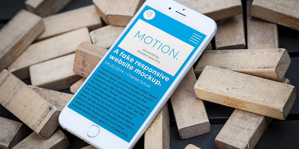
I just released two new typeface families. The first is SmytheSans Pro.

SmytheSoft Pro by Ian Lynam

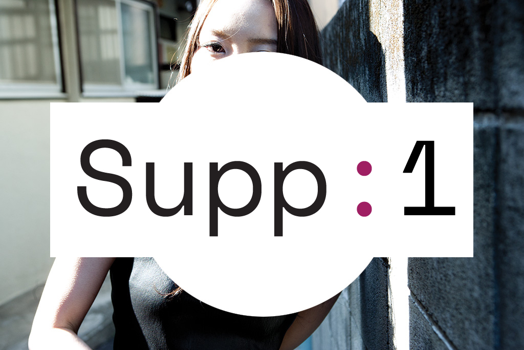
SmytheSoft Pro is a contemporary workhorse sans serif family that is eminently readable on-screen and in print. It is an updated display version of our popular family Smythe Sans with custom rounded terminals, rigorously spaced and kerned. SmytheSoft Pro includes Western, Central and Eastern European and Vietnamese character sets and is offered in five Roman and Italic weights: thin, ultra light, light, regular and bold.

SmytheSoft Pro by Ian Lynam

SmythSoft Pro features a large x-height, ample yet economic spacing for capitals, and subtle ink traps for less-than-perfect printing conditions (which can be exploited as design features at large scale). All of the capitals from the old Smythe Sans Display family are folded in to SmytheSoft Pro as OpenType accessible stylistic alternates—NASA-inspired space age alternate caps galore! The original Smythe Sans family featured Italic and Oblique cuts—in SmytheSoft Pro, the more calligraphic italic characters are available via OpenType-accessible stylistic sets. Each weight of SmytheSoft Pro features a bespoke paragraph mark which varies from weight-to-weight and includes over 100 ornaments, kinetic rules, symbols and pattern-making glyphs so that one might use SmytheSoft Pro as a complete design kit.

SmytheSoft Pro by Ian Lynam

The members of the SmytheSoft Pro family:
SmytheSoft Pro Thin
SmytheSoft Pro Thin Italic
SmytheSoft Pro ExtraLight
SmytheSoft Pro ExtraLight Italic
SmytheSoft Pro Light
SmytheSoft Pro Light Italic
SmytheSoft Pro Regular
SmytheSoft Pro Italic
SmytheSoft Pro Bold
SmytheSoft Pro Bold Italic

SmytheSoft Pro by Ian Lynam

The lighter weights are slightly slimmer than the regular and bold weights to give the typeface more of a vertical feel, inviting readers’ to rapidly read typeset text with a maximum of contrast and a minimum of optical dazzle. All work well on-screen as webfonts and in print as book type. Each is hinted with accuracy and kerned with precision.

SmytheSoft Pro by Ian Lynam

SmytheSoft Pro is an eminently readable typeface, particularly at small sizes on-screen. The strokes throughout are modulated to enhance humanist expression, with high-contrast horizontal slices taken out of certain letterforms to keep readers’ eyes moving forward in text. The typeface’s tendency toward a tall x-height was carried through the single-storied font with more horizontal characteristics for enhanced readability while being super-friendly and bright in appearance.

SmytheSoft Pro by Ian Lynam

Features of SmytheSoft Pro:
– complete Western, Central and Eastern European characters sets optimized for text typesetting
– radically improved spacing guaranteeing beautiful results in print and on screen for the Czech, English, Hungarian, Croatian, Esperanto, Maltese, Romanian, Turkish, Albanian, French, Portuguese, Spanish, Basque, Bulgarian, Finnish, Swedish, Norwegian and Vietnamese languages

SmytheSoft Pro by Ian Lynam

– all lowercase characters have an enlarged x-height, creating less optical dazzle than typefaces like Futura, Neutra or Avant Garde
– ink traps to enhance smooth printing when using less-than-optimum production processes like Risograph or if a press is overloaded with ink
– retro-futuristic alternate characters for most capitals
– 100+ ornament, kinetic rules, forms, symbols and pattern-making glyphs

SmytheSoft Pro by Ian Lynam

SmytheSoft Pro is available most affordably from Wordshape—$100 for all ten weights. Check it out here.

SmytheSoft Pro by Ian Lynam

The family is also available from YouWorkForThem, Creative Market and soon, MyFonts.

SmytheSans Pro by Ian Lynam

The second family of type is SmytheSans Pro. Essentially, SmytheSoft Pro is SmytheSans Pro with rounded terminals.

SmytheSans Pro by Ian Lynam

SmytheSans Pro is an updated version of our popular family Smythe Sans — we extended the characters sets, redrew most of the characters, rigorously spaced and kerned the entire family, and added a bunch of new features.

SmytheSans Pro by Ian Lynam

Smythe Sans Pro includes Western, Central and Eastern European and Vietnamese character sets and is offered in five weights: thin, ultra light, light, regular and bold.

SmytheSans Pro by Ian Lynam

The members of the SmytheSans Pro family:
SmytheSans Pro Thin
SmytheSans Pro Thin Italic
SmytheSans Pro ExtraLight
SmytheSans Pro ExtraLight Italic
SmytheSans Pro Light
SmytheSans Pro Light Italic
SmytheSans Pro Regular
SmytheSans Pro Italic
SmytheSans Pro Bold
SmytheSans Pro Bold Italic

SmytheSans Pro by Ian Lynam

Features of Smythe Sans Pro:
– complete Western, Central and Eastern European characters sets optimized for text typesetting
– radically improved spacing guaranteeing beautiful results in print and on screen for the Czech, English, Hungarian, Croatian, Esperanto, Maltese, Romanian, Turkish, Albanian, French, Portuguese, Spanish, Basque, Bulgarian, Finnish, Swedish, Norwegian and Vietnamese languages
– all lowercase characters have an enlarged x-height, creating less optical dazzle than typefaces like Futura, Neutra or Avant Garde
– ink traps to enhance smooth printing when using less-than-optimum production processes like Risograph or if a press is overloaded with ink
– retro-futuristic alternate characters for most capitals
– 100+ ornament, kinetic rule, form, symbol and pattern-making glyphs

SmytheSans Pro by Ian Lynam

SmytheSans Pro is available directly from my type foundry Wordshape, as well as YouWorkForThem, Creative Market and MyFonts soon.

Hannah Smith Photo logo by Ian Lynam

Why the name “Smythe”, anyway? Here’s the backstory: my dear friend Hannah Smith lived in Tokyo for many years and we are insanely close. The Smythe families are named after her. “Smythe” is my annoying nickname for her. I just designed the logo for Hannah’s photo studio in Sydney, Australia. She does amazing work (like many of the photos on this website) and is one of the best humans on this planet.

Plux Quba

cannibals6

I just published my new essay “Plux Quba: the Era of Neoliberal Design”. You can read it in print in Slanted #27 or online here. The subhead for this essay is “Cannibals in the cloud, or understanding design today”. Within: mobile devices, the cloud, the present and the future.

Weddings & Not Weddings

MoC1-Weddings1

My essay “Weddings” is now available to read in full-length format over at Modes of Criticism.


Thomas Jockin was kind enough to interview me for his TypeThursday series of interviews. Read it here.


I will be giving a lecture called “The Tokyo Olympics’ Visual Identity and Japanese Graphic Design History” at Lakeland College in Shinjuku on July 14th. You can find out more about the lecture here.

The Road to Brno

Ian Lynam and Kiyonori Muroga of Idea Magazine at Brno Biennial

I’m taking off in a few days to head to Brno in the Czech Republic for the 27th Brno Biennial. Kiyonori Muroga and I will be speaking on June 18 alongside design luminaries like Jon Sueda, Wayne Daly, Emily King and Manuel Raeder. You can see details here.

As mentioned earlier, Muroga-san and I are curating The Study Room at the Biennial.

The Study Room is organized into nine different thematic ‘islands’, loose groupings that explode national boundaries and general Orientalizing tendencies – instead unifying collections of publications under intuitive rubrics of expression.

The Islands:

  • Ordering the World
  • Connecting Cultures
  • Configuration of Space
  • Gesture
  • Symbolism & Culture-building
  • Space & Texture
  • Modernity-building
  • Poesis
  • Organizing Contemporary Culture
  • Visualizing Language
  • Analysis

Each island is populated by publications proposed by designers with some connection to Asia chosen by Muroga-san and I. The contributors to the Study Room include:

  • Aaron Nieh, Taipei
  • Åbäke, London
  • Kyungsun Kymn, Seoul
  • Yah-Leng Yu / Foreign Policy Design Group, Singapore
  • Yukimasa Matsuda, Tokyo
  • Javin Mo, Hong Kong
  • Leonard Koren, San Francisco
  • Philippe Egger, Villars-sur-Glâne
  • Daijiro Ohara, Tokyo
  • Caryn Aono, Los Angeles
  • Shutaro Mukai, Tokyo
  • Yoshihisa Shirai, Tokyo
  • Guang Yu, Beijing
  • Fumio Tachibana, Tokyo
  • Kohei Sugiura, Tokyo
  • Kenya Hara, Tokyo
  • Helmut Schmid, Osaka
  • Nobuhiro Yamaguchi, Tokyo
  • HeiQuiti Harata, Tokyo
  • Jens Müller, Düsseldorf
  • Xiao Mage & Cheng Zi, Beijing
  • Shin Akiyama, Niigata
  • Wang Zhi-Hong, Taipei
  • Tetsuya Goto, Osaka
  • John Warwicker, Melbourne
  • so+ba / Alex Sonderegger + Susanna Baer, Zurich & Tokyo
  • Peter Biľak, The Hague
  • Ryan Hageman, Chicago
  • Hattori Kazunari, Tokyo
  • Na Kim, Seoul
  • Kirti Trivedi, Mumbai
  • Lu Jingren, Beijing
  • Santi Lawrachawee, Bangkok
  • Chris Ro, Seoul
  • Randy Nakamura, Los Angeles
  • Sulki and Min Choi, Seoul

Muroga-san and I each contributed one book each to particular islands, and you know, I’m pretty damn excited about the Study Room collection. It’s got some really exciting, super-rare books—some are super-strange, others are more sober, and many explode our ideas of what books might or might not be. As a collection, it is not overly academic, nor is it overly pedestrian. It will surprise and delight, and *that* is the best.

Okojo Pro extended family

Okojo Slab Pro and Okojo Pro font family by Ian Lynam

We had three major font family releases this week. The first is the Okojo Pro family of typefaces.

The Okojo Pro Complete family is a reworking of Wordshape’s immensely popular Okojo family of typefaces. It includes Okojo Pro, a semi-geometric sans serif, Okojo Slab Pro, a semi-geometric slab serif, Okojo Pro Display, a round-cornered sans serif variation, and Okojo Slab Pro Display, a round-cornered slab serif.

The entire Okojo Pro family looks great at small or large sizes. The Okojo Pro family is designed for readability in long texts while simultaneously functioning as effective display type.

Features of Okojo Pro Display:
– all lowercase characters have an enlarged x-height, creating less optical dazzle than typefaces like Futura, Neutra or Avant Garde
– more humanist numerals and punctuation for enhanced readability
– complete Western, Central and Eastern European characters sets
– radically improved spacing guaranteeing beautiful results in print and on screen for the Czech, English, Hungarian, Croatian, Esperanto, Maltese, Romanian, Turkish, Albanian, French, Portuguese, Spanish, Basque, Bulgarian, Finnish, Swedish, Norwegian languages

The Okojo Pro Display family is influenced by the type designs of Paul Renner and Herb Lubalin, but smoothed over with more than a bit of Americana.

Both work well on-screen as webfonts and in print as book type. Each is hinted with accuracy and kerned with precision.The lighter weights are slightly slimmer than the regular and bold weights to give the typeface more of a vertical feel, inviting readers’ to rapidly read typeset text with a maximum of contrast and a minimum of optical distortion.

Okojo: it’s a little bit country and a little bit rock’n’roll.

Okojo Pro is available from Wordshape, YouWorkForThem, Creative Market, Fontspring and MyFonts.

OkojoPro Stack font family by Ian Lynam

Once upon a time, a young man with scribbles on his face rapped the words, “Stacks on stacks on stacks”. Prophetic. Engaging. And more than anything―*inspiring*!

Our second major release lately, OkojoPro Stack is a family of six stackable sans serif typefaces: three layers of extrusion, a solid face, and two ornamental stepped layers―Sunset and Sunrise.

You can use the different type faces together to create ornamental headline typography with thousands of different possible combinations. Bonus: The face layer is a rugged bold typeface that has been spaced and kerned for text typesetting.

Combine this family with the Okojo Pro Family of typefaces to create exquisite, eye-catching layouts for print or screen.

Okojo Pro Stack: Stack ’em up!

Okojo Pro Stack is available from Wordshape, YouWorkForThem, Creative Market, Fontspring and MyFonts.

Okojo Slab Pro Stack font family by Ian Lynam

Our third big release is Okojo Slab Pro Stack—another family of six stackable slab serif typefaces: three layers of extrusion, a solid face, and two ornamental stepped layers―Sunset and Sunrise.

Okojo Slab Pro Stack is available from Wordshape, YouWorkForThem, Creative Market, Fontspring and MyFonts.

All three families were designed in conjunction and work smashingly as an extended superfamily of clean workhorse fonts.

Scribble Guys!

Ian Lynam's Scribble Guys on YouWorkForThem

I just released a new collection of 24 different ultra-cute and expressive characters in vector form called “Scribble Guys” over at YouWorkForThem—check it out here.

Start Somewhere & Species Regret

Species Regret Ian Lynam

It’s been a weird couple of months—somehow I got the idea in my head that I was going to write a new book somewhere in Q1, plus have ‘an exhibition of writing’ associated with said book. The strangest thing is that it is not a book about graphic design at all, or it is only tangentially—this new book, titled Species Regret, is a collection of short fiction stories about mythology and contemporary culture.

I am having an exhibition at Goya Curtain in Nakameguro that is really short—only two days. And on those two days, I am going to read four bespoke pieces of writing explaining the ideas surrounding the book, a few stories from the book, a few stories that didn’t make it into the book and a few stories that I have written since the book was printed.

Exhibition info:

June 3rd – June 4th, 2016 (3PM – 7PM)
Readings:
Friday, June 3rd at 4PM & 6PM
Saturday June 4th at 4PM & 6PM

The blurb from Goya Curtain’s website:

Goya Curtain is pleased to present Species Regret, an exhibition of writing, sound, installation and prints by Ian Lynam. The exhibition is accompanied by the release of a new book of collect-ed fiction in a signed and numbered limited edition of 100, which will be available for sale for ¥2000 each.

In lieu of a traditional opening, there will be a series of 4 unique informal readings drawing from material within Species Regret’s greater cosmology, including unpublished writing.

Species Regret explores notions of what the world might be like if gods of the Hellenic and Norse tradition walked the earth today. Within the exhibition, the development of identity of self is examined through object relations study, mythology, projection, introjection and, ultimately, narrative.

Quoting the introduction to Lynam’s new book, “Today, we live in more or less a godless world—we look to the collapse of the Greek economy rather than to Hellenic tradition. This es-chewing of the past and what is culturally perceived as the basis of Western civilization offers up further identification with the gods and heroes of yore: if gods and their offspring walked the earth today, they would be irrelevant beings of tradition and immense might. Simultaneously, they would be losers of the sorest sort—defeated, withdrawn, aimless and immensely fucked-up.”

Drawing upon the narratives within his new book, Lynam has created a series of darkly resonant standalone typographic prints alongside a two-track cassette tape soundtrack that explores the concept of identificatory mimetism—the negotiation of the projected and introjected self in relation to mythology. Accompanying these elements are an installation of insidious found objects presented as seeming evidence as to the presence of the supernatural in our world.

Copies of Species Regret will be available at the exhibition, then later online.

Start Somewhere by Ian Lynam 
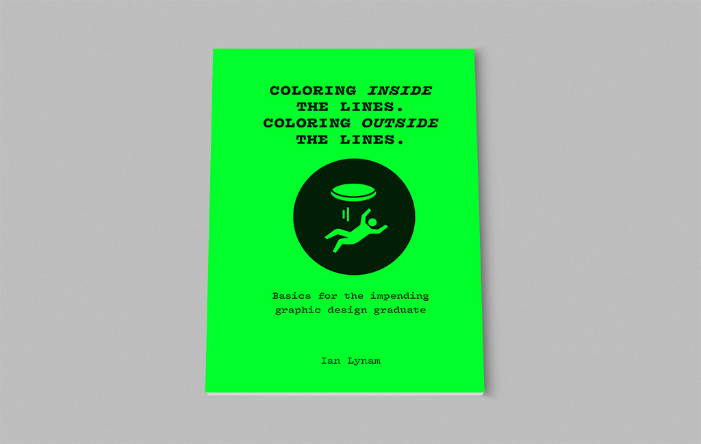
While I was writing Species Regret, I came up with the idea for another publication, titled Start Somewhere: A Handbook of Dubious Exercises, Tips and Rants About Becoming A Designer Who Writes. I had just returned home from teaching in Vermont and met with a ton of students who were having the hardest time generating their own content. Start Somewhere is my attempt at suggesting how designers might create work of their own—projects which involve design and writing, but that are fun, goofy, and insanely personal.

Start Somewhere is a 76-page handbook about how to become a designer who writes. Most designers grapple with generating their own content. This zine is full of writing about *how* to write and more importantly, how to get started. Start Somewhere includes 14 hybrid design/writing exercises, a number of helpful tips, and is copiously illustrated.

Within, I write about exactly *why* designers have a hard time making their own content, design theory, design research, guilty pleasures, shoe fetishes, design curation, and a number of other topics. The writing is as if we were hanging out and having a coffee. And then having a beer later. It is not textbook-y or pedantic. I wrote it from the heart and you can purchase a copy here.

Surface Magazine interview

Surface_Magazine_128_Cover

I was interviewed in the latest issue of Surface Magazine.

Slanted #27

Slanted_Portugal_02

I have a new essay in Slanted #27, the Portugal issue. The essay is called “Plux Qubaa: the Era of Neoliberal Design”. The essay is an examination of global labor structures through the lens of a dinner party.

The subhead for the essay reads, “Cannibals in the cloud, or understanding design today.”

An excerpt:

This is where we are: in a new era. I am giving it a name and staking the claim that we have entered into a new era of design history: the Era of Neoliberal Design. What Keedy calls “The Global Style” is just the skin, the ‘landlord paint’ of a world unloosed from obvious structures—both visual and economic. Design, particularly graphic design, looks the way it does now because the grab-bag of history is the ’52 pickup’ of technocratic plutocracy. Understanding graphic design today through the lens of political economy gives context and semantic space for subservient theories of post-postmodernism and metamodernism. Efficiency and flexibility in the market opens up a porousness that we can use to understand our desire to oscillate between the past and the present and the future.

Slanted_Portugal_40

This is the reality we have dwelled in since the death of grunge (a.k.a. postmodernism with the intellectualism neutered). A landscape of sans serif typefaces used in a centered axis composition overprinted with tetrahedral, futuristic ornament and browser-like images with varied dimensions and aspect ratios—and why so much design looks like the Internet printed out… and why so much design looks like different eras of the internet printed out. Locale and class bely the ‘appropriate’ aesthetic.

We cannot further deny an understanding of the synthesis of these varied aesthetics and their reason for being. We live in an age where a technology corporation has more cash than the leading economy of the world. With the opening of Cuba and the continued ascendance of Apple, an important concept has come home to roost (again)—late market capitalism is the only way forward in terms of global economies, a la Francis Fukuyama’s The End of Humanity. In a world bereft of options other than the rush to the bottom of market goods and services provided, we are forced to efficiency—it makes sense that the Internet of Things and the Design of Things look so similar. This sameness—it is the function of a market economy. It is the evidence of the pervasiveness of results/evidence-based policy, practice, design, and education.

You can pick up a copy of Slanted #27 here.

VCFA at TypeCon!

VCFA at TypeCon!

VCFA will be well-represented at TypeCon, North America’s premier type design and typography conference, to be held in Seattle from August 24 to 28!

Co-chair Dave Peacock and Chair Emeritus Silas Munro will be giving a presentation and Co-Chair Ian Lynam (a.k.a. ME!)  is on the board of judges for this year’s SOTA Typography Award. VCFA friends like John Downer, Subylle Hagmann, Alice Lee, and many others will be giving amazing presentations and showing new work.

Join us in Seattle!

O, Chicago! O, Vermont! Oh, Tokyo…

Ian Lynam in Chicago

I just got back from a whirlwind 4 days in Chicago. I gave a lecture about the work of Oz Cooper called “Heft, Gravy and Swing” for the Chicago Design Museum/ÄKTA, a lecture on how the Olympics fits into the history of Japanese graphic design for Chicago’s Society of Typographic Arts, and a lecture about marrying the divide between practice and theory for the School of the Art Institute in Chicago. All were great, and I made a ton of new friends, as well as seeing some old ones.

A giant round of thanks to my dear friend and patron Paul Gehl of the Newberry Library, VCFA alums and amazing friends Bill Kaminski and Margaret Gonzalez for making it down to hang out, the one-of-a-kind Julie Sittler, my girl Heather Snyder Quinn, Ryan Hageman of Gurafiku for introducing me at the Design Museum event and for being a total mensch, Bud Rodecker, Kiyomi Negi-Tran, Heather Anderson, Karley Schimpf, Tanner Woodford, Jacob Ristau, Renate Gokl, James Goggin and so many others for making it all happen. I am honored.

VCFA

Prior to my Midwest adventures, we had our Spring residency at VCFA. It was amazing, as usual. Our Guest Designer/Critic was the esteemed Kenneth FitzGerald who gave a lecture titled “Singing the Surface” and a workshop called “Music for Metaphors”. Both were amazing.

Congratulations to our latest graduating class: Dick Schellens, Addison Landers, Carl Julien, Deb Kline, Erin Beckloff, Jason Alejandro, Laura Rossi Garcia, Lisa Williams and Ru Jurow.

It was amazing to welcome our massive incoming class: Beth Adams, Mike Berrell, Corey Brabham, Danny Cardenas, Colleen Clark, Le, Suzette Cozzens, Adam DelMarcelle, Luke Dorman, Sam Flora, Jeremey Forsberg, Jason Fowler, Gareth Fry, Katie Krcmarik, Edna Pedroza, Rosemary Rae, Heather Snyder Quinn, Anna Spool and Wendy Strasolla.

As usual, residency was transformative for all—a massive thanks to the students, faculty and staff at VCFA. And speaking of transformations, I am excited to be Co-Chairing the program for the upcoming year with my dear friend and colleague David Peacock.

Lithuanian Design Awards

lithuanian_design_week

I just finished up judging the Lithuanian Design Awards 2016, weighing in on Graphic Design, Industrial Design, Interior Design and Fashion. So much great work!!!

Lecture for STA Chicago

chicago_ian_lynam_tokyo_olympics_lecture

I will be giving a lecture for Chicago’s Society of Typographic Arts on Tuesday April 19th at 6:30pm.

Morningstar
22 West Washington Street
Chicago, IL 60602
Directions

More information here.

PAC

PAC.MN - Share multiple URLs easily

Pac.mn is a project we worked on a few years ago which we’re still quite happy with. It’s an easy way to share multiple URLs in a graphic and non-intrusive way.

PAC.MN - Share multiple URLs easily

You can see Pac.mn here.

Areas of Interest workshop

AreasofInterest_Workshop04

Some of my writing will be the focus of this upcoming workshop that is a part of Singapore Design Week. More: http://areas-of-interest.com/workshops

Space Academy

Space_Academy_Christchurch_identity-03

We just finished up the identity for Space Academy, an event space in Christchurch, New Zealand.